
Winter Castle - Rendering in V-Ray
Learn how Vincent Flohic worked through this project to build a huge castle environment in V-Ray. He explores using references, analysing composition and light, creating textures in Photoshop, matte painting and much more. If you love deep-diving into specific settings and details then this article is for you.
Introduction
My name is Vincent Flohic and I'm a young CG artist that graduated from LISSA School of Art & Design in Paris, studying Animation 3D/VFX in 2016. Currently I work as a 3D Generalist Artist at VIV in Paris. Since my childhood I have been passionate about art and cinema, so I have looked for a profession combining these two fields and that’s how I discovered the world of 3D. I started studying 3D animation and VFX and I didn’t regret my choice!
Working from Concept Art
As a generalist, I wanted to experiment the 3D environment with a personal project. I researched art concepts to inspire me and I came across Dawn Pu's work Winter Castle in the hillside. I really liked it so I decided to reproduce it in 3D by being as faithful as possible to the original concept.


Planning your Composition
For me, when we start from a 2D concept we must first analyse the picture and understand its composition before launching directly into 3D.
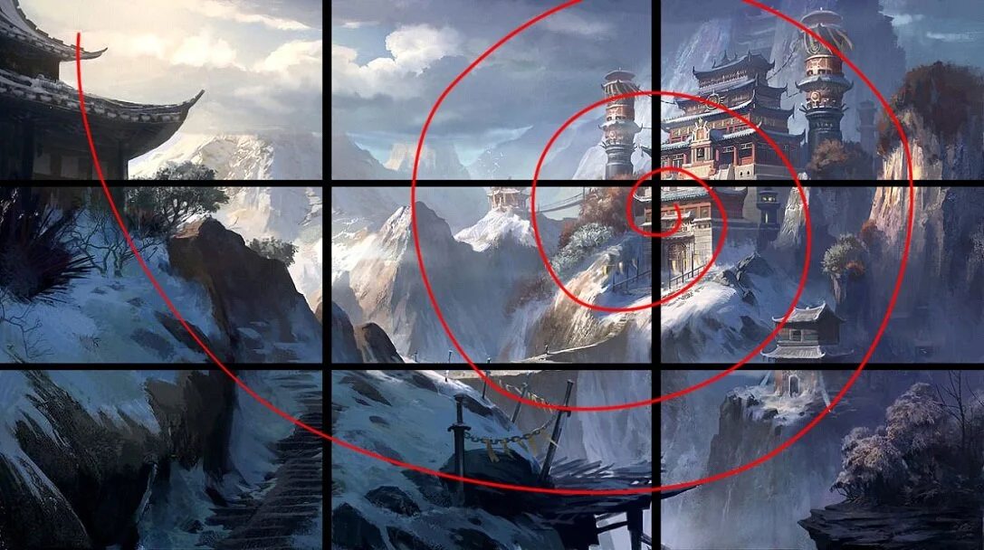
Guiding the gaze
On an image, the eye is always drawn first by the clearest areas, the gaze is influenced by the lines of construction of an image, whether they are conscious or not. With an environment like this, depth is important and to achieve this effect it is wise to have different tones. The foreground being darker and the background more clear gives the viewer a feeling of atmosphere.

1 = Dark Foreground, 2 = Midtone Midground, 3 = Light Background
The masses, their values, their hues, their number, will greatly influence the perception of a visual. They participate in the scene.
Using References
The Internet is your best friend! Search and inspire yourself with reality using reference pictures. For this picture I looked for references on snowy mountains, Asian temples and others for the details.

Example of references
Setting up the 3D Scene
The Camera
The framing is a big part of the composition. The place, the focal length and the lens aperture are all influential parameters.
The Focal Length
Zooming and moving are not the same thing. For the same proportion in the framework, the rendering of perspectives and depth of field will be very different.
Between 40 and 50 mm a focal length is close to the perception of the human eye. It is a good starting point for an image.
Shorter focal lengths (between 12 and 35 mm) deform the subject, they are used to have an overall vision if there is a lack of recoil.
Longer focal lengths (above 70 mm) crush the perspectives, they require recoil or allow shooting from a distance.
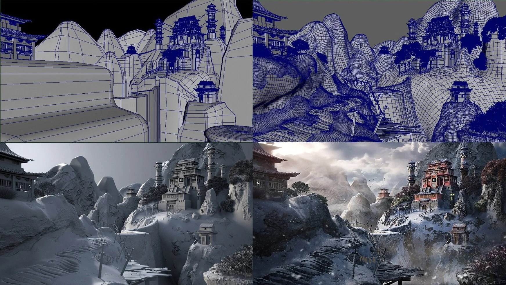
Placing These Elements
I placed the elements according to the reference, I first realised a blocking of the environment by placing simple shapes without going into details. This allowed me to fix the camera, adjust the focal, set the location of the mountains and see where this would position all the architecture and assets modelled in parallel. The mountains would be sculpted later on in ZBrush.

Establishing the blockout
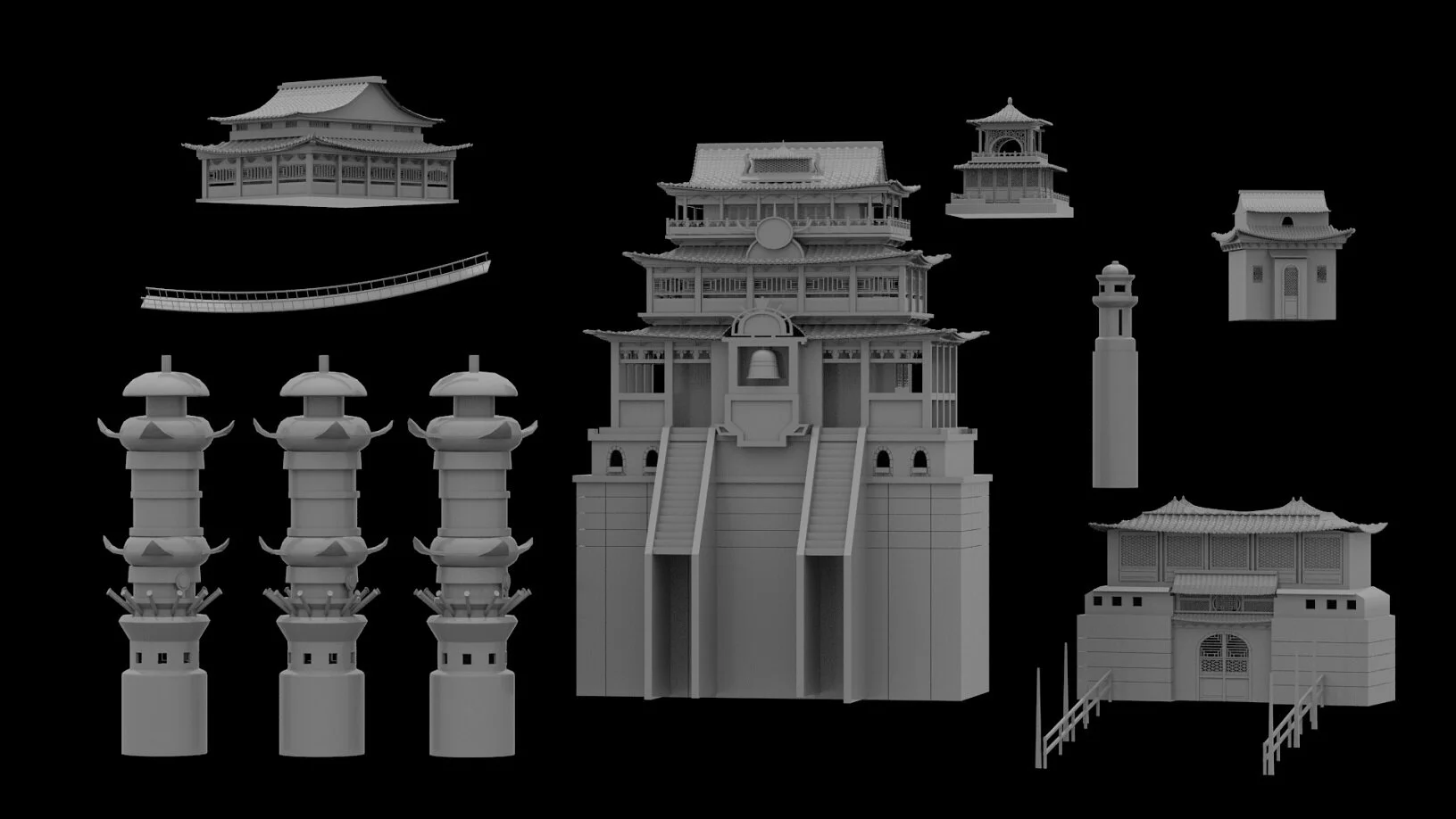
Architecture

Assets
Process
Lighting
Light is your main strength for showcasing an image. It will guide the gaze, enhance, mask, make the materials live, give relief, shape or perspective.
It is important to ask where light comes from, what justifies it, the nature of its source, what will give some colorimetry and some type of shadows. The use of an HDRI is frequent in lighting! It simulates a real luminous atmosphere in our 3D scene. So I used an HDRI map with a cold light environment. The temperature of the lighting sources will give the atmosphere and help give perspective, to detach the plans. Don't hesitate to use sphere tests in your lighting, it is important to see the direction of your light but also to be aware if you are not overexposed and so distorting the shader! Once the HDRI was validated, I used a V-Ray Sun Light to get a main direction of light. By identifying the light source of the concept we can see that the sun is located at the top left of the image, so that’s where I put the direction of my sunlight.
To see how a light acts on your 3D scene, the ideal process is to work light by light. Finally I combine my directional light (sun light) and my ambient light (HDRI).

Ambient light with HDRI

Directional light with V-Ray Sun Light
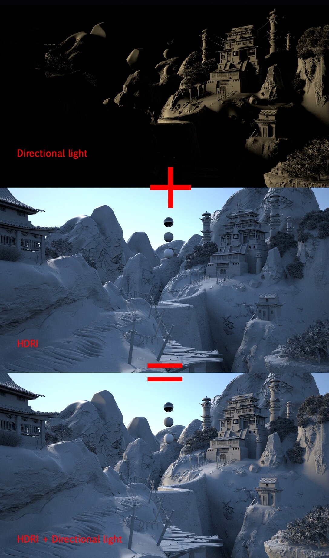
Only two lights used overall
Composition and Colour
Chroma is the hue range present in the picture. Depending on the bias, we will favour some shades, we will desaturate others, we can also transform some of them. Already possessing a strong composition from the concept created by Dawn Pu, the colour choices and its use were easy for me because I only had to take the same colorimetry from the concept. We can also notice the artist concept used complementary colours combining warm and cold.
Association and colour tuning are important in a visual! When they work together it is not a coincidence, as for a harmonious melody, the colours meet precise rules. Studying them and applying them in your composition can make your image tell a deep story.

Colour temperature analysis
Texturing with Photoshop
When I realised for this personal project that I didn't have the opportunity to work on my textures with a 3D software like Mari or Substance, I worked with a more traditional texturing method using Photoshop.
Before texturing a mesh, you must first unfold your UV’s and this is an important step especially if you are texturing with Photoshop. Once the UV’s of the mesh are unfolded, I export it as an image in PNG. I import these UV’s into Photoshop and apply my textures. In picture 2, I added frozen areas to the wood using the UV’s of my object as a reference to paint the areas that interest me. Remember to hide the UV’s layer when you export your Photoshop texture.
Here is an example of the wood diffuse map.

Wood without frozen areas

Wood with frozen areas
Render example
Working with V-Ray
V-Ray is known for its speed and by default uses any resource on your PC (multi-core CPU or GPU) to render. It's generally used for print or for animation.
My tips and tricks for working with V-Ray aren't necessarily the only solution because everyone has their own way of setting it up and using it. If this is your first step with V-Ray, you should know that as in any renderer, the more quality you look for, the longer the rendering time will be.
To begin with, if you already have everything in place (modelling, shading, texturing, lighting) and you wanted to have a quick preview in rendering, the ideal isn't to overly boost the parameters directly. Stay in progressive mode, uncheck your passes in render elements, decrease the resolution of your picture and if you are in an outdoor environment, deselect GI (global illumination). If you are using GI, leave the basic parameters for your tests. Decrease quality by setting Low if you are in Irradiance map and if you are in brute force set Subdivs to 8.

Set the subdivs of your light, reflection and refraction at 8 for your rendering test.
I know your picture will not be of good quality but it will allow you to gain speed over the preview of your rendering. Once the rendering tests are complete and you are ready to launch your final rendering, you can turn on your passes, increase the subdivs of your scene and the final resolution of your picture. For me personally, I use adaptive for my final rendering with these parameters below.
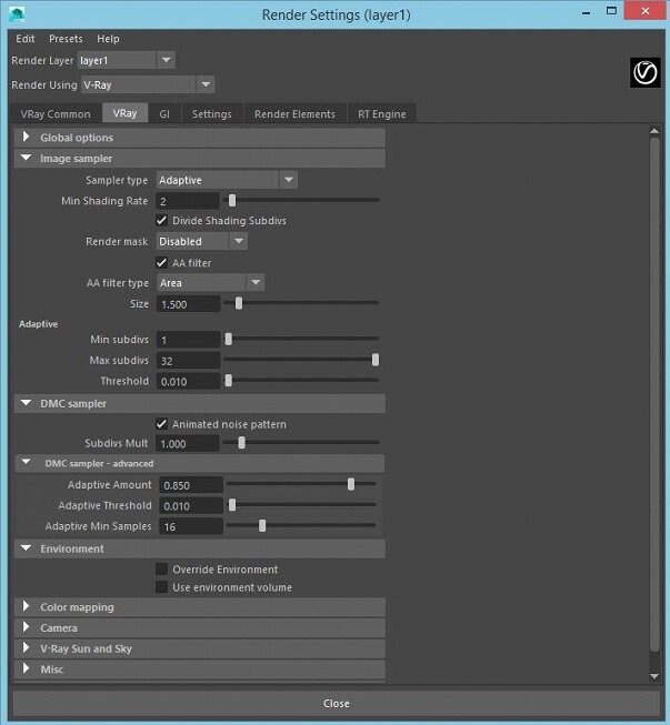
To Know
The subdivs will be mainly responsible for the grains in your picture, so by increasing them you will decrease these grains.
The subdivs are located in the reflection and refraction of your shader, in your light but also in render settings. It is however not useful to increase them if for example you don't have refraction in your shader.
For my part when I work on print, the subdivs of my shader and light, I put them at 32 or 64, only the Dom light I put 512.
When I work on animation I reduce them in half (subdivs 16 or 32).
Threshold (render settings → V-Ray → Image sampler → Threshold) works the opposite of subdiv. The more you increase it, the worse the quality will be. However it isn't necessary to lower it too much because the more you decrease it the longer the calculation time will be. For my part I leave it at 0.01 and at the maximum I decrease it to 0.008.
GI also takes the resource for rendering, it is advisable to use it when you render on an interior environment (car interior, studio, living room, bedroom, kitchen, etc.). If you are working on an outdoor environment it is better to uncheck it, your project will render faster.
Practical Shortcuts
Instead of deselecting your passes one by one in the decoded render elements directly Enable/Disable All.

If you want to change the resolution of your picture quickly for testing, you can directly handle it in your render view.

To handle all your light settings, you can handle them from the V-Ray Light Lister.

There are still many parameters to understand in V-Ray to optimise rendering. I strongly encourage you to watch tutorials and learn from other people who know V-Ray because it’s always useful to know what you are doing when setting your render settings.
Background
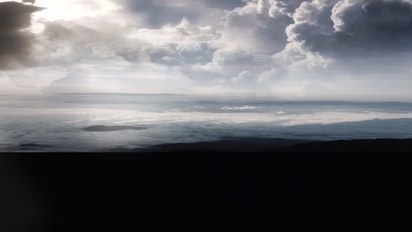
To create my background I try to get as close as possible to the concept, which was a sky with a lot of clouds and a sun half hidden by the them. I did this by creating a matte painting. I put together several images with skies, clouds and a sun and after a few tests I decided to keep 4 images to make my background.

Pictures for matte painting
With some editing and adjustment, I used these 4 images by assembling and retouching them. For questions of law, if it is a project for customers, it is better to buy or download your picture free of right. For my part it was only a personal project so I didn’t really pay attention to these rights.
Step-by-Step Process
First I imported my main image, the one that served as my base.

Imported base image
Then I desaturated it because the sky on the concept is of a less saturated tone.

Desaturated base image
Then I added clouds.

Added Clouds
I added the sun (top left of the picture).

Added sun
For the last step, I adjusted the colorimetry and I did some retouching to uniform the image.
Final image with adjustments
Snow
A lot of people have asked me if the snow animation was done in FX particle in Maya or other software. It was actually simpler than that! The animation I was planning to do didn't use FX to create the snow, it was much simpler. I took green screen footage that I used in compositing and it was the same for birds.
You will find in this link an animation where you will see the breakdown of this personal project where I add the green screen footage of snow and birds.
My Advice
If I had any additional advice to give, I would simply tell you what my leads have taught me in my career as a 3D Artist.
Ideas come at all times, the eye is constantly nourished and formed! Think about observing and being curious as much as possible, take an interest in photography, cinema, advertising... Sharpen your eye, create a planning, search and organise your references. This will allow you to emerge your ideas. For this, Google is your best friend for reference searches, tutorials, technical problems… Search before and if you do not find, ask your colleagues, friends or on forums. If you do not find the answer to your problems others may know!
Conclusion
This personal project was a challenge for me because I had never worked fully on a 3D environment. It wasn't easy because I worked daily on this project after my day job but with good planning you can give yourself some free time and not spend all of it on the computer.
Thanks to my friends for giving me retakes to improve my project and my skills. The desire to be proud of the work I do, to bring it further and to progress is something that motivates me as a 3D Artist.
Thank you for your attention and sticking to the end, I hope the explanation of my work was helpful. There are probably a lot of things I haven’t talked about but I’ll leave it at that for this moment.
Don't hesitate to contact me for any questions of a general nature or related to Maya, ZBrush, V-Ray or Photoshop work. I am always extremely happy to help you!
You can find my work and contact me at this link.