
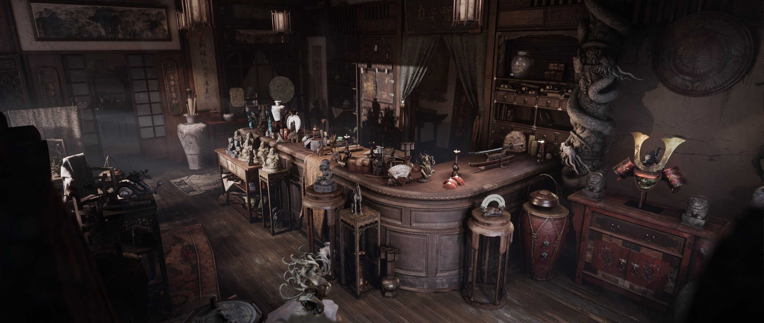
The Croft antiques shop - a showcase of dedication and detail in ue4
Have you ever thought of giving up on a project? Inspired by Tomb Raider and Asian culture, Balasz almost scrapped this project before bouncing back and creating this incredible piece. In this article we explore how Balasz maintained such high quality and detail across the scene, his shortcuts and tricks for asset creation, how to find motivation, getting the most from online communities and that’s just the start!
Intro
My name is Balazs Domjan, I’m a self-taught 3d artist from Hungary. The story of how I got into 3d art is quite a long tale to tell, although I’ll try to make an attempt to condense it.
My relationship with art started out when I was about 6 years old. My brother loved drawing and I adored the process enough to try it out myself. It’s been one of my hobbies since then, and traditional pencil drawings were the only form of art which I could have afforded until very recently. The games and film industry however, is almost non-existent in my country. Therefore I’ve never considered that as an option when I had to choose a career path after finishing secondary school. That’s how I ended up learning economics at a local university, where I spent 7 years learning. During my studies there hadn’t really been a single moment where I genuinely felt that I loved what I was doing. However, the absence of opportunities here slowly made me forget about my dreams and I accepted that I’m going to have a business related profession. I managed to get good grades during my studies, which rewarded me with scholarships. That’s how I had the chance to travel to Australia, Italy and the US. Exploring these places made me realise how much I didn’t know about the world and how many opportunities are out there. Unfortunately I had to return to my homeland and I didn’t have any more chances to travel and gain experience, so I finished my studies instead. After graduation I got a job as a customer service representative at a multinational company. I was receiving phone calls and customer complaints every day. Even though I loved helping people and learned how important team work is, my life was monotone and uneventful. I felt that something was missing, and I knew what, I didn’t have enough courage to make the radical decision to give myself a chance to change my life. I was constantly thinking of how people generally liked my drawings, and I despised the feeling I had about not making any in years. After spending half a year there however, I felt the desperate need to stop doing what I was doing. I was finally determined enough to decide to stop only dreaming and start taking actions to make my dreams come true. That is why I quit my job, sold my own house, and started learning 3d.
Art Style
My artistic preference has gone through many changes. When I first grabbed a pencil, I only mimicked my brother who was drawing cars and motorcycles. So, we can say that I started out with hard surface. But organic elements have always interested me much more! Video games and movies have always been the main source of my inspiration, and they evoked the desire of making art inside me.

I was still only drawing, but I switched from cars to characters. Warcraft and other fantasy titles were my favourites, and I used their artworks as references. I loved that organic surfaces are not so tight and precise as opposed to hard surface. I took great pleasure in tapping into my own imagination and creating things that cannot be found in real life. When I started learning 3d 2 years ago, the first tool I touched was ZBrush. Having a background of a lifelong hobbyist in fine arts, I couldn’t imagine being creative without having a pen in my hands. At first I was making characters but I only enjoyed sculpting creatures. And since my aim was to become a working professional one day and the majority of game characters are humans (apart from a few titles, of course), I thought that I’d try environments instead. It came all of a sudden, and the interesting thing is that I’d never even thought of environments before. However, it clicked almost instantly! I loved that I could build worlds of any sorts, and that it has more elements than characters in general. I’m not only crafting assets, but I also make compositions, study materials and play around with colours and lighting. This change from characters to environments happened about a year ago, and it stuck with me.
Composition
The final composition has a long story of how it came out as it is. When composting an image/still shot, the artist needs to keep multiple elements in mind in to order achieve a goal. Things like harmony, balance between symmetry and asymmetry, or the golden ratio are means to put an image together, and basic rules by which the result can be aesthetically pleasing to the eye. If one wanted to break the equilibrium of the image and make it to have a dramatic effect instead, these rules should also be broken.
My scene was specifically difficult because I didn’t only need to pay attention to those, but also because I had a lot of different cameras set up. The establishing shot was a wide, almost panorama-like picture with a relatively low camera angle and a very high number of various elements. Whenever I placed or moved something, that didn’t only make changes in the main image, but in other shots too. The iteration process was, therefore, really long and I had to be extremely careful. I wanted to create a mostly harmonious image overall, but also to make it have a sense of clutter. To achieve my goal I needed to play with lighting and the placement of the objects in the space. When it comes to lighting, the directional light/sunlight casts the sharpest shadows, and the rest would be diffused lights with softer transitions from dark to light, and with less discrepancies in intensity of the values. The objects also reflect lights, so they all contribute to the global illumination in the scene. That however, cannot brawl with the main light source. The most important thing I tried to achieve is to set the focal points of the image according to the rule of thirds. The directional light is coming in from the left through a (not visible) window, bringing in the brightness.

Sunlight Breakdown
That in itself creates a visual interest and accentuates a certain area of the image. The counter was intended to be the main centre piece of the whole scene, and the sunlight helps highlighting that. That big piece of furniture also has a specific shape which serves as a guideline for the eyes of the viewer. Moreover, it connects two intersections of the thirds. The direction of the wood planks on the floor complements this diagonal order.

Rule of Thirds
The bottom right point is occupied by that bright curved object, while in the upper left point we can see two glittering pottery items. The inequality in the number of objects is also a subtle touch to break the balance (not the harmony!) a little bit. If I placed 1-1 object in each places, that would have felt a bit strange an unnatural. Another key ingredient here to play around carefully was the amount of noise. You can observe that the image is very ‘eventful’ almost everywhere. The owner of the store (Miss Croft) has had a lot of adventures and too many articles to sell. This resulted in her stuffing her goods where ever it was possible: under the tables, shelves, or even on top of each other. Also, this place had been an antique furniture shop before she took possession of it, and the amount of equipment further increases the clutter. That’s why I purposefully left the floor emptier than I had initially been planning it. Although leaving it completely clean and empty would have taken too much of the busy areas away. How much of its surface is covered is very deliberate, because that balances out the noisier parts of the picture, which are heavier for the eye, as opposed to the floor which is more of a rest.
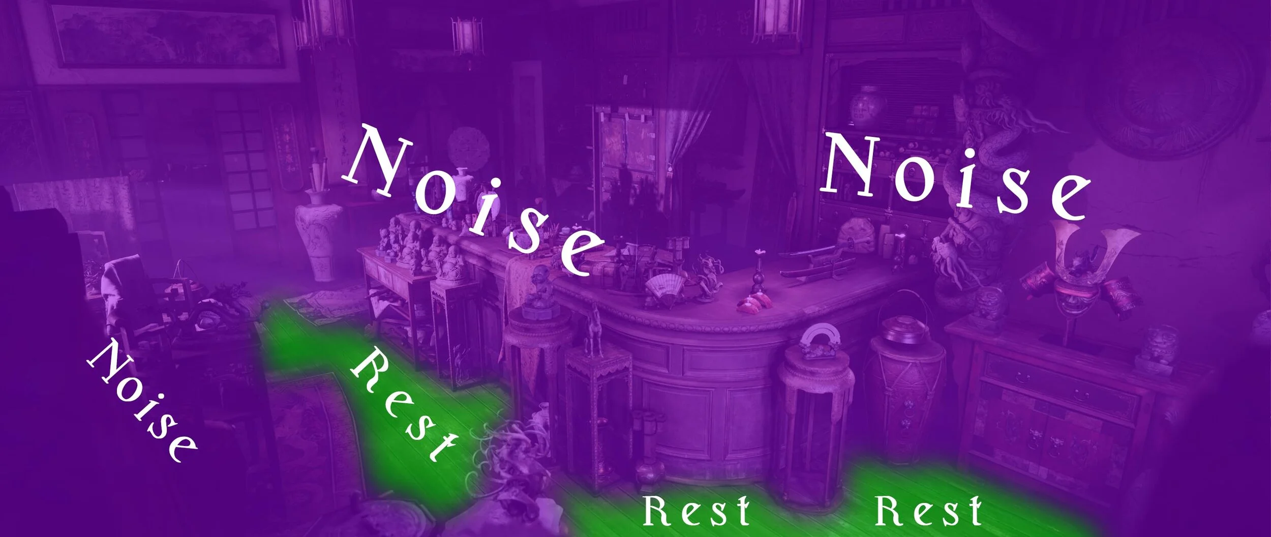
Noise and Rest Breakdown
That’s why I threw two carpets there, placed the dragon statue (to slice the floor in half by covering it from the camera) and added some dirt and white wear to the wood planks here and there with vertex painting.

Breaking up the floor
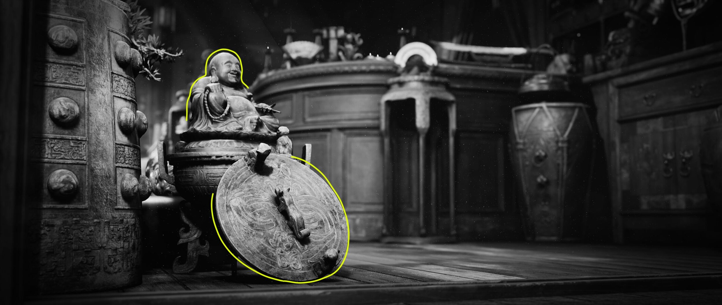
Although I need to say that each of my pictures are both similar and different at the same time. There were rules which were applied to all of them (rule of thirds, for instance), but they had their own focal points and little unique features. When we look at this picture, for example, our eyes immediately gravitates towards the sitting Buddha on the left. This is because of two reasons: placement and lighting. It’s put in the left third intersection. The Buddha, himself, is seated on the top, and its ‘throne‘ occupies the bottom cross-section.

Rule of Thirds
By analysing it further, if we connect the handles of the lid it creates a straight line that also crosses the top left third and point at the Buddha’s head. That diagonal composition provides the image with a natural feel. The red cabinet in the right also makes directions, all of which are beaming at the lid. That’s something you would probably never notice at first glance, but your subconscious does, and it further accentuates the focal points.

Directional Composition Lines
Another subtle compositional touch was the threshold on the bottom and the vertical wood beam on the left. These ornament the image with a (not straight and precise) frame. Although, it’s only a half frame, by which it break the rules of balance (not harmony!), making the image feel more natural.

Angled Half-Framing of the Shot
From a lighting point of view, the Buddha is the largest bright spot. It’s even more apparent by desaturation the image and increasing the contrast.

Lighting Values
I also tried to arrange the background in way that help the Buddha stand out. The key there was to have it darker around the statue, so that it makes more contrast.
Separating the Buddha From the Background
The background is also relatively clean around/behind the Buddha, which has a much noisier/eventful surface in comparison. This was a purposeful way of guiding the eyes. The next image is probably my favourite among all. The focal point is immediately apparent, I believe, but drawing the thirds there makes it even more obvious.

Rule of Thirds
By connecting two intersection points, we can see that we actually have two focal points: the chubby lion and the white vase in the background, the former being stronger than the latter. Even though both are bright spots, the dog figurine is still the dominant, and that’s what your eyes are drawn first. Then your sight travels to the vase, and then it jumps to the blue dragon figure right next to it. That blue spot actually marks kind of a border: we can see, that the objects in the background create a curve (green line). This separates the busier part of the image from its less noisy part, while still keeping the rule of thirds.

Focal Points
I loved putting this one together! That tiny little doggy/lion is standing firmly on an end table, which is much bigger in scale. However, he conquered it and he’s on top of the world! This little chubby fella’ guards the shop, making sure no one steals anything. He is the boss! Lighting was the chief contributor to the composition in this case. The puppy is hit by a powerful sunlight, making it almost glow immediately. Because of this, the bigger dragon behind the dog feels like smaller scale actor, even though it’s placed on a taller table. The sunlight gives almost the entire of the image a warm tone. However, I subtly lit the dog’s little face with a colder light. Even more, it does directly hit it, but it rather provides him with rim lights. This way the details are more accentuated and the dog’s smirk also feels a bit menacing. This next image is a good example of a very calm and clean composition.

Rule of Thirds
Drawing the lines of thirds there, it’s apparent that the vase rules the place. Although there are so many other elements here which guide the eyes.

Other Guiding Lines
The leg of the table creates a firm vertical line, which is further complemented by that piece of furniture on which the cloth is hung. Another vertical line is marked by the edge of the table cloth which is thrown on the table. The table also creates a horizontal line in the middle of the picture. And finally, there’re two more: one set by the small chair in the bottom, and another one created by the cloth hanger.

Areas Highlighted by the Lighting
The light hits these objects in a way that it accentuates the vase, the corner and the drawer of the table, and a small portion of the chair in the right. We can draw a line then and see that it intersects not only these highlighted areas, but also two of the main compositional points. Taking this even further, the chair under the table is slightly pushed closer to the viewer, so that the light hits it, but only in a subtle way. This is very important, because it gives the image its balance. Without that chair being there, we would have a dark spot, which wouldn’t be a problem at all, but the image then would have a different meaning. Let me explain!

Compositional Traingles
The vase and the table create a triangle. The vase, the chair on the right, and the small chair in the bottom left also create a triangle. What’s vital to mention here is that the bottom of the triangle is relatively wide. This creates the balance, this makes the image calm and clean. If I turned that triangle upside down, the whole image would be broken. Again, that in itself is not a problem! But the balance would disappear and the image would wave tension. So, it’s all about what the artist wants to achieve, what they want to communicate. These are classical compositional rules. When the Egyptians built the pyramids, they didn’t make it triangular because they wanted them to be so. They formed them that way, because it gave them a stable structure, it became balanced. And look at them now, they’re still standing as they were back then!

Golden Ratio
Also, the legs of the small chair creates vertical lines, although not as strong as the table ones. These divide the image into a few sections, and what’s interesting about them is their proportion to one another. The width of the area, marked by most right yellow circle, is bigger than the one next to it. As we’re moving to the left, this width decreases, but with the same ratio. This is the golden ratio, which equals 1.618. This is a proportion that Da Vinci himself was studying and can be found in my many of his works. Even our body is constructed by this rule: the sections of our phalanges has the proportion of 1.618 to one another. The larger section is 1.618 times longer than the smaller one, and that is 1.618 times longer than the smallest one. The same rule applies to our upper arm, forearm and hands; the femur, the tibia and the feet. It’s everywhere, like the number 23.
Some of these things I showed you are there without me having been thinking of them purposefully when I was composing the shot. Many times the image felt off, and moved things around. It was my subconscious that warned me countless times that an item is not in its appropriate place. Because I wanted to establish harmony with this particular image, and that goes beyond placing something in the intersection of the thirds.
Also this image is in a bit of a contrast with the other renders I made because it’s much cleaner and less cluttered. The things that matter here much subtler: where the statue looks, how close it is to the vase, the drawer of the table is ornamented or not, how much of the chairs we can see, etc. The values also play a much bigger role here: the brighter areas make the image more serene, but the darker tones break that. The fine handling of these elements is what makes a composition! That’s why this shot is a perfect representation of the idea that less can look good too.
The last image I want to talk about a bit is this shot, because this is the most complex in terms of composition.

Separation Between Noise and Rest
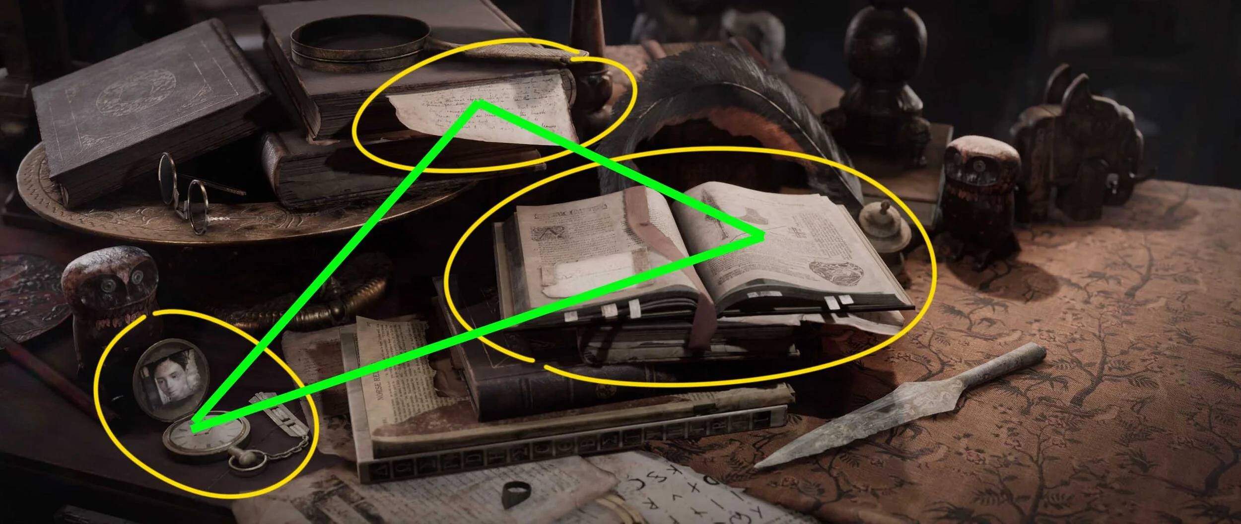
By looking at the lines, it’s immediately apparent that the main focal point (the open book) in not placed on any of the intersecting points of the thirds. This is intentional however because placing it on the left would push the whole image and show far less of what I wanted it to have. Although sliding it to the right would have caused another problem: right now the left 2/3 of the image is cluttered and noisy, but the remaining 1/3 in the right is cleaner and provides a resting area for the eye. The green line shows this separation.
The main composition, encompassing the whole image is diagonal. We can see it by drawing a line from the bottom left corner to the top right. The arrowhead, which is resting on the table next to the pile of books creates another line which is parallel to the main diagonal one. This provides the image with balance because it follows the direction of the main composition.

Compositional Lines to Frame the Book
The edge of the open book also follows this rule, and the books in the top left are further complementing it (turquoise lines). In the meantime, the left and right edges of the open book are slicing the image in 3, and those rather vertical lines are somewhat perpendicular to the other lines we already mentioned. This frames the book and makes it a strong focal point.
Compositional Triangle
This image also has that balance I mentioned before. The open book, the paper sticking out in the top of the image, and the pocket watch in the bottom left create a triangle. Here again, the triangle is wide and standing on its bottom. Rearranging the object in a way that would turn it upside down would take the balance away. This triangle also guides the eyes, which is advantageous because I wanted the viewers to explore the things that it highlights. The images in the book, the writing on the sheet and the image on the watch are all elements that make the story, things which tell you more about who the owner of the shop is.

Intersecting Points on the Rule of Thirds
Another example: the very bottom of the book pile also draws a line, just like the edge of the table cloth does. The corners of the books can also be connected. All these lines are intersecting the points of the thirds, hence the balance is there.

Using the Owl Figures to Guide the Viewer
One last bit I’d really like to mention is the two owl figures: their purpose is to guide the viewer’s eyes to relevant story elements. The open book is kind of an obvious one, especially with the drawing of the same arrowhead that’s lying on the table next to it.
The other one however, the pocket watch is a little Easter egg, so if you don’t want to find out the Easter Egg, skip this paragraph! Since this shop is owned by Lara Croft’s grandmother, that’s a photo of the young Lara glued on the lid. She takes that watch with her wherever she goes, and she loves seeing her granddaughter. The owl is not only pointing this out by the direction of its sight, but also serves as a metaphorical guardian who protects.
One thing to be mentioned here is that these are only a few examples I gave. At least 30 more lines and triangles can be drawn in this image. It’s really just a matter of how long you are observing it for. The delicate and purposeful placing of these objects and the light sources are what create a coherent picture, and there is a ton of secondary compositions besides the main which I didn’t create intentionally. I solidified the main composition, and then the rest complemented it anyway.
This shot took me the most time to compose among all. It was like placing layers on top of each other in Photoshop and masking them here and there. The big shapes and the smaller details needed to be synced which was a huge task to carry out. This is how da Vinci was probably feeling while painting The Last Supper.
Apart from the still compositional shots however, I also wanted to make the place feel believable. What I mean by that is where everything is placed had to make sense. That’s why I placed the most unique and intriguing objects close to the entrance. Those where the ‘click baits’ of the shop, what the pedestrians walking on the street would notice first. Those are the items which look captivating enough to make the people walk in. The sitting and smiling Buddha right at the entrance also radiates a welcoming feeling. And as we move from the entrance to the back of the shop, the visual appeal of the items decreases.
This area on the top of the counter also holds some story elements.

The owner spends a lot of time in her shop when she’s not on a trip, and this is supposed to be a place which is kind of a personal space for her. That’s why I placed that pile of books on the left and the scrolls on the right for example. She reads a lot about ancient artifacts and geography and does a lot of research to decide where to venture to next. She makes notes sometimes, and that’s why there’s a brush on the table. She also loves tea, chocolate and coffee with cinnamon, you can see traces of those.
Although this is also the area where she deals with the customers who want to buy something. That’s why I placed those two tiny elephant statues near the edge, to counterbalance the mess and to make the customers say ‘aww’.

Colour and Light
When looking at any of the renders of the scene, anyone can tell that it’s not that colourful overall. Even though colours play a huge role in making something look aesthetically pleasing, we also need to make sure that they make sense. This place was not a confetti shop or a florist’s boutique but an old store with a lot of wood surfaces and antique objects. That’s why I didn’t really venture out of the realm of brown and red. I used various shades of those, and I purposefully made the browns relatively dark, so that it gave the whole image a real antique feeling. Red and brown are also fairly warm colours, which facilitated my plan to make the shop feel like a place of harmony, where the customers would feel welcomed. Those are the emotions I wanted my scene to communicate: harmony, serenity and peace.
There were very few instances where I wanted to create contrast with colours, because I didn’t want to use only red and brown everywhere. The assets themselves however, erected a barrier in front of me to be honest. I didn’t have too much leeway with them because they are old, sometimes ancient. That in itself shrank the array of materials that can be shown and also restricted how colourful they could be. Porcelain pottery, bronze vases, statues carved out of stone, old books, antique furniture, all these things are fairly similar from the colour perspective.

Colour Wheel
This colour wheel breaks down the basic colours and how other tones can be achieved by mixing them. Red and brown are really close to each other, which means they are in harmony. Green and blue are the colours which are in the opposite sides, so to break the balance and create tension, those colours are the best choices. This is one of those images where I injected those tones and this is probably the most colourful one:

This shot has a horizontal composition, having the short table in the foreground and the taller one in the background as guidelines for the eye. Although, the placement of the objects creates a diagonal line:

Compositional Lines
By drawing the thirds in there, we can see that the green colours are mostly populated in the top left, whereas the blues are in the bottom right. By adding these tones to the image it breaks harmony and creates tension, but placing them the way I described counterbalances their strength.

Colours Occurring on the Rule of Thirds
This is another image where colours played a more significant role:

There’re two main points: the white plate on the right third, and the white vase and the turquoise dragon statue combo on the left third. It can be either one of those which the viewer first glance at. Although the placement and colour of the objects guide the eye:

Guiding the Viewers Eye
Starting out from the plate, our sight travels to the bright orange relic in front of it. Than we notice that triangle shaped statue, which looks to the left. That makes our eyes continue exploring the image in that direction. The sitting figures and the owl further strengthen this. Then we arrive at the baby Buddhas, their colorful nature halts our sight for a moment. Although we would want to move out eventually because the turquoise dragon is calling us! It looks to the left and passes our attention to the metal dragon statue in the background, which orients us back to the white plate. Painstakingly placing the objects this way creates a circular composition and the spectators’ eyes are subconsciously up for a nice little trip! It’s also very important to point out that these contrasting colors (green, blue) are not intense. Moreover, the saturation is toned down on the whole scene. This means that I relied more on the values and lighting, rather than the colors when trying to accentuate the focal points in my renders.
ZBrush and Substance Painter
Substance Painter has played a major role in adding details. When I was sculpting in ZBrush, I almost never added micro details to the meshes. I found surface imperfections can be manipulated more effectively inside Painter. I used height maps with smart masks, which I usually masked further by adding another fill layer to the mask, selecting a grunge map and setting the blending mode to Multiply. I love this workflow because the major shapes are baked down so the smart masks can give me really nice results and the smaller details can be changed on the fly by adjusting the mask opacity and offsetting the texture which is used for the imperfections.
A great example for this could be any of the pieces of furniture I made: I only sculpted edge damage and the wood grain came from a height texture. Although a more interesting example of adding details in Painter could be this tiny little owl figure. You can see that sculpt itself very clean and only contains the basic shapes, whereas the final model has far more details on its surface.

Owl ZBrush Sculpt

Owl Textured and Baked in Substance Painter
To get the desired results, I used a wide variety of height and normal maps which I found useful. Among those there are scanned bark normal maps found on the web and also stock smart materials which come with Painter by default (one of those is the ‘Iron Old’, which has nice surface bumps). Smart masks were my best friend here and I applied one of those on almost every single layer (surface worn and surface are especially useful), which I masked further with grunge maps.

Texturing GIF
Another useful feature of Painter is that you can add alphas to your brushes. I took advantage of that when I was adding those leaf-shaped details on this bird. I created these alphas, added a fill layer on top with a simple orange colour and height set to a minus value, applied a black mask and started painting. I only needed to slightly add flow, size and position jitter to the brush and increase the spacing amount. These settings made every single brush stroke a little bit random so the whole thing was done in a slit second and it’s all non-destructive.

Alphas Used While Texturing the Owl

Substance Painter GIF
Another good example can be the teapot I made. I only sculpted the edge damage, and the rest was added in Substance Painter. I created this map in Substance Designer, applied it to the surface, increased the tiling amount and masked it out.

Map Created in Substance Designer
You can see that this pattern appears all over the place, and sculpting that would have taken considerably more time.

Substance Designer Map in Action
Shortcuts and Reusable Assets
My assets are generally quite unique, so I relied a lot on raw sculpting. However, I also tried to be effective and find ways to achieve good results faster by being a little bit more resourceful.
When it comes to sculpting for example, there were many instances where I created IMM (Insert Multi Mesh) brushes. The asset where I used them to a great extent was the sword. It had a lot of embellishment and those ornamental shapes were very similar. So I quickly sculpted two meshes and created an IMM brush. From that point, I only needed to push it into the surface a little, dynamesh it and smooth it little bit. I managed to get something done very quickly, which I can’t even gauge how much time would have taken me.

IMM Brushes

How the IMM Brushes Were Used
The very same can be said about those dragon stone pillars which frame the shogun helmet in the scene. You can see the meshes for the IMM brush and how much they added to the pillar in the images below.

IMM Brushes

Dragon Pillar Before and After IMM Brushes Added
Another feature that I used very often was the ‘mask by alpha’. Where it came in handy the most was one of the bronze vases. I modelled a mid-poly mesh and only UV’d the area of surface where the alpha mask would be applied. The UV needed to be straightened out to make it easier to place an image there and avoid it getting distorted.

Vase UV’s

Image Used as an Alpha Mask
To make the magic happen, in ZBrush we need to import the image as an alpha and immediately flip the UVs by the V axis. Otherwise the alpha will be applied upside down. Then we click on mask by alpha, and I noticed that using the ’inflate balloon’ option first, and only then using ‘inflate’ makes the geo pop out much smoother. After it all has happened, I grabbed my pen and polished the ornament further. This method has been a huge time-saver in many cases.

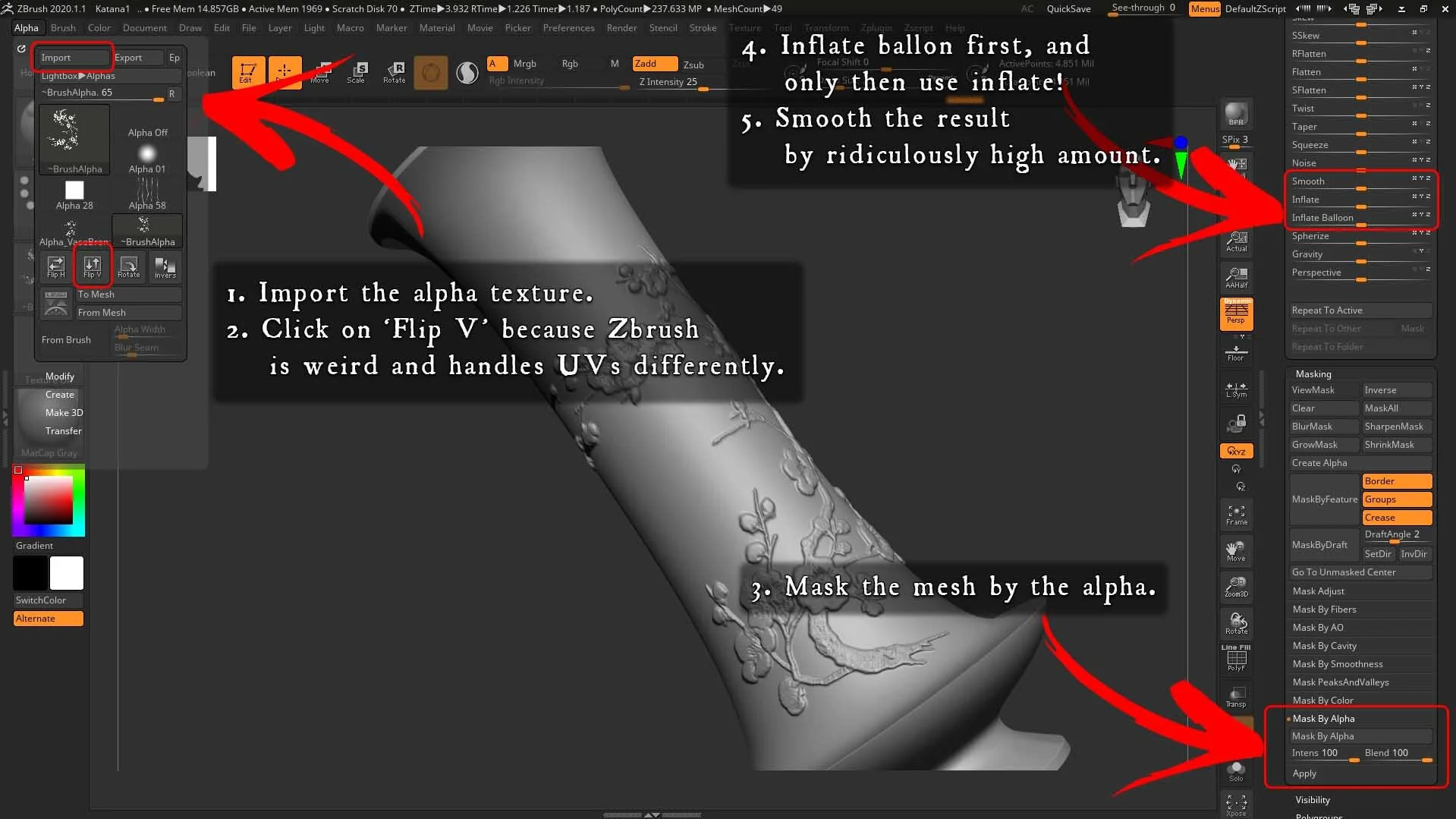
Mask by Alpha and Inflate in ZBrush
Why Is Every Prop Of Hero Quality When Most Artists Recommend The 70/30 Rule?
I’ve heard about this ‘rule’ before, but I personally think that this cannot be applied in all cases. From my standpoint it completely depends on the scene itself. When I first looked at the concept art, I immediately realised that the scene is going to be really prop heavy. This is an antiques shop, a store with the purpose to sell intriguing old artifacts. Those things should look majestic! They needed to have such visual appeal that is a feast for the eyes of the viewers. They had to look good enough so that they cannot only grab the attention to those who are walking on the street and accidentally peek into the shop, but also to captivate them, make them walk in and take a look.
However I assume that artists set this rule because they want to focus on what’s in the focal point and also because there’s usually no time to give so much attention to everything. Although in my case, there is a ton of objects you can see from a close angle. Whenever I placed an asset in the scene, which I didn’t care about a lot, it always broke the image and the immersion.
In addition to that, I used the already created assets in the background too, I didn’t create more props for that purpose. However, you’re not going notice that at first glance because I tried not to place the same objects in both the foreground and the background of the same shot. Therefore it might seem that I was taking a lot of care of the things which are not intended to be on the forefront, but that’s not the case. And frankly saying, according to the feedback I’ve been receiving, these intricate features are those things that people love the most about this scene. It’s interesting to viewers when they can spot a tiny detail somewhere where they wouldn’t expect it to be. Exploring the images can feel like an adventure, like looking for Easter eggs.

Shogun Helmet Compared to the Reference
As for time itself, I’ve always found a way to be quick and efficient. Apart from 3 really complex and big props (the shogun helmet, the sword and the dragon statue) there was no asset which I spent more than a day on making. There were days when I managed to get 5 or 6 assets done from start to finish.
Also, the quality sometimes comes from the sharp textures themselves, which has absolutely nothing to do with how much time I spent on it and care I gave to the individual objects. Although the sharpness comes from having an efficient UV layout and not maps with high resolution (I don’t have a 4k map in the whole scene). On my furniture, for example, I always modelled and textured the top and one leg, and I just mirrored, duplicated and rotated the components, and that’s it! That way 2k textures looked like 4k.
A big thing in my defence however, is that I just really enjoyed making these assets! I love sculpting, and that is the most enjoyable part of the creation process to me. When I’m making those organic shapes is the real time when I truly feel that I’m making art, that I’m creating something. I’m crafting something with my own hands and only with connecting nodes or applying filters which the computer calculates and renders down. There were moments when I knew that I could make it quickly by using alphas, mirroring certain parts of the mesh, or other things like that. Although I’d rather take the time and make it myself, just for having fun! The sword and the shogun helmets are good examples of this: I wanted to replicate the same ornamental shapes what I saw in the reference, but I couldn’t find similar looking alphas. Was it a bit slower? Yes! But I enjoyed every second of it, and that made the asset more unique and made me care about it much more.
The last, and probably the most understandable explanation is that making those props gave me a ton of opportunities to learn. Besides showing my skills, this scene was also a learning process. I had to create shapes I’ve never done before and explore materials I’ve never translated into 3d. Overall I feel that I’ve made a gigantic leap from where I started out and where I am now in terms of my skillset. And after crafting so many assets, encountering and then solving countless problems, I can confidently take the risk on making anything really.

Sword Compared to the Reference
Motivation
I’ve had and ups and downs and I considered giving up on this project many times. I had a lot of struggles but I tried to soldier on because I had been sharing my progress with the Discord community since the very beginning, and leaving it completely would have felt like a huge fail in everyone’s eyes, and I didn’t want to get that impression.
Although there was one point where I fell into depression, and I was absolutely determined to abandon this shop. I feel that it was the culmination of many things that have happened to in the last few years: I had wasted 7 years of my life with studying something I didn’t enjoy, I had quit my job, I had sold my house, and I had been running out of money. I also spent almost every single second of the last two years of trying to learn the craft, which resulted in me not meeting my friends and family almost at all. At the same time however, all of them have been making progress in their lives (getting jobs, buying a car, getting married etc.), while I felt that I was just gradually losing everything.
The scene itself has also posed me a ton of challenges. Besides it being a really big project in itself, getting the composition done was my greatest battle. I spent countless hours on iteration and moving things around. I wanted to have a composition so that I could start making the props and materials. But without having props which I could place in the scene and play around with, I couldn’t settle the composition. And in this scene, simple grey boxes and cylinders weren’t enough. That’s how I got trapped in a vicious circle and I felt like I hit a dead end.
That is how the tension had been building up and weighting my shoulders, and it was really hard to be able to focus on my work and to stay inspired. All those things have put a combined pressure on me, which I felt I couldn’t hold. After ‘announcing’ that I was going to stop working on this project for good, I saw that people were trying to encourage me not to do so, because they wanted to see how it was going to turn out. I also got private messages from so many lovely people, and my friends and family tried to cheer me up too.
I tried to find my inner peace and get rid of the dark storm clouds which were shadowing my mind. After a few days, I opened up the project again and tried to think about how many amazing things could be achieved there. I managed to turn it around, and after working on it for a couple of weeks, it really started coming together. From that point I really enjoyed the process. That’s how I regained enthusiasm for life! If it wasn’t for the community, this project might have ended up in the garbage. So I’m going to be forever thankful for everyone who helped me get through this!
Maintaining High Quality and Detail
When you can get the base of an asset down that means that you understand what you’re doing. But when you nail the details too, that means that you also love what you’re doing. At least this is my opinion.
The way I see it is that things with less detail can look great too! An object with nice detail but lacking in the foundation (basic shape, colour, etc.)? Not really. However, your prop is going to look the best when everything’s there and when everything comes together.
From my perspective details are as essential as the base of an asset. Individual features are also part of an object, that’s what makes it convincing, that’s what gives it a story, and that’s what distinguishes a good artist from a great artist.
I believe that there’s no magic or big secret here. It seems to me that the most critical thing is observation. You can be the best in the world at every single tool, but until you have the ability to see what makes something look as it is, the result is not going to be authentic.
This is actually really hard to explain or summarise. Every single object, material or place has its own unique features. Let’s take this furniture as an example:

Table Compared to the Reference
The first thing I always observe is the shape and it was crafted. The former seems to be pretty simple in this case, but only at first glance! It needs to be analysed a bit further, because the key here is how it was put together. My first task was to identify the components and figure how the carpenter might has put it together in real life. After that’s done I modelled only these shapes:

Only These Parts of the Table Were Modelled
I transferred these guys into ZBrush and sculpted a bit of an edge wear. This step is crucial! Nothing has sharp edges in real life! There’s a certain level of wear or bevel on everything. This doesn’t take more 5-10 mins in ZBrush, and even though it might seems a subtle thing, it makes an immense difference when it’s all baked down to the low poly mesh. I cannot emphasise how much having a decent high poly actually matters. You can see it in the picture below:

Low-Poly and High-Poly Meshes
When I’m about to texture I also try to decipher what the real life object is made of. Again, it’s obvious that it’s wood but wood has countless different types. The grain itself can have almost countless variations. Furthermore, is that wood painted? If yes, how old the paint is? How shiny/reflective is it? Is it worn off anywhere? If yes, where and how? How old is the object? Is it dusty? Has the painting got darker in certain areas, especially in the cavities?
These are just a couple of example questions I ask myself, but this is what makes you a good observer and helps you out while texturing.
In this case for example, I applied the raw wood first, that’s the base here. The next layer was the painting and then came some dust. Interestingly enough, I’ve applied a raw wood as a topmost layer in Painter. I found that the best way to add the edge wear, which is super simple. The only thing you need is to throw the ‘fabric edge wear’ smart mask on it, add a fill layer to mask, set the blending mode to multiply and select a grunge map. If you’re not satisfied with the result, add another fill layer and do the same. And that’s it! Very easy and you’re done in a couple of minutes!
I used this method on all the furniture, and I cannot even estimate how much time it has saved me.
Creating The Books
My first idea was that I wanted to create the pages on my own. It seemed to be a fun idea at the beginning, however it turned out be much more difficult when I started working on it. It was really problematic to design the layout of the text, what I should actually write on the pages, making nice initials, images etc.

Book Asset
So, it happened all of a sudden that I stumbled upon images of very nice antique book pages when I was about to compose some Lorem Ipsum for the text. They looked so good and matched the style I was looking for. So I opened the images in Photoshop, masked the text by using the ‘Select – Colour range…’ feature and laying it down onto the UVs.
It seemed to be a bit of a cheating move however, so I made some changes. I tilted a few lines, rotated a whole paragraph by 90 degrees and changed the title to something that is related to the scene. That actually came after I found this image:

Arrowhead Image
I really liked the idea of having an object in the scene which is really old and broken, a true ancient relic. So I made this arrowhead in 3d and placed it next to the book. To add a bit more to the story of the scene, I manipulated this image so that it looked like a pencil drawing and placed it on the book’s page. This is the final result which I used as a mask in Substance Painter later on:

Alpha Created for the Page Detail on the Book
This meant that the shop owner has just recently got back from an excursion, and she found this artifact and looked it up in the book to find out more about it. It’s a tiny detail in the scene, but it can be a great moment for the viewer when noticing it.
Video Clips
The videos were the most spontaneous things that happened as I recall it. I was planning this whole scene to be almost completely static and I only wanted to have still shots. Nothing’s literally moving in the scene, apart from the dust particles and the animated incense smoke. Therefore, I only wanted to make a GIF showing that, but that’s it.
However on the publishing day of the scene, I woke up in the morning, looked at it and questioned: Do I know how to use sequencer? No. Have I ever recorded videos? No. Fair enough, let’s make one! I watched a quick tutorial on sequencer, started playing around with the cameras, recorded a few shot and edited them together in Techsmith Camtasia. It all happened in one day, and I also published the scene that night.
Video Clips Breakdown
This was a very random process because I had no idea what videos I wanted to record. I started out by looking at the still shots and tried to imagine what a subtle motion could do. The close shots I already had seemed to be perfect for this purpose. I grabbed the CineCamera actors and panned them very slowly while also adding a sliding movement. The only thing that needed to be done is to find both the starting and the ending point and set the camera accordingly. These two images represent the first and the last frames of probably my favourite short video:

First Frame

Last Frame
As we can see, the camera movement is very delicate and slow (it’s a 15 second long video), it only goes up a little bit and gets closer to the tiny dog figurine. The relatively slow motion emphasised the calm atmosphere of the scene. It starts out by having an empty space in the middle and noise on the sides. Even though this doesn’t change too much, that is more than enough! As the video progresses the dog becomes more and more the focal point. It is in the top right thirds during the whole time, the camera nearing it makes it even stronger.
An important thing I tried to keep in mind is that the whole video is more effective if the camera movement is slightly faster at the beginning and slows down later on, when the focal point gets clearer. On this one in particular, the camera almost halts at the end and it keeps the dog framed. This makes the entire thing more impactful and feel more cinematic, almost like a teaser trailer.
To achieve a really smooth camera movement I needed to smooth the curves in the editor. To achieve the best results I had to add another keyframe near the end. That gave me another point by I could control the curve and made it easier to slow the camera down at the end of the shot and to have it sit there for a bit.

Sequence Editor
Here you can see the result and how little motion the camera actually makes.

Camera In Motion
Substance Designer
Substance Designer is a tool which is not among my strong suits, I must admit! Regardless of that, I know what it’s capable of and there definitely were instances when this tool seemed to be the best choice.
The perfect example of this is the animated incense smoke.

Animated Incense Smoke
I really wanted to have this in my scene and I didn’t know how to approach it at first. I was thinking of painting it in Photoshop, but the issue of giving motion to it was still there. Then it dawned on me that there’s no other way but to figure out a procedural approach.

Incense Smoke Substance Designer Graph
It all started out with dropping a shape node there and narrowing and beveling it. Then I only needed to mask its top and bottom and the base was ready.

Creating the Base Shape
From there the only thing I did was to warp it a couple of times. This consisted of plugging both big and smaller shapes into the warp node. The former made big distortions, and the warp intensity had to be relatively high. Whereas the latter made smaller but more drastic alterations, so he intensity had be set to a much lower value.
I duplicated that part of the graph twice and blended them together. That gave the smoke a thread-like look, like it’s floating slowly apart as the smoke rises higher, which naturally happens.
When it was all put together I framed those nodes which I used for warping the shape. By playing around with their parameters, I got almost an infinite number of variations of the smoke.

Creating Variation

Progress GIF
Besides that, I used Designer on the assets on many occasions. What I can immediately recall is the books. I was brainstorming so much on how to model and texture the paper part of those. I managed to find a way eventually by using being procedural again.
I warped an anisotropic noise and blended it with a few grunge maps, and that’s it! The amount that can be adjusted within the anisotropic noise node controls the ‘thicknesses of the book’s pages.

Book Pages Substance Designer Graph
I used the texture in ZBrush to displace geometry, and then it was baked down onto the low poly mesh.

Texture From Substance Designer and Result After Baking The High-Poly From ZBrush
One more example could be the textures I used on all of the fabric meshes. By using the normal map I had, I made a generator that would give the albedo a worn fabric effect.

Cloth Maker Substance Designer Graph
The graph is not too complex, it’s all about extracting the curvature out of the normal map and blending it on top of the colour map, which could be literally anything I found on the web. Those oriental patterns are so delicate that I didn’t even try to replicate them myself. I know that the same can be achieved in Photoshop, but this way I could change the albedo and the parameters on the fly at any given moment. Here’s what it does:

Cloth Maker Results
Custom Materials
Yes, I made a handful of master materials inside the engine and then used only instances of those. My shaders are fairly simply in my opinion, I didn’t get too technical. This is what I used for the unique assets, for example:

Master Material for Unique Assets
I wanted to be able to iterate on the materials on the fly, so I made a few parameters. The two which I cannot live without are desaturate and colour brightness. Having the options to adjust those is crucial, because an asset that has just come out of Painter is not always going to look the same in the engine with a different lighting setup. It almost never does actually. And since I had quite a large number of props in the scene, and I wanted to maintain a consistent colour saturation and values, always going back to Painter to fine-tune the texture would have been cumbersome.
Adding a colour node as a parameter with a multiply node was also very useful. In many cases I slightly tinted the colour of the assets to make them more synced to each other.
Another feature I love is the ‘flatten normal’ node. I felt the normal was always a bit stronger in Unreal than in painter and I had to decrease its intensity very frequently. Another handy idea was to have the aforementioned features separately for the metallic and non-metallic surfaces. I did that by adding a lerp node and using the metallic channel as the lerp alpha.
This is another shader I made for objects made out of fabric, such as the tablecloth or the drapes:

Fabric Master Material
I didn’t need a metallic channel in this case, and since the AO is usually barely noticeable, I inserted the roughness map into the alpha of the Color texture. I know that the alpha channel is expansive, but here I managed to reduce the number of textures I had. Another thing that makes this material different from the previous one, besides making it tiling, is that I added detail normal and fuzzy shading on it. The former needed simply because there were instances when I also had a baked normal map, and the detail normal gave me the micro details of the fabric material (the tiny threads). Whereas the fuzzy shading made it look so much like a real textile. You can see what difference it makes:

Fuzzy Shader
The biggest shader graph I had was for the floor and the walls.

Floor and Walls Master Material
It might seem intimidating at first glance, but it really is simple. I set up 4 materials (which are carbon copies of each other and looked the same the first graph I showed) and connected them with ‘height lerp’ nodes. Using the vertex colours as the transition phases made it possible to vertex paint 4 variations of the floor: standard, darker and less rough, dusty, and slightly painted. Another important section of this node map is the UV setup.

UV Setup
I wanted to have the option to rotate and offset the UV’s open. They came in super handy when I was playing around with the direction of the wood planks on the floor. Offsetting is also quite fancy feature, which is capable of doing this:

Offsetting the UV’s
Experience Points and DiNusty Online Communities
The amount of feedback I’ve received from those communities is really hard to summarise. Whenever I needed any sort of help, being it technical, artistic or motivational, those amazing people were always there and helped me. Their support cannot even be measured and categorised.
I could come up with countless advice which made it possible for me to finish this scene. There was a point for example, where I was struggling really hard with the basic composition of the scene. Not too many assets were modelled and textured but they had their silhouettes and I applied basic UE shaders with a uniform colour which were close to the overall colour scheme of the objects. The place was super cluttered and felt a giant mess and Chris Radsby confirmed that the composition was weak and he did a quick colour grading and paintover. Sadly I don’t have that image anymore so I cannot show it. But he advised me to accentuate the counter area a bit more with lighting and gave me examples of how I should move the objects around to get a better overall image.
I must say one thing though: this is only one example and even though it helped me a lot, there were so many other people with a ton of advice that made this scene possible for me to build. Besides the countless technical and artistic advice, I’ve also got moral support, career advice, had nice and chilled chats about all sorts of topics and made new friends. So I could come up with an infinite number of examples when someone from the community gave me suggestions or shared ideas with me. I’m equally thankful to everyone for their support!

Inspiration
The main sources of inspiration for me have always been movies and video games. Their visual can light the fire inside me and the desire to start creating something. Whenever I see some nice visuals which are pleasures to the eye, I cannot help but want to make something like that.
Another big contributing factor is travelling. I had the chance to explore certain parts of the world while I was studying at university. Visiting new places not only provides you with vistas you have never seen before, but also offers you the chance for meeting new people. These two combined can give you endless moments when you see, hear or experience something that clicks. I can even hear the chime in my head, like when I receive a text on my phone.
It all really comes down to me seeing something I like, or experiencing something which evokes a feeling inside me that I can translate into visuals later on.
With this Antiques Shop scene, in particular, when I first saw the concept art I fell in love! I loved the mood of the image and I was also really intrigued by how many interesting objects are there. I loved that it opened up the opportunity to even inject a bit of fantasy into it. I also had a soft spot for exploring the Asian continent. I was not only intrigued by Chinese and Japanese architecture, but also their culture and their lifestyle. I have met Chinese and Japanese people and they all were so well balanced, calm and cheerful. This sort of spiritual equilibrium is something that really inspired me, what I wanted my scene to communicate.

Feedback
Before starting project I had purchased a mentorship program from Ryan Benno. It consisted of 10 sessions and I had the chance to decide when I wanted to use them. Although I had already used half of those when I started building this shop, the remaining 5 were extremely valuable in terms of feedback. Ryan is extremely talented and he was able to help with literally anything I needed. I didn’t only receive critiques on the artistic and the technical sides of things, but I also got my questions about the industry answered. His experience and expertise were major sources of feedback. And I genuinely loved that he wasn’t always telling me right immediately what to do, but he rather tried to teach me how to master a way of thinking by which I can solve the issues myself. Of course, whenever I had hit a wall, he helped out with his tips. So, I owe him another big thank you!
The other main source of feedback for me was the DiNusty and the Experience Points Discord communities. Nowadays it’s almost impossible to separate them to be honest because they’re both equally great if you ask me. Whenever I was seeking advice however, I first tried to solve issues on my own. I’m convinced that one shouldn’t immediately ask for help whenever something unexpected comes up. I do believe that trying to solve a problem is key!
I’m not saying to shy away from asking for help. What I’m trying to get to is that I always tried to show something that could be critiqued, and I always disclosed what feedback I was specifically looking for. It’s important to state what your goal is, what you wanted to achieve with your work, so that it’d be easier for others to give more valuable feedback.

Another important thing on this subject is that I try to filter the feedback in terms of how valuable that is. Earlier, my problem was that I took all advice granted and tried to implement those in my work. I only later on realised that those criticism hold the most wisdom which are actionable. There were feedbacks which were too generic and not really specific. I can’t really come up with an example here but my point is that I always asked back what they meant exactly, or how they would have approached the problem. This doesn’t mean that I want a solution right away. What I wanted to say is that if I can see the way of thinking of that person who points out a particular issue, that’s something I can use and move on.
After all, I’m still really amazed by how helpful the Discord communities are. I’m not exaggerating when I say that I’ve never met this high number of nice people in one place in my life. Whatever sort of feedback I was looking for, I always received more than what I needed.
Advice
One thing I can confidently encourage every to do, is never stop chasing their dreams! Everyone has at least one, and everyone knows what that is. But only dreaming is not enough! We need to be able to make sometimes really hard decisions and take actions.
My dream is to constantly become a better artist and to work on a AAA project I’m really passionate about with a great team one day. I’m still not there, but I haven’t given it up, and I never will! Relentless dedication and believing in yourself are the key agents in turning your dreams to reality!

Future
I recently started as a Junior Asset Artist at Guerrilla even though the future is always uncertain. But one thing is for sure: I’m going to produce art! I already have many ideas for my next projects. There’s a lot of things I want to learn and a ton of styles/themes I want to explore. I’m very much gravitated towards the fantasy genre, but I’ve never done anything like that. Perhaps the next scene is going to be in that realm!
Outro
If you made it this far that means that you took the time to read all my ramblings! I’m very thankful and I hope that I could have provided you with a few things which you might find value in! If liked what you read, you can always check out my Artstation and LinkedIn, where I’m posting everything new that I feel worth sharing. Bye!