
SUNNY MARKET ENTRANCE - CAPTURING THE VISUAL STYLE
Jasmin stops by EXP for a second time and details how she created this beautiful sunny market. From breaking down the concept to sculpting and her texturing process, all of the steps are covered as well as how she expanded some areas of the scene to make it feel lived in. Jasmin’s approach on stylized art is some of the best and learning how she achieves these results is worth a morning read.
The Project
I initially focused on Hand-painted works when I got into 3D and continued to do so in the past years. Over time, I liked to challenge myself and introduced new workflows into my project to improve them. This time, I wanted to tackle something with a PBR workflow to get more comfortable with the Pipeline. I also wanted to see how I can incorporate my passion for painted textures and dreamy sceneries to another technical approach. My knowledge and experience from creating hand-painted props and environments benefited me in many ways with my Sunny Market Project!

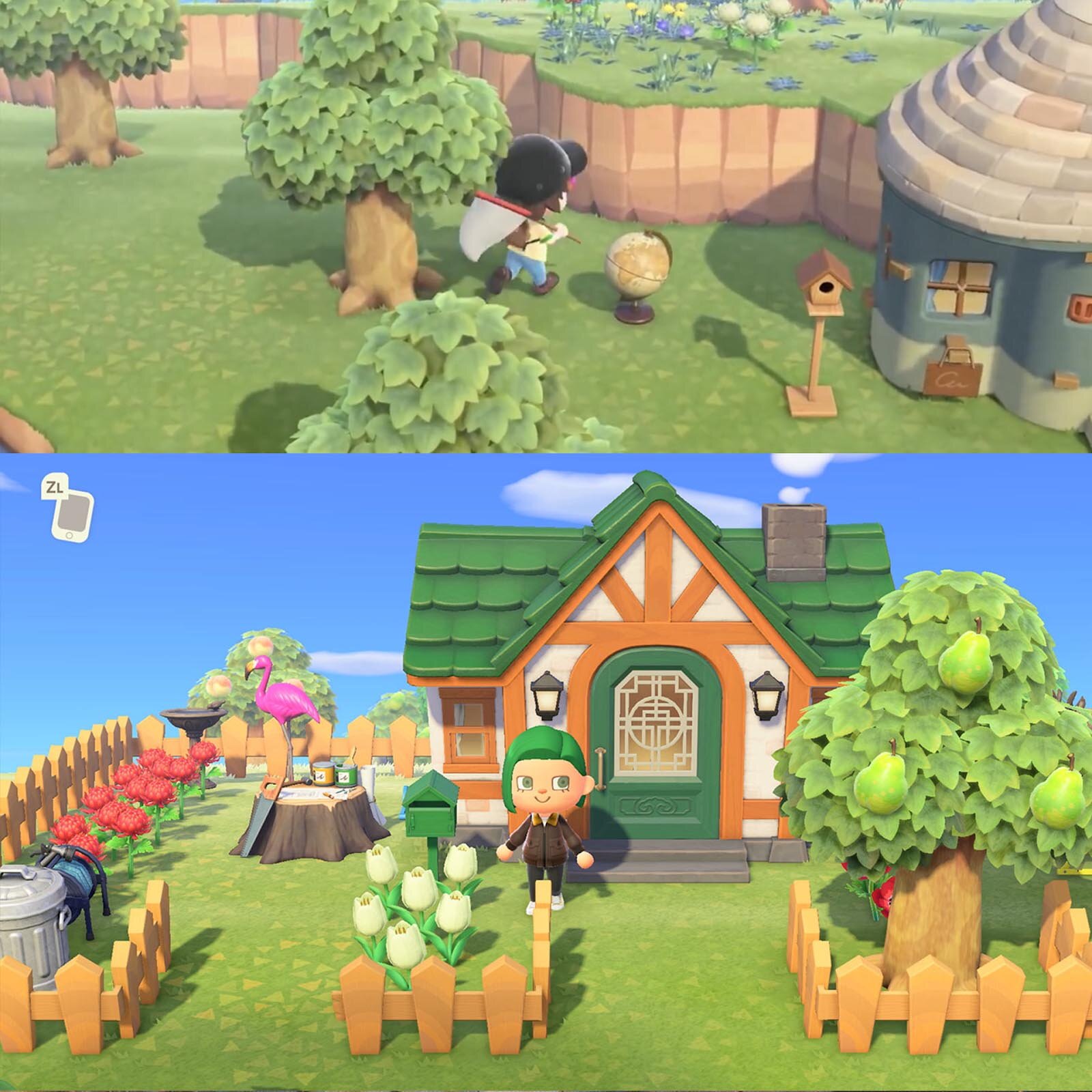
When I saw Hyunsu Cha s beautiful concept, I was instantly drawn to it and felt like it could perfectly fit inside a Ghibli movie. I tried to pinpoint what it reminded me of and I realised it reminded me of the markets in Howl’s moving castle with all it’s timber framed buildings and the little market streets. The recent Animal Crossing with it’s new PBR approach has also been very influential to me in the past months (probably because I’ve been playing it for over 500 Hours counting).
The texturing style is very clean yet detailed, making it always exciting to inspect the props closer. In terms of PBR, I also admire the environments in Overwatch, always wanting to try something similar in style myself. But one of my main sources for inspirations has always been my hometown and surroundings. Growing up in Germany, I have an affinity for timber framed buildings, castles and lush forests that I frequently visit.

Spirited Away and Howl’s Moving Castle
Animal Crossing New Horizons
Feedback
Usually I seek feedback on Art-related discords or from other fellow artist friends. I feel very fortunate to have the opportunity to hit them up whenever I need some advice or if I feel stuck at a certain point, especially when working on a project for months. With this project, I’ve been a lot more private. I initially wanted to take this as an opportunity to learn Substance Designer and Painter and focus less on the final outcome. I expected this project to end up being shelved since I did not feel experienced enough to execute it to its fullest potential with my knowledge of the Substance Suite.
To my surprise, I learned a lot while working on it at my own pace without the pressure of creating a “portfolio piece”. During this, I received a lot of feedback and mentoring from Ryan Pocock, who guided me through Substance Designer. Seeing him using Substance for a long time to create stylized textures inspired me to get serious about the program and see if I’d enjoy this approach too. Having someone actively helping you with any questions you have, especially when not being well versed with everything the software has to offer, really speeds up the learning curve. I am very grateful to have had this guidance on my side for this. Plus, it feels good sometimes to try something new and unfamiliar. Maybe the outcome won’t look as great as the things you create with familiar tools, but I strongly believe that staying inside your comfort zone for too long creates some sort of barrier for learning new things. Not everything you make has to be the groundbreaking piece that changes everything.
Concept & Model
When working from a concept, it’s not always possible to stay 100% true to it, especially when the model is meant to be viewable from different angles and positions. If the intention of the 3D piece is to be a one to one replica of the concept, it will most likely look great from that one angle and beauty shot. I personally decided that for this piece, I would like to be able to show it up close and immerse the viewer into the market.
Once I started to assemble the modular parts of the market building, I quickly realised that some of the proportions needed adjustments in 3D. This applied mostly to the round building on the left. I tried to adapt the flared bottom shape and made it wider. In 3D it didn’t seem to have the same appeal as the concept unfortunately. Whenever I realise that something doesn’t work well inside 3D, I try to focus more on what I can do with it to improve it and not get too fixated on the concept art.

Hyunsu Cha’s concept vs. My 3D interpretation
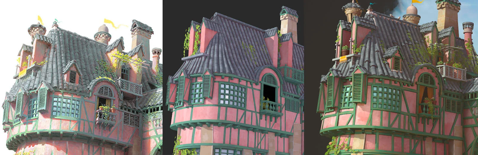
Concept - Trying to adapt it - Final Version
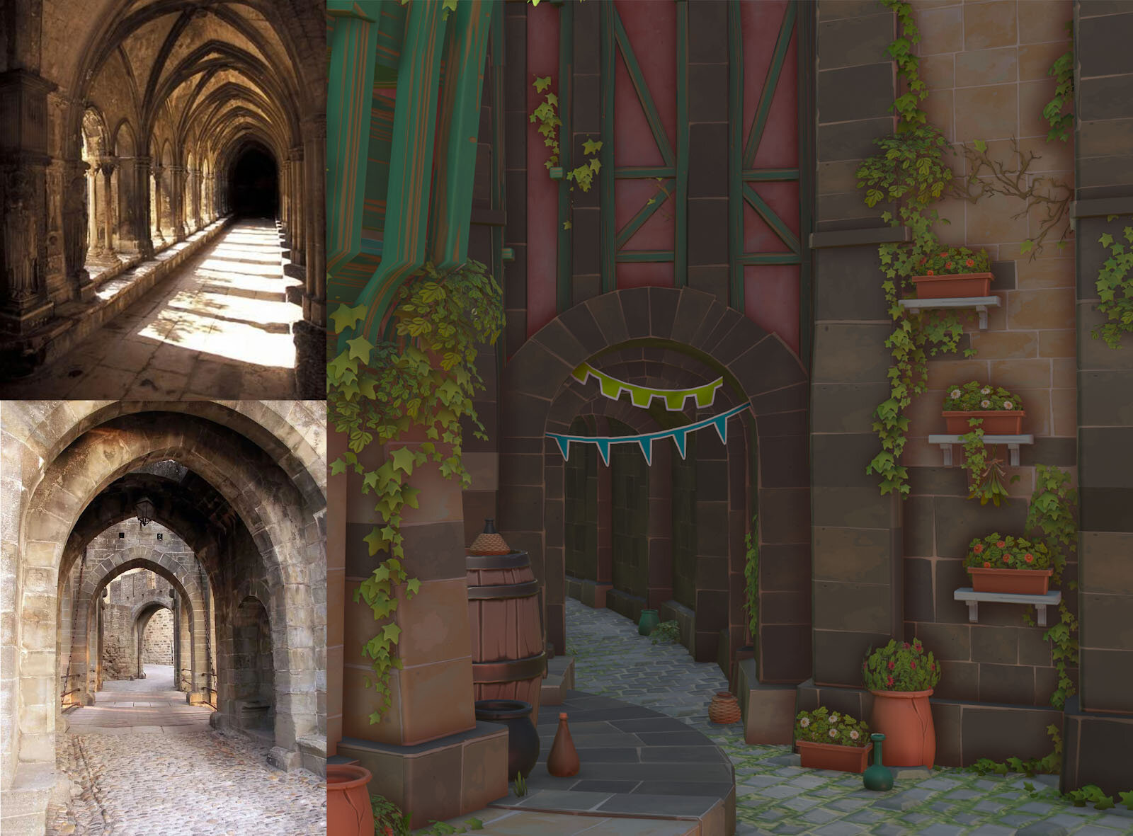
Back Alley behind the Archway
I was almost done with the market, when I sent a render of it to one of my friends for feedback. What stood out the most was the area behind the Ornament. It felt very empty and disconnected to the whole market, almost as if something was unfinished or missing. At first, I wanted to add the sky background to the archway too. Once doing so, it became apparent that the bright background made the focal point of the scene get completely lost, which was the Ornament. It had to be darker behind it to make the silhouette and colors stand out.
I looked into medieval archways and realized that a lot of them have little alleys behind them. I picked the arch I created for the right side of the market and colored it into a darker stone material. With this, I built the continuation of the main archway. I tried to keep that part in line with the overall architectural style and reused all of the existing props without the need to make any new assets.

Shops
Another aspect I had to develop beyond the concept was the insides of the shops. Until the last stretch of the project, I kept the insides dark without any actual rooms. It didn’t appear very believable though, especially after I added a lot of details to the outside of the fruit market. For that, I reused all the existing props and placed them inside too.
The sewing shop on the other hand, required a unique prop set to compensate for the lack of items showcased outside of it. I ended up making a couple of fabric rolls, thread rolls and hanging fabrics. Other than that, I made little wall-mounted shelves for storing the thread rolls. The rest was a matter of cluttering the insides with existing assets, which is my favorite part of building an environment!

Sewing Shop Props


Modular Kits
I started by looking for pieces that are repetitively used all across the building. The concept showcased a great opportunity to make a modular kit. I created a set of wooden beams, concrete walls and roofs, with which I could easily construct the market. Then I moved onto the smaller additions such as the windows, blinds, towers, doors and the smaller wooden beams.
Most of the parts stayed similar to the initial block outs I made, besides some shape adjustments, especially towards the end. Mid-way through the project, I decided to change the way I approached the timber framing. At first, the wooden beams of the timber framed parts were inset and a lot thinner, following the concept closely. After modelling and assembling all the wall pieces I realized quickly that it doesn’t look very appealing in 3D and is straying away from my goal to align the visual quality with Overwatch.
After researching more into timber framed houses, I realized that it’s also very common to have wooden beams stick out of the structure. I also looked at the Eichenwalde Map and really liked the chunkiness of the houses with the wooden beams. I scraped my old Modular pieces and built a new system which actually made it a lot easier to build everything. For this, I created a set of wooden beams with a simple bevel on them and custom normals. The Weighted Normals modifier in Blender helped with that.


Capturing Overwatch’s Artstyle
Since one of my visual inspirations was the way Overwatch approached PBR, I used it as reference for several aspects. The proportions with Overwatch Architecture is pretty accurate to real buildings, which was the case with Hyunsu Cha’s concept too. Therefore I felt like it would be a good place to look for their way of approaching materials and lighting.
Wood
I faced the most challenges when creating the green wood. On my second pass for it, I took a lot of inspiration from the Havana and Busan Maps. The green wood in those environments had exactly the amount of detail I wanted to achieve. They are vibrant and instantly recognizable as wood while being very subtle. I tried to apply that to my wood by toning down the noisiness and improving the wood scratches by revealing the natural wood color instead of making them look simply green.

Lighting, Rendering, Presentation
I rendered the scene inside Marmoset due to how quick it is possible to set up materials and lighting. I started doing so from the start once I had some of the main structures modelled out. It’s important to check the model and the textures early on in-engine, since the lighting has a huge impact on them. Lighting can make or break an environment.
At first, I wanted to achieve a similar lighting to the concept, however I realised quickly that the whole pastel-esque colour palette of the concept wouldn’t work well with the textures I created. I kept the pastel shades, however they gave them a bit more saturation and contrast. This is required for lighting that does the same. I moved away from the Concept and looked for inspiration elsewhere. My main references here were the Havana and Busan Map in Overwatch again. The warm sunlight matched with the colourful architecture was exactly what I wanted to aim for.

Havana Map in Overwatch

Old and Final Lighting set up
The biggest breakthrough was achieved when I realized that I was relying on Global Illumination too much. It started to obscure the way the Ambient Occlusion was being generated, which resulted in a lot of the timber framing on the building wouldn't have any AO around them. It also influenced the colours of the materials, making them a lot more saturated and vibrant than they actually were. Once I turned off the GI and started building the lighting from scratch, I ended up with a much cleaner set up.
From the start, I used one red-ish light to emulate the warm shadows and one directional light with a slight yellow tint. Those two lights were adjusted several times until I reached a balance between the two. I also added a custom Skybox, which showed a sunny day with a little overcast set on a lush field. After I decided to add a small background, I realised that the overall lighting was a lot darker than I thought. Having that natural sky background made it very apparent how dark the shadows were. Increasing the lighting of the Skybox and adding a very faint fog generator did the trick in the end. To add some highlights to specific parts of the market, I put several Omni and spot lights around the window areas or the walls. The shadows on those were also turned off.
The Clouds
For the little sky cutout, I was excited to paint something after not doing so for most of the project. I drew it inside Photoshop with brushes that have a watercolor texture, mixed with a simple soft brush. The sky went through several iterations, where I tried to see what colors would fit with the already established color palette. Some of them were either too saturated or cloudy. I wanted it to reflect the slight overcast but still sunny lighting that the skybox emulated. The values of the blue in the sky are the same hue but lighter in value.
The texture was applied on a halved sphere, which I tapered and scaled to fit nicely in the bigger empty space between the two market buildings. I found that a smaller and more rounded sky worked the best, giving a sense of continuation but not taking too much space and attention in the overall composition.
What I am especially happy with is the transition of the sky into the background. The airy feel on the edges was supposed to add to the illustrative feel of the whole piece.

Textures & Visual Consistency
I tried to establish a common approach with all of my textures to keep consistency. The benchmark for most of the materials was set with the plaster. With that material, I managed to merge my interest for hand-painting with Substance Designer, which I continued to do throughout the project. My main reference for this was the red plaster in Spirited Away. I wanted to give it a painted feeling while keeping the overall details to what is necessary, since it’s the most used material besides wood.
I started by creating a simple base for the Plaster Material by picking a Grunge Map with a dripping paint look to it. By blending Fractal Sum Base and a Clouds texture into it, I got more noise into the texture and also lowered the contrast. I then blended it with another Grunge Map for additional variation and a simple rose-tinted gradient to add color. I also included “fake” brushstrokes which I generated by following Vincent Derozier’s breakdown of his Stylized Designer Materials.

Now that I had a good base, I started to paint on top of it. I lowered the contrast by evening out the values and emphasized the horizontal cracks inside the plaster to give it a more worn out feel.
Going back into Designer, I put the painted Albedo into a Directional Warp with a Tile Generator plugged into its intensity. This warped the horizontal cracks I drew by hand vertically to create the illusion of dripping plaster/paint that dried up in the process of applying to the wall. To simplify and sharpen the added brush strokes, I used a Mosaic Color Node with Clouds. This Node really helped to get closer to the Ghibli-esque painting style with bigger shapes and less noisy textures.

70/30 Rule
The main materials used in the scene were plaster, wood, tiles and bricks. Once I created all of those, syncing them up to have the same amount of detail and harmonizing colors to each other, I moved onto creating the small props. It always helps to work from big to small details, a universal rule which I apply to planning, modeling, composition and texturing.
This whole scene was very dependent on the clutter to make it more believable. However, there had to be rest areas too. These were ensured by the market walls and roof. Their lack of micro details give the viewer appreciation for the areas that have exactly that. The goal was to balance between empty and cluttered areas.
While I reused the wood material (recolored) for the boxes across the market, I was excited to uniquely texture the other props, including the food ones. I first started by sculpting everything inside Zbrush keeping the High poly versions very clean with minimal sculpting involved. I only used Hpolish and the Orbs Cracks Brushes to create the little cuts and imperfections on the vegetables and plants with a universal clay polish at the end. The key was to give it enough detail to be recognizable as those objects on a small and bigger scale/viewpoint.
I textured everything inside Substance Painter and Designer (For the flowers and leaves). I mainly made use of top to bottom gradients, mask editors for adding curvature details to the edges and some very slight hand painting into the Base Color Map. I assembled the bushes, fruit batches and bouquets of flowers inside Blender.


Ornaments
I was excited and to an extent intimidated to approach the ornaments in this piece, since it was my first time modeling a complex filigree shape. What helped was studying old baroque designs and stone carvings on buildings from around that time. I also remembered seeing a lot of metal signs in my hometown too which can be found on old timber framed pubs or shops. Those signs would indicate the guild or occupation the shop inherited. I especially followed these references for the sewing and fruits shop.
I also looked at the elaborate Ornament Kitbash Pack by Jonas Ronnegard to see how others tackle modularity with these ornaments, since it didn’t seem very efficient to me to uniquely model every single part. After some experimentation, I decided to use one of the baroque designs as a base to model the leaf shapes. I also interpreted the shape above the flower ornament as a shell, which was found very frequently on the top half of these designs to emphasize the “royal” feel of these. For the flower I also tried to incorporate the circular shapes on the shell and leaf ornaments to keep it consistent.
Once I had these shapes, I started to arrange them in a way that the golden flower was nicely framed. I grabbed the same leaf arrangement and scaled it down (+ lowered the polycount) for the two little market shop signs. For the texturing, I used Substance Painter where I made a shiny, stylized gold material and an oxidized version of it. With the mask editor I managed to create a slight oxidation effect on the gold parts, especially on the flower. The rest I painted in.


Advice & Outlook
I’m planning to create tutorials based on my learnings, work on more personal environment projects with the new skills I acquired and graduate from university!
Outro
I am glad that I decided to create a PBR project as my first environment piece of 2020. Even though this year is out of the ordinary, I feel motivated to continue pushing myself and focus on improving my skills. Creating cozy and inviting places help to keep my morals high. I want to make art pieces that make people want to visit or explore them, just as I want to be part of the worlds I get inspired by.
Thank you Experience Points for inviting me! I hope this little breakdown gave a better understanding of my project. For any further questions, you can find me here: