
BIRTHDAY BOY - NOSTALGIA CELEBRATION IN UE4
This scene was one of 2019’s highlights and hits all of the nostalgia feels. In this beautiful breakdown, Derk Elshof covers a variety of topics ranging from asset creation, storytelling with sound, composition, colour palettes, interior design tricks and much more. Don’t wait for your birthday to read this piece!
Introduction
Hi, my name is Derk Elshof and I’m a Material / Environment Artist from the Netherlands. I recently graduated in 3D Arts at the HKU University of Arts in Utrecht, The Netherlands.
For the last two years I have been dabbling between creating characters, assets and practising my texturing skills. I wasn't quite sure what I wanted to pursue as a career so it was about time to combine the things I learnt and create an environment.

In my last months of university I was really stressed out, I wanted to lose some steam by playing a game and relax for a moment. I bought Life is Strange 2 a few months back but never took the time to start up the game and play it. I enjoyed the previous games of Life is Strange with some very nice environmental storytelling. So I was looking forward to seeing what DONTNOD Entertainment came up with this time.
I started up the game and played it for around 15 minutes before entering the room of the protagonist. It felt like being in my own room but with different stuff laying around. I was so impressed by their lighting, set dressing and the use of colour that I decided to take screenshots and jump back to 3D.
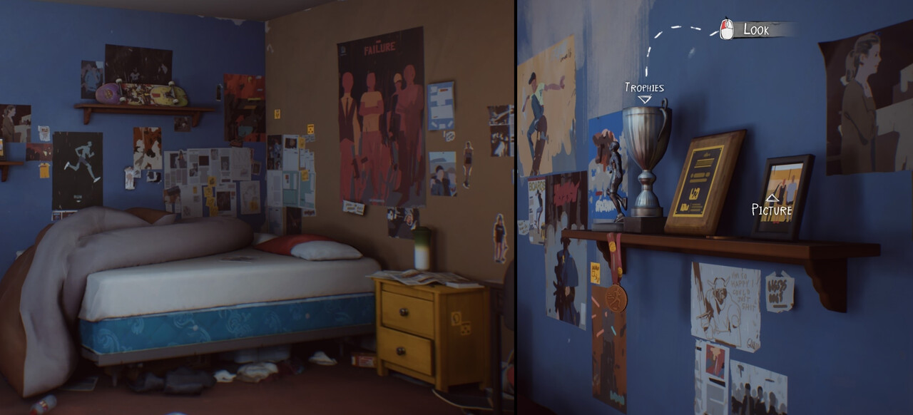
I really loved the placement of the props in the bedroom scene of Life is Strange 2 so I wanted to create something similar but with stuff I liked when I was a teenager. I was really into movies, games and comic books when I was 16 years old so I started collecting reference that I really liked during those years.
Collecting References

When I started the environment I collected some stuff I could find in the attic where my parents kept a lot of movies, comic books and other things from my childhood. I brought most of it towards my desk as reference for the set dressing, modelling and texturing of the scene.

Early reference images I collected when making the first block out.
Blockout and Choosing of Colours
I had a lot of fun working on the blockout and texturing the environment. I wanted it to be as readable as possible while feeling like a lived-in place with a lot of colours. I knew from the start I wanted to display a room of someone who is into art, games and movies with magazine covers and collected posters on the wall. Creating a room I would love to be in.
I will go over some of the decisions I made when making this bedroom. The biggest part being the choosing of colours and working on the lighting.

Here is a small preview on the overall process of the environment from blockout to the final result.

I knew I wanted my main composition being someone who just opened the door and looked through the room. My initial goal was to invoke as much storytelling as possible in a single frame, showcasing the person's interest, what stuff he did the night before and what he does for a living. I didn’t want to mimic my main source of inspiration 1:1 so I changed the layout of the room with different dimensions, placement of the door and windows.
I modelled the block out in Maya and did a few different lighting setups with the use of Arnold renderer. I started with little to no experience in Unreal so doing this phase in Maya really gave me a head start. I eventually picked up the basics of Unreal when implementing the models and creating some simple shaders.
I had some ideas of stuff I wanted to include in my environment, so after finishing my blockout I started writing down movies and games I played or watched during the years before 2010. A few of the titles were recommended by friends and I didn’t want to disappoint them.
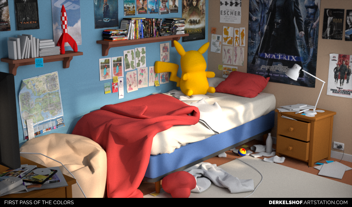
After planning out the posters on the wall I started picking colors for the walls and furniture. I didn’t want the nightstand, shelves and drawers to stand out so I kept them as simple as possible. The teddy bear had to be the main focus of the composition but when getting the colours down the stuffed animal tended to lose its interest while being the same colour as the nightstand. I replaced it for a Pikachu which made gave the room a nice tertiary colour palette, making the yellow mouse the centre of attention.
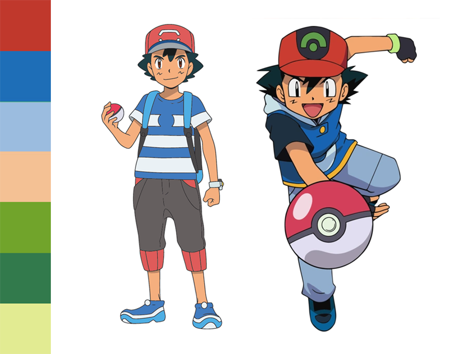
During my years in primary school I played a lot of Pokemon. Since I changed the teddy bear to a Pikachu I thought it would be a nice idea to try to use the colour scheme of Ash Ketchum from Pallet Town throughout the whole room.
I used blue as a filler colour for stuff that wasn’t that important to the environmental storytelling and used red for stuff I wanted the viewer to take more notice of like Tin Tin’s rocket, the comic books, Mario’s Mushroom and the ball from Pixar.

The whole room being blue made it very difficult for the bed to stand out from the walls. At first I had some doubts about whether to go for red or blue but after getting some other opinions on the matter from The DiNusty Empire I changed it back to red, bringing back some of those complementary colours.
Reviewing My Own Work
You can really get stuck if you are working on the same thing for a long time. When reviewing your own work I like to jump into Photoshop and check my compositions and values in greyscale, black and white, blurred out and with a rotated and flipped canvas. This usually brings up new things and makes it clear on what things I have to change.
The most important thing would be the focus points a viewer would have when seeing the environment for the very first time. Making sure the story elements are prominent in the scene and noticeable enough will help tremendously to get the story across that you had in mind.

When first reviewing the environment I numbered the things I want the viewer to take notice of. I first looked at the Pikachu and then saw the Mushroom second, after that I tended to look through other things in the environment and then back to Pikachu.
Having both the characters in the same vertical axis made it a bit unpleasant to look at in my opinion. I thought it would be a cool idea to have the mushroom watch television, which essentially made the left part of the composition a lot more noticeable when the viewer enters the room.

A preview of what it would look like when someone enters the room before and after making changes.

A preview of what it would look like when someone enters the room before and after making changes.

When previewing it in greyscale it was really noticeable that some parts created too much contrast for things that weren’t that important in the scene, for instance the posters on the wall. Switching up the Batman poster with Inglorious Bastards made them fade more into the wall. Other simple things like making the nightstand and bed sheets brighter was necessary to make them stand out more from the background. Creating rest as much as you can in such a busy room is essential and by making these changes I noticed a big difference.

When previewing the environment in black and white, it made it even more clear on things I had to change that I have seen in the greyscale as well. The silhouettes in the scene become a lot more noticeable. To break up those dark values in the scene I added patterns on the bed sheets and wall.
Using Interior Design Tricks

As a student in the Netherlands it can be hard to find a big room for a nice price. When you have a small room you want to make sure you have a nice atmosphere and make it feel as spacious as possible since you’ll be spending a lot of time studying in that place. Using some decoration tricks in my environment definitely helped me to figure out some of the colours and set the mood I wanted to create.
Stripes - In interior design the use of stripes can create an optical illusion to make things appear higher, wider or smaller than they actually are. This is also depending on the thickness of the stripes, the orientation and the size of the room.
Colours - The use of blue and grey colours on the walls will make the rest of the room stand out more. This puts more focus on the furniture instead of the room itself. You generally want to stick with 2 primary colours and definitely not go over 3, otherwise it would make the room feel messy and optically smaller.
There are a lot more things you can apply to make an environment feel bigger. It’s something a lot of households do, both in a bad or good way. Being aware of these design choices can really help you out when creating a variety of different rooms, from small to big and from clean to chaotic.
Asset Creation in Marvelous Designer
During University I dabbled a lot between environment art and creating characters. A little over a year ago I picked up Marvelous Designer to get better at creating clothing for characters. When I decided to focus my time on environment art I really wanted to explore another side of Marvelous Designer and create a bunch of different assets.

By looking up some tutorials I knew that creating the cushions and bedsheets wouldn’t really be a problem so I decided to give myself a bit of a challenge. I wanted to create some stuffed animals and decided to go for Mario’s Mushroom and Pikachu.

As an adult I love to see ugly looking plushes but as a kid it must be heartbreaking to end up with an ugly version of your favourite Nintendo character. As seen in the screenshots it was nowhere near its original design. By tweaking the pattern and the material properties I eventually had something acceptable.

Adding the party elements such as the balloons, party garlands, confetti and the bag of chips was something I did in the last phase of the environment. At some point I really wanted to spice up the room with new story elements and do more explorations in Marvelous Designer.

Figuring out the patterns and how to sew those together was definitely the most challenging part of the program for me. For someone with no background in sewing it can take a little longer to get things right but once you do it’s just really satisfying seeing the balloons inflate and come to life.
To make the balloons inflate I fiddled around with the pressure setting and changed the gravity to 0 (Preferences → Simulation Properties). Once I got my high-poly mesh from Marvelous Designer I made some slight changes in ZBrush and baked all the details on a low-poly model I retopologized using Maya.

Stuff like confetti and balloons are really easy to make in Marvelous Designer. You layout all the patterns and let the gravity do most of the work. I ended up with a few clusters of confetti and used them as foliage in Unreal Engine.

As a kid my parents always hung up party garlands in the living room which really made it feel like a birthday. It’s definitely something you wouldn’t do for yourself. I had a hard time hanging those up for reference purposes. I couldn’t find many spots to tie the rope or place them between books. I ended up using tape but that couldn’t hold the weight and the garlands fell to the ground. I ended up using that in my own environment.
Stay Consistent
To stay consistent in the texturing throughout the whole environment I reuse the setups I made in Substance Designer and Painter as much as possible.

All the paper, magazines, posters and wallpaper are using the same setup I created in Substance Designer. With exposing a couple of parameters it’s quite easy to create the desired look for each prop.

This is the setup I use for all the paper. Just a couple of nodes to create a crumpled paper effect without feeling too procedurally made. I found this one of the most fun materials to do since there is a lot of room for trial and error and still come up with good looking results. You might come up with some new cool techniques to create rocks or some other kind of surface.


I did the same for the clothing and mattress. For these textures I created some height maps with Marvelous Designer and used those in Substance Designer. You can really quickly create a bunch of different variation by changing the sewing and material settings in Marvelous Designer.
Since creating the mushroom didn’t go so well for me in Marvelous Designer I didn’t feel comfortable enough to do the same for Pikachu. I decided to go and head back to ZBrush and sculpt him instead to save myself some time.

In ZBrush I started out with ZSpheres and went on sculpting Pikachu using standard brushes, mainly the Move Topological and ClayBuildup along with some smoothing. Since my Pikachu reference was really fluffy, most of the details wouldn’t be that noticeable in the end result. I did some detailing using the Standard, DamStandard and Inflate brush along with some alphas I created in Marvelous Designer to get all of the folds in there.
I didn’t really know how I wanted to texture the Pikachu yet so I tried creating some fur in ZBrush and baking those details. Since my results were not that great I decided to head into Substance Designer. I exported my normal and displacement to Designer and started generating some fur based on these maps.

The fur generator was very simple to setup.The direction of the fur is controlled by the maps I exported from ZBrush, being the normal and displacement map and using that as a vector displacement within the shape splatter node. I ended up using this generator for Mario’s Mushroom and the rug as well.

A preview on the base color of the pikachu in Substance Designer with different fur amounts of fur.

A screenshot of the base color. For most things I added a fair amount of dust on the top of surfaces and in the crevices of objects. As a student you might get lazy cleaning your own room once in a while so adding dust in both the color and roughness can create some nice variation to make it feel more believable.

Here is a preview of the roughness. Some values are really pushed more then you will see in real life but sometimes this is really necessary to make things pop in engine.
Challenges
Invoking so much storytelling in a single frame was definitely the most challenging thing when it came to creating this environment. At some point I didn’t know when to stop with bringing in new assets. When working with nostalgic stuff you can endlessly keep adding things but at some point you just have to call it a day and move on to the things that really matter.
Telling a story is what it is all about. There are so many factors that come into play when bringing an environment to life. The key aspects being the set dressing, lighting, choosing the right camera lens, composition, colour grading and most importantly sound.
https://www.youtube.com/watch?v=l5Z7hvu67sU
A quote from David Lynch
“Films are 50 percent visual and 50 percent sound. Sometimes sound even overplays the visual.”
Visual storytelling can be quite tough to do from a single composition, especially with no characters being in the scene. To get a story across the use of sound can play a big role to make something as simple as a hallway feel immersive. Storytelling goes further than just the things you see only see on screen.

Going that extra step is definitely worth it to create the mood you set out to do. Presentation is everything, this counts for showcasing materials and props just as much as in creating an environment. Playing around with lighting, adding animation and sound can greatly enhance the viewers experience. So if you can do a bit of sound design or add some music it would almost be a shame not to ;)
I hope you found this article remotely interesting and I thank you for reading this ;)