
STYLISED vs Realistic - Creating Hell from Concept
Phil Stoltz has a talent for working in both stylised and realistic art styles. Explore this breakdown to learn how he built his Hell Scene, the choices he made on composition and colour and why he works on stylised and realistic scenes. He also shares some great advice on presenting your portfolio and advice for landing your first job.
Introduction
Hey everyone! My name is Phil Stoltz and I’m currently working at Turtle Rock Studios in sunny Orange County, California as a 3D Environment Artist working on a game called Back For Blood. This will be my third industry job, before I worked at Airship Syndicate on a game called Darksiders Genesis and Amazon Game Studios where I primarily worked on a game called New World. I come from a small town called Redmond, Oregon. I knew I wanted to work on video games since I was 15 and eventually I made my way into the Art Institute of Portland to study concept design and illustration. After taking a few 3D classes I realised how much fun 3D was and never looked back. I knew doing 3D art was for me. I landed my first job at Amazon Games a few weeks before graduating college. The first games I ever played were a combination of Goldeneye, Mario Kart 64 and Pokemon Red.


Art Style - Realistic and Stylised - Common Mistakes
When it comes to picking a style I really don’t have a preference. Each one has their own challenges associated with them. For example, most of the stylised scenes I’ve done, I’m paying more attention to pushing the silhouette (still important for realistic scenes). And it’s more about exaggerating the lighting by pushing the colour and intensity, big shape reads and making sure the texture work isn’t too noisy or distracting. Also it’s about selling the “feeling” or “emotion” of the scene.
Whereas if I’m doing a realistic scene or prop, the goal is to make sure it looks as if it belongs in the real world. So I try to push accuracy of shapes and believable material reads. You want the players to feel like they are experiencing a real environment. It’s easy to break player immersion if there’s something in the scene that feels wonky or doesn’t feel real. I have found that in some cases, an object may be modelled very accurately to realism but looks off in a game engine (sometimes the edges may be too sharp or surfaces may appear flat). That’s why it’s good to push bevels on edges or for example, make bolts and screws a little bit larger so players can actually see them. Same goes with realistic materials, a lot of times I tend to make objects glossier than they really are because it can quickly grab a players attention.

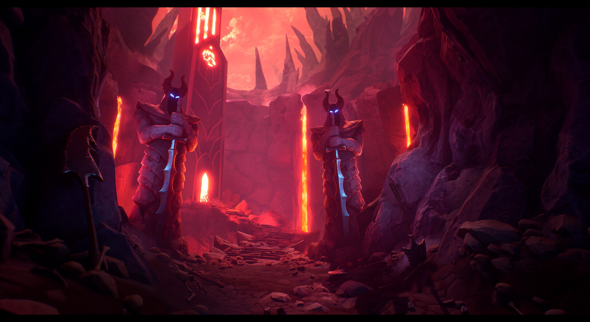
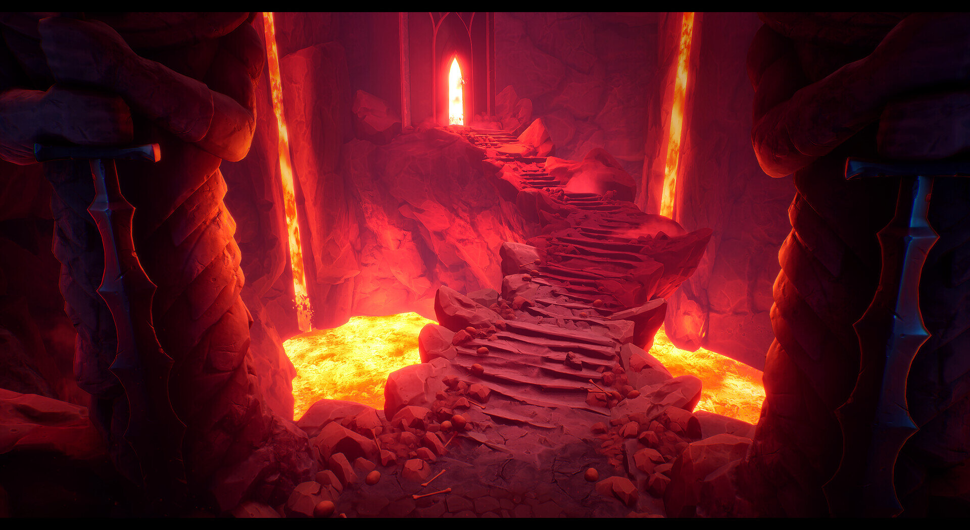
Hell Scene - Inspiration
Typically before I start an environment piece I will go searching all over Artstation, Pinterest, DeviantArt and many other sites to get inspiration from other artists. Sometimes the inspiration comes from playing a video game or watching a movie. Occasionally I’ll open some of the architecture books I have laying around as well and look at some real world reference. I also like to have some sort of goal for the environment as well; in this case it was to push the lighting as much as I could to really try telling a story and setting the mood. I also knew I wanted more of an organic scene, so outdoors with rock. For the Hell Scene I chose the particular concept because it had a really fun composition and it provided me a way to try and push the stylised lighting in 3D.

Concept
Composition and Set up

Composition Analysis
For the main shot I wanted to try and match as closely as I could to the concept shot. It felt very intimidating with the skewed perspective and the statues staring down at you. However I also wanted to try and establish more of a foreground to open up the shot a bit more to give the player a ‘starting point’.
Each of the important elements I wanted to add into the scene are highlighted. I wanted to add them not just because they were a part of the concept but because they each tell their own important story. They add the feeling of danger and tell the player that this is not a safe place to be.

Lighting Setup
Notice how the diffuse colours of the textures in the scene are a more neutral colour? If the assets had a lot of colour as well, the actual light colour would clash with the textures and make the overall colour seem blown out. I like to think of this technique as painting your scene with lights!

Realistic vs Stylized
Working from Concept - Making it Your Own
I think one of the best advantages from working from a concept is that you have a lot of visual information to work from. And depending on how detailed it is, you may be able to generate a good prop list from the concept and do a call out sheet of assets you want to build. You’re also getting lighting information, composition, texture detail, mood, story, and the list goes on. Now the downside to working strictly from concept is that you are pretty much locked into that image and composition. It might be difficult in some cases to create or model what’s not being shown in the concept. For instance, whatever is behind the camera. For me, I tried to match my environment to the concept as closely as I could. Some of the liberties I took were deciding on what certain materials would be.
Workflow - Stylized and Realistic
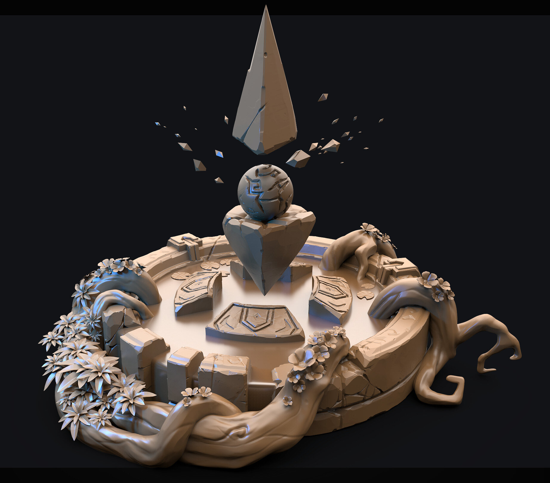
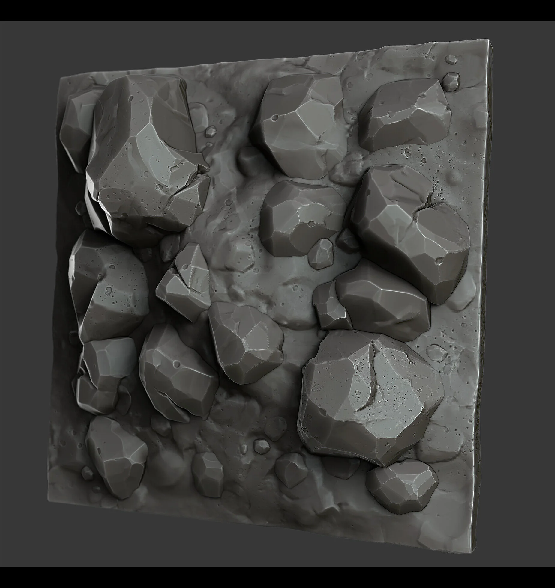
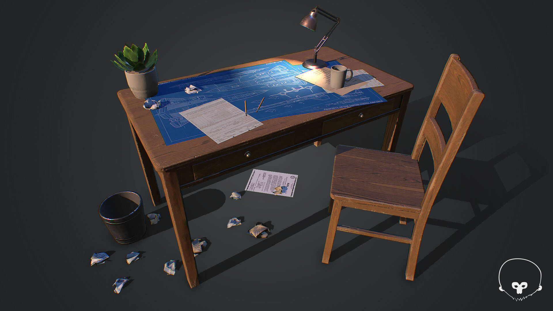
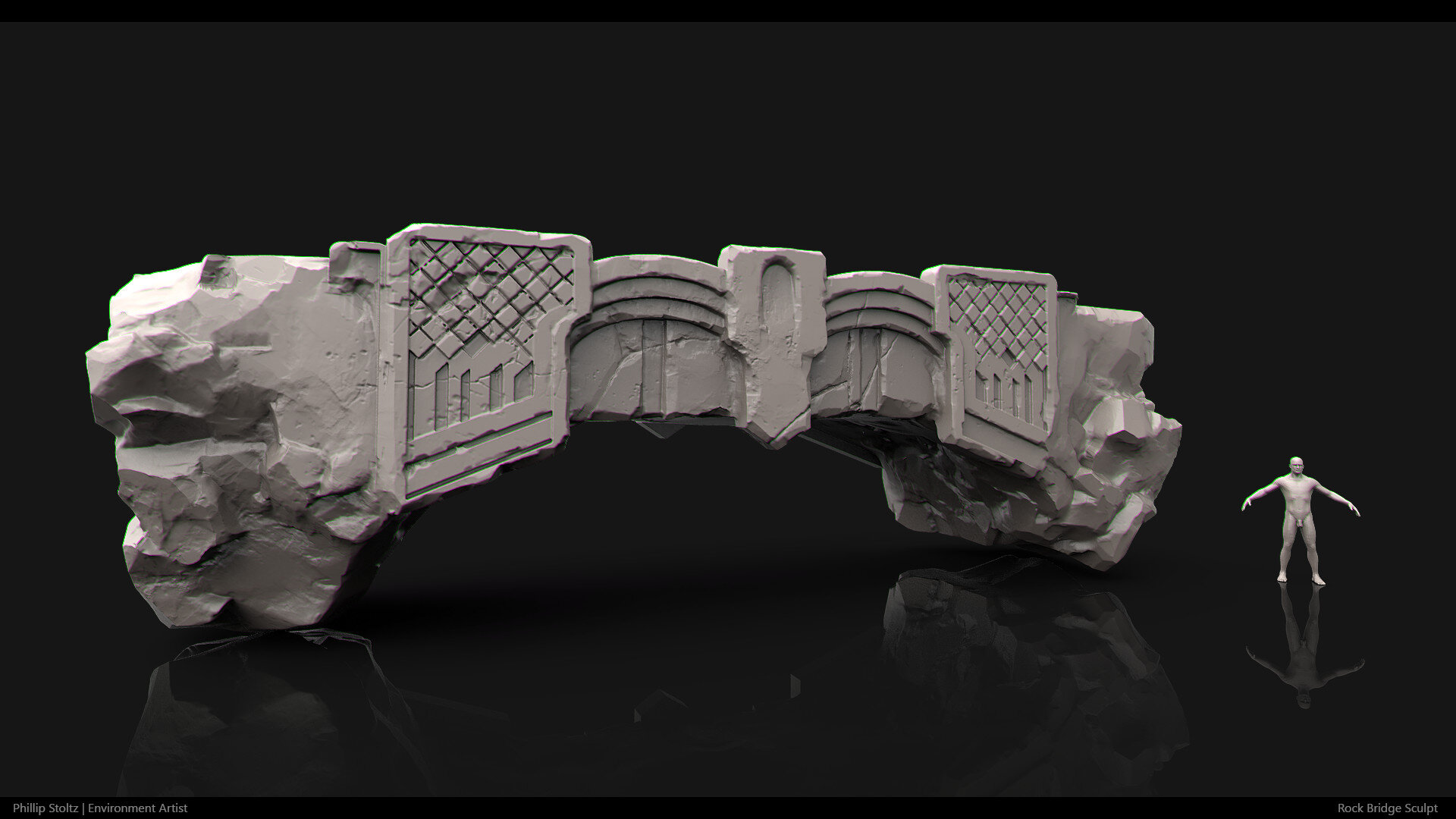
There really isn’t too much that changes as far as my approach goes. It really depends on the asset. A lot of the time when I’m doing stylised work, usually everything gets sculpted. So typically, I like to do my blockout work in Maya and quickly get it into ZBrush just because I enjoy sculpting quite a bit.


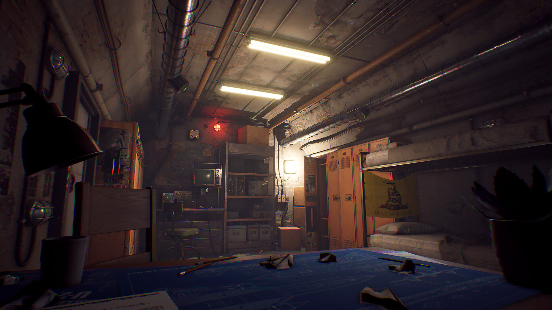
For example, in the bunker scene I did there really wasn’t much sculpting so I primarily stayed in Maya for the asset creation portion of it. The biggest difference to me is how far I push the models silhouette.

Colour Palette and Theory
I’m definitely a big fan of using colour in my levels to tell a story or evoke some sort of emotion. A lot of reds and oranges really give off the sense of danger and fear. But the palette that I chose really stemmed from the concept; that was definitely my starting point anyway. You’ll notice that the renders of the finished level are much more saturated than the concept and that was done intentionally. I wanted to push the colour past the point which I felt comfortable. I thought it’d be a fun test to do something out of my normal comfort zone. It was important to keep good colour harmony throughout the scene. I stuck with using an analogous colour scheme (group of three colours that are next to each other on the colour wheel) so in this case; Orange, Red, Violet.
In my experience if you don’t adhere to a specific colour scheme, you’ll find that your painting, level, textures, etc will appear to be really noisy and unbalanced and something about the image will not look correct.

Workflow Tips
I’ve found that speed modeling/sculpting are good ways to improve speed for sure. To practice that, find an object to model or sculpt and give yourself a narrow time frame. Don’t worry about being efficient, focus on speed. Set your goal to model or sculpt the object as fast and as accurately as you can within the short timeframe you gave yourself. Aside from practicing becoming quicker, speed will come naturally as you progress throughout your career. As you learn new techniques and spend more time on the craft you will get faster (especially when you have deadlines to meet).
Seeking Feedback
When It comes to feedback, I always find it useful to seek out those who are highly knowledgeable and very talented at what they do. So I turned to Lydia Zanotti, Environment Artist at Riot Games for feedback. She is currently working on stylised games and so I thought it’d be great to get her input on my level.
When I ask for feedback I start by asking if there’s anything glaringly obvious that stands out to them that looks off or feels weird. It’s really easy to get tunnel vision on your own work when you’re the only one who’s been staring at it for hours on end. Some great feedback I received was to pay more attention to the composition and framing of the scene; use the statues as framing elements to showcase the building in the back. Since that was where the player would be going.
Another great piece of feedback I got was simple and really effective and that was to make the eyes of the statues glow blue instead of red. Because the scene already had a lot red hues; having them be blue draws your eye right to them and forces the players to look at the statues face as you pass by them.

Career
Landing your First Job or Interview
My first piece of advice would be to never stop learning and working on your craft, whatever it may be. Some students think that because they graduated from school they can take it easy, when in fact they should be kicking it into high gear. Because now you’re not going up against other students to find work, you are competing with everyone else that’s currently in the industry.
Apply at multiple studios; not just a few, that’ll increase your chances of at least getting your work seen. Even if a studio isn’t offering junior level positions, apply for mid-level positions as well; you never know what a studio may be looking for. Another important piece of advice is don’t be a stranger, reach out to other industry professionals and ask them to look at your work and critique it. Almost all of my fellow industry friends are always willing to give feedback and advice and are happy to do it. And lastly, always work on your portfolio and stay up to date with current tools and software. The industry changes very quickly!
Portfolio Presentation Tips
Well first off I’d suggest using Artstation as your main platform for your portfolio. Most creative professionals are using it and the community is fantastic. This has been said over and over but only show off your best work. Quality over quantity is key. Also something that is really important, whether it’s an environment or prop, take the time to take high quality pretty renders. I see a lot of artists who spend a lot of time on their work and then sell it short because their renders weren’t given any thought.
I always suggest to look at how professional artists are rendering their scenes or props and see what’s working for them and take some notes on it that you could use and implement into your renders. And lastly, even though this may seem silly; your thumbnail is going to be the first thing people see on Artstation. So it’s definitely worth spending a little time composing a fun thumbnail of your work that will draw people’s attention to your work/portfolio.
Recreating Destiny 2’s Style
Typically, the first thing I notice when I look at concept art is the colour pallete, followed by shape language and then composition. Being a big fan of colour I like to dissect that by painting a colour palette and breaking it up into a percentage based on what colour groups my eyes are picking up the most.

Mars Concept Painting
From there I begin to look at the different elements in the scene and split them apart in 2 groups, man-made or vegetation/natural. I look at the different materials that are being used and study how they are interacting with light and shadow. Now, for my scene I really just wanted to capture the colour palette being used and the sort of gaseous feeling the planet gives off. You’ll notice that in the original concepts I did, the scene was looking a little boring, with the typical colours of Mars being brown and red. I eventually changed my direction and wanted to add more colour to the scene. That’s how I ended with the colour palette from Destiny 2!


Analysing a Studio’s Style
I think that’s very important to do. Every studio has a specific way of how they go about creating their particular style(s). A good example of this would be Blizzard. Overwatch looks very different compared to World of Warcraft. Considering the obvious, one is hand-painted and the other isn’t; two extremely different styles. But I think if you wanted to take it a step further than just dissecting a style, particularly for an environment artist wanting to work at a studio. Start asking questions like: how are they lighting this level and why that way? How are they dressing the level to tell a story? Look at the different animations going on, if there are any. Think in terms of gameplay as well, how does the environment relate to gameplay? When you start asking these types of questions, you’ll broaden your knowledge of how a studio develops their levels. I love going through games and taking a second to analyse an area to see how things might have been constructed, and then keep playing.
Applying for a Job - Do we need an Environment? Are assets enough?
It’s funny you should ask that because when I graduated college and landed my first environment job, I didn’t have a single environment piece in my portfolio. I truly count myself lucky in those regards. And I’ve been learning how to get better at environments ever since! However, I highly recommend that someone applying for an environment position have at least one solid environment in their portfolio. It doesn’t have to be this massive Skyrim world. It can be something as simple as a room. Assets and props are always good to but having an environment will show a potential employer your understanding of composing a scene, lighting, storytelling, environment modelling, set dressing, etc. So basically, an environment will show off more skill sets than if you just have props; that will make a candidate more desirable.

Portfolio Highlights and Common Mistakes
The first thing I notice in a good portfolio is that all the work is consistent. There’s no bad or questionable work in the artists portfolio. It doesn’t matter to me if it’s professional work or just personal work. It’s also easy to tell that in a good portfolio, the artist knows what they are doing and has a good understanding of basic, lighting composition, materials, and modelling skills. It’s also nice to see variety, multiple styles can always be a plus when looking at a portfolio.
Some things that kill a portfolio to me personally is when I see the same type of work over and over again, generic sci-fi hallways, fantasy taverns, etc. Don’t get me wrong, when done well those environments stand out. It’s just always nice to see environments that haven’t been done before. Something that can be a turn off in a portfolio is seeing work that was done using a tutorial. Those are great for learning new techniques but shouldn’t be used in a portfolio. It just shows that you know how to follow step by step processes and not really be creative on your own.
Advice and Tips
Practice, practice, practice! It’s what has been said over and over to me and it’s the only way to get better. And not just at art, in anything you do. The only way to get better is to keep working hard everyday. Don’t wait to get inspired to create art; if you see something you want to make or that looks cool, do it! And lastly, my favourite piece of advice to give is, don’t be a dick :) I was given this advice early on in school and how the industry is very small and everyone knows everyone. It’s all true, studio culture is very important and it’s important to have a positive attitude; even when times are tough in the studio. We are all here to make great games and have fun while we are doing it. It’s important to remember that at the end of the day.
Outro
Whether you are doing stylised or realistic work, the principles and foundations of art will always remain the same: balance, proportion, emphasis, variety, movement, rhythm, and harmony. Game art uses every single one of these principles so it’s important to always go back and remember these fundamentals of art. Remember to always set goals for yourself to hit; you may not know how to make that goal a reality but that’s okay; just work extremely hard towards that goal, day by day. Eventually you’ll make it happen!