Slate descent- creating an atmospheric cave using photoscans and procedural tools
In this article we explore how Tom Carter created his stunning system of caves, Slate Descent. Tom shows us how he used tools such as Houdini and photo scanning as well as technical breakdowns of the scene, what inspires him and his advice for students and Junior Artists.
Intro
I’m Tom Carter and I'm currently a Senior Environment Artist at Cloud Imperium Games. I initially got into 3D through making terrible Quake 1 maps and wider 3d scenes by playing around with some kind of 3d garden designer tool that came on a free CD, something I’ve been idly trying to track down for years. The first game I remember playing, that I knew the name of, was the very first Duke Nukem.

Composition
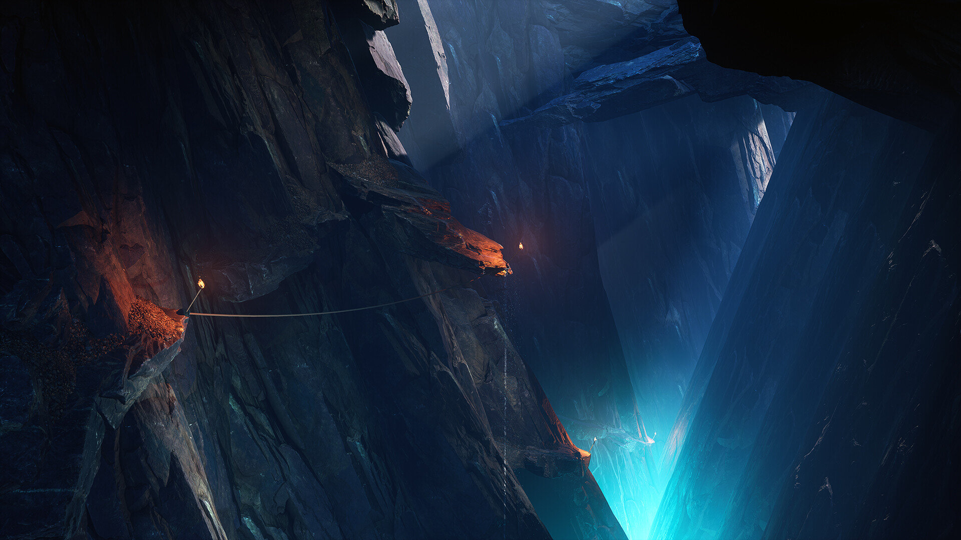
For the overall composition of the shots I wanted the viewer to feel as if they were journeying deeper and deeper into this huge cave system as they scrolled down through the images.
In the first image the viewer's eye is drawn down to the most extreme bottom right of the image and as the viewer scrolls down this viewpoint becomes less extreme before levelling out on the final image, the destination is reached, calm water stretches out before them. I experimented with switching between regular widescreen images with a fairly wide field of view to a much closer cropped square images with a narrower field of view, these were inspired from very early Victorian photos of rock climbing which all had this square, very closely cropped appearance which I wanted to emulate in some of the shots, these helped draw the viewer into the scene but also revealed details that would not necessarily have been visible with the larger scaled shots.
Paintover Analysis
Compositionally the shots follow the same rough form of a ‘V’ shape, the major forms are spaced out as far apart as possible before converging down to a single point to focus the viewer's eye. Sometimes this is flipped upside down or additional ‘V’ shapes are placed into the shot at different scales but all the shots follow this rule of converging points to draw interest.

Paintover
This image shows the major shapes always converging to single points, sometimes to the centre of the screen sometimes far off above and below the image.
Once this rule is setup and I’ve found my two dominant converging walls, I stick to the direction of these walls pretty strictly when placing my assets. Deviating from this rule for instance rotating a rock mesh away from the overall direction and against the ‘grain’ of the other rocks can look unnatural very quickly and can lead to a ‘popcorn’ look to the rock walls where individual rock meshes can be picked out breaking the illusion that the rock face is one consistent piece. For the pathways leading down I followed the same rule but this time I changed the axis to generally more of a horizontal direction zig-zagging left to right, I could be a bit looser with the placement but generally I pick a direction and stick with it.

Paintover
Lighting
The lighting was chosen to be purposefully, almost stereotypically ‘gamey’, using photogrammetry assets in the past, the lighting choices tended to be more grounded in reality and I gave myself less opportunities for experimentation.
So I wanted to move the lighting in more of a stylised punchy direction and to push myself to learn something new, not only improve my lighting skills but also to validate that the de-lighting and colour accuracy of the scanned assets was as good as i could get it and ensure there was no limitation with using a scanned asset over a traditionally made asset when going for more of a directed lighting style. Once I had my first completed scanned rock I tested it by using really extreme over the top lighting setups in Marmoset Toolbag.

Over The Top Lighting Setups In Marmoset Toolbag
Once I had started to build a library of assets, all of the pieces I had completed so far were brought into the same scene in Unreal and I started to make quick compositions and lighting setups to really stress both the scanned assets and the workflow for them but also the master material setup in Unreal, this allowed me to go back and refine the process if I found an area to be lacking.

Quick Compositions and Lighting Setups in Unreal Engine
This image shows some of the early tests I did, not only did this help me refine the workflows and improve the assets but also was an early indicator of the direction I wanted to go in. The main lighting source was a cold ethereal blue light that would pull the viewer through the images, first starting off in the bottom right of the images before flattening out into the centre of the images it would become a darker blue then becoming much whiter and washed out in the final images. This was to support my initial idea of the viewer journeying deeper and deeper into a cave system before reaching their destination.
This image shows the average colour of the shots getting progressively darker before becoming whiter in the final shot at the top.

For the ambient cold blue light that's prevalent throughout the shots I used an Exponential Height Fog with the Volumetric Fog ticked, changed the fog inscattering value to a blue tone over the default colour and raised the extinction scale and static lighting scattering intensity values. Combined with some very bright lights at the bottom and raising the indirect lighting amount value in the post process this give me a soft ambient blue value that allowed me to punctuate it with even more intense blue point lights to draw attention to certain points and islands of detail. I made sure that they did not affect the fog to avoid the lights appearing as orbs of light floating in the scene.

Scene Lighting
As an offset I used burning torches with a colour temperature of around 1900 for the flames, this helped to give a contrast to the lighting and helped to make the flaming torches a little more visible which was vital to help sell the scale as these were the only man made objects in the scene. These islands of light acted as breadcrumbs and helped to guide the viewers eye into the scene becoming smaller and smaller as they go deeper into the scene. For the master material for the rocks I had instanced sliders to raise the min and max roughness values of the assets masked by capturing the gloss mask of the scanned rocks changing these values helped to highlight the edges and silhouettes of the rocks further carving out a space for the lighting.

Scene Roughness Values
Even though I used the same assets in places altering the roughness values further helped to sell the forms I was going for in the scene. This approach helped to support the composition I had setup, with the dominant light generally in the centre of the two converging points being framed by the rock faces and the supporting flaming torches placed either side acting as islands of detail and helping to draw the viewer into the centre. I made heavy use of volumetric fog throughout the scenes, this helped to sell the scale of these huge caverns and defined the background and foreground elements. For example lowering the brightness in one space and relying on the volumetric fog to help simplify some of the meshes to silhouettes in the background, produced a cleaner easier to read image I found.
Colour
Once I was happy with the larger direction for the lighting and colour choices the quickest way to play with variations and to increase the quality of the shots was to take screenshots and bring them into Photoshop for editing and tweaking then use a lookup table in Unreal to bring those changes back into the engine and make further tweaks using a post process volume. I made several passes refining the lighting each time until I got something I was fairly happy with. In Photoshop I made most use of the colour lookup adjustment layers as well as tweaking the hue and saturation values and increasing the contrast to make the lighting more punchy.

Tweaking the Colour and Lighting With a Lookup Table
The image on the top is the initial lighting while the image at the bottom is the final image with the post processing changes and the LUT file applied. It's fairly subtle but all of the major lighting features are more visible and the image is less muddier than before.
Story
For the overall story of the scene I was inspired by looking at very early Victorian rock climbing photos particularly by Owen Glynne Jones. They all tended to have this very stark appearance with very early climbing equipment visible and I initially went in this direction, the rough idea being a series of black and white climbing photos presented in a kind of journal.

Early Victorian Rock Climbing Photos
But I quickly found the climbing equipment just become lost in the scene and piles of ropes aren't particularly interesting to look at without the context of a person next to it so I decided to push the scene in a more fantasy direction, which would give me more room for experimentation. The ethereal glow was inspired by Lord of the Rings shots that used this effect as an uplighting effect to frame and highlight evil and otherworldly locations particularly in places like Minas Morgul which used more of a greenish tint, I switched to a colder blue colour that became more and more of a neutral white in the last shots as I was concerned the coloured lighting would dominate and wanted the last shot to have an almost calming effect.
Houdini Workflow and Benefits
I’ve found the best workflows for creating anything in Houdini particularly when I'm trying to make something visual, is to first create a benchmark asset in another program. This is usually the program considered the strongest traditionally for the task or one you are most comfortable in.
This acts as a visual target, I note how long it took me and any major steps I went along the way and then I try and re-create those steps in Houdini, breaking it down into component steps that I can apply again and again on a variety of different meshes. Otherwise without doing this step I’ve found it's very easy to make something in Houdini that's insulated from what other programs can do, people generally won’t care if a system in Houdini produces something very quickly if it isn't as good as the benchmark program. Particularly with how top loaded creating the graphs can be - the biggest time sink is creating the graphs and systems to create a final mesh so a visual benchmark helps hugely in breaking this down and ensuring you are on the right track. The benefit of all this means once you have your system setup in Houdini, for example for large rock faces, you can very quickly produce a number of meshes that would take you much longer to create in a traditional program and even if you discover something that looks better or needs refining, re-processing the assets is much quicker than having to re-sculpt a number of rocks in ZBrush for example.
Planning Procedural Assets
The only completely procedural asset in the scene was the flaming torch, used as a human-scale element to help sell the sense of scale for the overall scene. Initially I had expected to make more human scale elements - ropes, brackets and other early pieces of climbing equipment and made a setup in Houdini that would allow me to create a number of these wooden and metal assets. I created a graph in Houdini that took a base low poly mesh, either created in Houdini or blocked out in Unreal. I could then tag elements of the mesh as either wood or metal and it would create high poly versions complete with ancient gnarled wood grain and aged metal and also bake in the cavity map into the verts for refining in Substance Designer. But quickly I found these become lost in the scene, so the torch with the flame was the only thing that was completed, this GIF shows the breakdown of the major steps in creating the wooden forms for the flaming torches.

Creating the Wooden Forms For the Flaming Torches
Below is a rough flowchart for the wood pieces visible in the GIF, a pretty simple graph that gave me what I wanted pretty quickly.

Flowchart For Creating the Wooden Pieces

Advice For Learning Houdini
I initially started to learn Houdini as I wanted to take advantage of the procedural modelling nature of the program. This is now commonplace in programs like Substance Designer for materials particularly for making organic surfaces which typically are variations of repeating fractal noise so I wanted to see if I could leverage it to do the same for meshes.

Organic Surfaces in Houdini
As Houdini is a pretty old program typically used in films and offline rendering there are a huge number of resources online and the focus now seems to be to switching to supporting game development through the gamedev / SideFX Labs Tools which I’ve found hugely helpful and a great way of learning as they allow you to open them up and breakdown what the graphs are doing. For video tutorials again there is a huge resource online, I’ve found the video series by Bubble Pins really good as she breaks down a series of topics clearly without immediately presenting a wall of unnecessary complexity.
Photo Scanning
As I was only using small rocks I had complete control over the setup for capturing them for photo scanning, so I could control the lighting and also do complete 360 degree closed scans of each rock for more variations, both of these are somewhat difficult to do, if not impossible in the field. I didn't do anything radically different when scanning the rocks, I used a lightbox with a turntable to rotate the rock 360 degrees on one axis then flipped them over and did the same for the other side and finally tried to capture a middle ground between the two sides in case I missed anything in the process. A Macbeth colour chart was used in combination with the RAW photos being processed in Lightroom to ensure the colours were correct. The photos were captured with my camera mounted to a tripod with the regular and polarized photos captured one after the other.

I placed linear polarising film over the lights that came with the lightbox set to a colour temperature of 5600k according to the manufacturer for approximate daylight colour temperatures in combination with a circular polarising filter on my camera rotated to the correct amount to produce the regular and polarised photos. I’ve now changed this approach to using a powerful ring light mounted on the camera with polarising film placed on top of that in combination with a circular polariser on the lens, with a camera frame from which I plan to attach a light weight fabric frame to block out any other non polarised lights. Not only is this in essence a portable lightbox which allows me to use it in the field but produces much cleaner results, I was getting errors from the cameras polarising lens being reflected back onto itself as a ring and minor polarisation issues which have now been much improved, this is an ongoing test and I hope to create something with it soon.

Once I had taken my regular and polarised photos for each side they were processed and masked as separate chunks. The photos for each chunk were aligned to a sparse cloud, then once they were all processed the separate chunks were aligned and merged together to one to produce a closed 360 degree sparse cloud that I could then produce the depth maps and the high poly asset.

I placed my regular and polarised photos for each scan in separate folders so I could enable and disable them if I was producing the regular or polarised texture, I found using the polarised photos much better for producing the high poly mesh as it gave much more equal levels of detail over the rock even in cracks and occluded places, typically if something is overly glossy or too dark in photogrammetry less detail can be extracted from it, so this worked well.

Hand Painted Rock Masks
I hand masked photos of the rock from the background, in the past I’ve tried automating this process using a chroma key in the background but found the amount of clean up I had to do was the same time as doing it completely manually, using the intelligent scissors in MetaShape to create the mask and holding CTRL to lock to a certain value makes this process very quick now. Additionally taking the regular and the polarised photos one after the other meant i could use the same mask for both sets of photos halving the amount of masking required.

The GIF shows the effect of increasing the effect of cross polarisation from nothing to almost complete cross polarisation, the ambient blue from the sky is removed and the actual colour of the rock is revealed. I wanted to take advantage of cross polarisation for capturing accurate albedo’s and also use that to capture the glossiness of the surfaces by comparing the regular photos to the cross polarised photos and extracting any differences, which I could use as a gloss mask.

This image shows at the bottom the regular shot, the middle with cross polarisation and then at the top i'm using a difference blend in Photoshop to extract the differences. I’ve somewhat exaggerated the effect to make it more visible, in the proper process this was done on the final unwrapped high poly meshes. A pass was done first on the non-polarised photos to create a texture in MetaShape then another on the polarised photos to make another texture making sure to re-use the UV’s so everything lines up then the gloss mask was created as part of a process in Substance Designer by subtracting one from the other as part of the high poly bake.

Substance Designer Graph
I used this graph for all the scans I did, it's fairly simple as I didn't want to layer in unnecessary details or drift too much from the original scan data. I used the ‘AO cancellation’ node very subtly to remove any indirect AO although this was minor, increased the levels slightly as the polarised scan had a habit of appearing ‘flat’ and blended in some very subtle fake camera ISO noise into random sections to make the asset appear very very subtly more noisy. Finally I used the ‘PBR safe color’ node to validate my values for the albedo.
The baked normal map was combined with the polarised baked albedo first colour equalised to remove any large repeating elements then run through a luminance highpass at a low value to crush the histogram then grayscaled and run through the normal node at a very low value and combined with the baked normal. Using the polarised map ensured the level of noise and grain was consistent throughout and I dint get spots of detail.
The gloss map was created by first levelling both the polarised and non-polarised albedo’s to maximum and subtracting one from the other to get the difference auto-levelling it and channel packing it in with the cavity, AO and height maps.

Texture Maps Breakdown
Choosing Assets For Photo Scanning
All of the rock pieces were sourced from a garden centre and the smaller gravel pieces were bought from modelling shops normally used for creating railroad dioramas. The main issue was selling the sense of scale - using scans of much smaller rocks in the place of a huge cliff faces meant I had to be careful with what I was scanning. Rocks are fairly fractal, the same shapes and forms occur again and again in differing sizes and they even break apart more or less the same, some types of rocks are better than others but generally they all follow this rule.
The biggest thing I found that would break the sense of scale was the natural buildup on the rocks and gravel that occurs in nature, soil is blown into any cracks collecting bugs, twigs and bits of leaves, moss forms over larger surfaces all of this combines to make convincing the viewer the rock is anything than the scale it is very difficult, everyone knows how large moss or leaves are so to convince the viewer it's much much larger would look strange.

This shot of a nearby river bank has multiple things which instantly betray scale to the viewer, something I wanted to avoid. So I found the best option was to source rocks from a place where very little of this natural ‘bedding in’ has occurred. The other reason I did this was I would know exactly what type of rock I was getting, I could choose variations and immediately get an idea for what would look best in the final scene and not be limited to what I could find in nature. For the piles of rock debris I bought a number of small pots of gravel around 100 to 200g from modelling shops typically used for making model railway dioramas, this had the benefit of the scale already being worked out, if the shop said it worked well as boulders for railway sidings at 1:64 scale I could use that as my measuring value.

Rocks Bought From a Modelling Shop
One limitation I found was many of the product photos on the websites tended to be poor quality and what looked like one colour could in reality be another when correctly photographed. One way around this I found was once one of the larger rock pieces were processed I could safely chip off parts of it and mix it in with the gravel and smaller pieces to push it more towards the correct overall hue for the main rock pieces so they sat more naturally together.

Scanned Rocks
Trying to adjust the colours in Photoshop I found just looked completely unnatural and the eye quickly picks out something looking ‘wrong’ so sticking to the original scan colour and sourcing rocks that were more colour appropriate for the overall scene produced much better results.

Assets Used With Toad as a Scale Reference
Unique Shaders
I created a single master material for all of the pieces with features I could toggle on and off and tweak depending on the asset via instanced materials. The main maps used were,
Albedo
Normal map
Roughness, Height, Ambient Occlusion and Cavity maps channel packed into a single texture
High passed detail diffuse map
Detail normal map
All of these maps including the detail maps were derived from the scan data of the rocks I collected, like the Substance graph I was conscious not to lose too much of the original scan data and to ‘muddy’ the result.

Master Material
The albedo is fed into the ‘DetailTexturing’ node before being fed into a ‘slopeMask’ that reads the baked normal map to lerp with one of the tileable gravel textures controlled with a slope angle param so it can appear at different angles, although this wasn't used much in the end. The result is then multiplied with a value and the baked AO map and again multiplied with the cavity map both from the channel packed texture to produce the final base colour output. The normal does much the same blended with a gravel tileable normal using the ‘SlopeMask’ run through the ‘DetailTexturing’ node where the detail normal texture is added before the red and green channels of the normal map are multiplied with a param and the blue channel appended back to control the normal intensity. Roughness high and low values are controlled by params going into a lerp and the roughness mask into the alpha, all in all pretty standard stuff.
What Do You Look For in a Junior Artist Portfolio?
An interest and real drive for creating art is vital and is what will propel people throughout their careers. A desire to learn a new program or technique and to constantly be thinking about art is really important and is always noticeable in portfolios over someone simply ticking off pieces as part of their Uni work modules.
For portfolios a Substance material is nice but a completed scene with it in is even better! A scene is always better than a single asset or material however well polished as it shows the person can not only create a series of themed assets, but successfully incorporate them into a scene and focus on lighting and general composition to tell a story. It doesn't have to be a completely closed scene, an inner corner with a floor, walls and a ceiling and a nice prop tells so much more and gives the artist a lot more to experiment and play with to and to stamp their own style on, without becoming swamped in work and shows they are thinking beyond just a single prop or tileable texture.
Common Mistakes in Student or Junior Artist Work
Don't rely too much on ready-made scratch and wear maps, generators and templates for your materials without going through and adding your own spin on them, it's completely fine to use all these things as a jumping off point to save a bit of time, but without adding those extra steps to make it your own it can come across as either lazy or the person didn't know what they were doing.
It's harsh, but when generally everyone in the industry is using the same filters and grunge maps as everyone else a collective memory forms and it becomes very easy to quickly notice these things so you want to do everything to try and mask these things as much as possible.

Differences Between a Regular Environment Artist and a Senior Environment Artist
An Environment Artist would typically work almost solely on the art side, working piece to piece to completion and be a solid artist overall, being able to lock into the art style and direction of an established scene quickly.
A Senior Environment Artist would be expected to create an entire suite of materials for a scene or an entire level working under direction from the Art Director that could then be used by others in the team, from blockout of shapes to final maps. Art slices, small pieces of a whole level, would also be created for a new environment exploring the direction of the overall style and mood again working with the Art Director to ensure the direction is correct so that others in the team can use it as a jumping off point. They would also be expected to help define, manage and delegate tasks and resources to others so things can be completed as quickly as possible and to troubleshoot any potential technical issues and to act as a guinea pig for any new tools when they come available.
Where Junior Artists Fit in the Production Pipeline
A Junior Environment Artist would typically work on smaller pieces within a scene such as doorways and small modular elements that would typically be handed to them blocked out for detailing using a pre-existing library of materials. This helps them learn the art style and direction of the title but also to understand any technical considerations to take into account, they can also provide feedback to the artists creating the material sets, sometimes problems can occur without it being extensively tested throughout a scene so it's always vital to get this feedback.
Good Traits For Junior and Mid-Level Artists
Being able to work independently and to be driven and interested in what they do is always nice, not being afraid to ask questions is important too you can’t be expected to know or remember absolutely everything so there is no harm in asking your peers around you to improve and to get better as an artist.
Key Skills You Look For and Wish You Had Learnt When Starting Out?
Really understanding shape and form in a three-dimensional space and being able to make a space look interesting purely without any materials is something I wish I had focused more on when starting. Taking a relatively simple space with no materials and lighting it in a way to sell mood and atmosphere and not to get bogged down in unnecessary fussy details.

If You Had to Start Again Where Would You Focus Your Time and What Skills Would You Want to Learn?
I would have definitely have focused more on lighting and exploring shapes and forms instead of going super detailed and noodley with details a common problem for most people I’ve found. Just because you can do something doesn't mean you should, having the confidence to strip back detail for eye rest and to enhance the pieces that do have detail is a vital skill and is something I had to learn quite quickly, this goes for individual materials all the way up to entire scenes.
Managing Stress
Personally I find managing stress involves getting away from the computer and any screens going on walks and enjoying nature and understanding when to switch off. There are very few jobs you are expected to ‘take home with you’ most are 9 to 5 and then you go home, so sometimes it's important to completely detach from it for a bit and to come back refreshed
Inspiration
I typically find inspiration from photography sites like Flickr, there are thousands of photos of abandoned places, weird factories or Japanese quarries for example and you can quickly build up a collection of things pretty quickly. I also really like looking at physical models that people have. I use PureRef to quickly create a themed collage I can add and remove images as i'm working on something instead of flicking through individual images.
I also have a fairly decent collection of art books I like looking through, I try and avoid looking too much at places Artstation for ideas for a new project as I personally find it too easy to follow exactly what somebody else has already done all of the creativity and thought gets taken out, for getting inspired by the the time, detail and expertise someone has put into something sites like that are vital though.

Seeking Feedback
The main place I seek feedback is with my work peers, I usually just ask one or two people as it sometimes can become the offline equivalent of posting on forums or Facebook groups where everyone has a different opinion even contradicting what the last person said and it can be hard deciding where to go from there - even when the feedback taken individually is good, so limiting feedback is very important i’ve found to keep a clear direction of what to do next.
I also ask my family as while they don’t have the technical knowledge they do have art backgrounds so it's good to hear feedback focused purely on the art without getting locked into any technical limitations.
Advice
Whenever I make a new scene or environment I always try to make sure I'm learning something new, it could be a new technique or workflow or an entirely new program so something is always fresh and I’m not just doing the same things over and over again. I find this helps keep my interest when making a scene and lets me build up my knowledge base.
Future Projects
I’m currently balancing continuing to learn Houdini creating a larger scene with that and building a portable camera rig that can capture polarised photos for better quality photogrammetry, so I'm hoping to create some scenes from those and continue learning into the future.