
Memories Of War
In this article we’re joined by Doru Bogdan as we delve into Memories of War, a vintage wartime project with a heavy focus on realism. Doru covers topics such as bringing life to a scene with storytelling, using lighting and colour palettes to create artistic direction, replicating real life references as well as his top hard surface modelling, baking and texturing practices.
Intro
Hello! My name is Doru Bogdan. I’m a Senior Weapons Artist at Wardog Studios from Romania.
My journey into 3D started a long time ago, probably around 2005 when a school colleague gave me a bootleg CD of 3ds Max 5. This quickly became an on and off hobby of mine for years. I would study any tutorial I could get my hands on online at the time (unlike today tutorials were very hard to come by and very short, usually in image formats). Also, around that time I was heavily into games and when playing one of my favourite games ever (Gothic 1) the idea of working in games as a 3D artist first popped into my head. It took a lot of time and study to find a way into the industry as a self-taught artist, but the accomplishment was very satisfying.
Composition
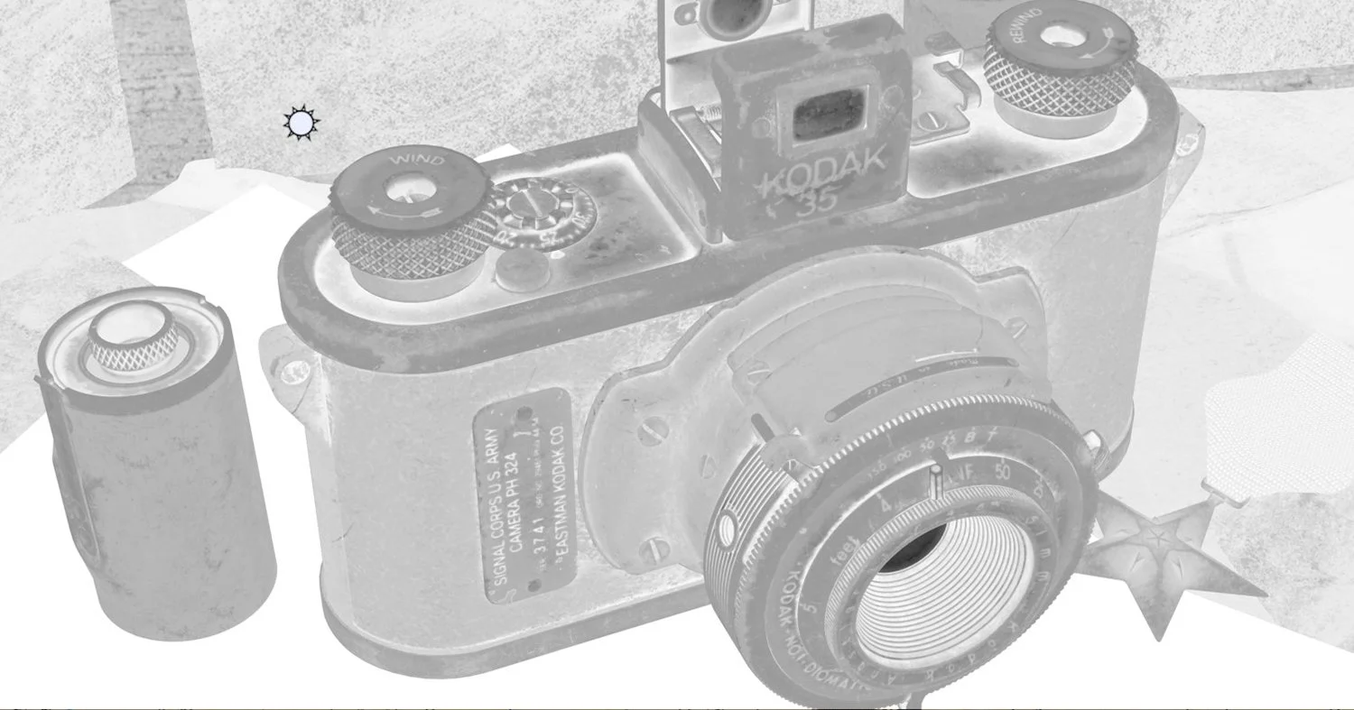
My camera composition was quite simple, and I haven’t used overlays or necessarily thinking about composition rules actively but having photography as a hobby for many years these things come naturally.
Composition Overlay
Making use of the rule of thirds and the pyramid composition are some of the most natural rules and a lot of times what compositions look good are just natural for the human eye. We tend to see patterns, order, symmetry or asymmetry and some configurations are more pleasant to the viewer than others.
Even a lay person without any training would be able to tell if it’s a good composition or not but just not be able to express why. For that reason, I think it’s very good to try out a lot of things, experiment with as many different angles and lens lengths and configuration and just step back and see what looks most pleasing to your eye. Experimentation is key! Another factor that plays into composition is set dressing. The way you setup your scene, your light your props in the scene in relation to one another will play a very important role in what you are able to do with your composition and how you can present your subject.
Colour and Light
In this scene colours and lighting were some of the most important elements. In this sense I had a very clear vision of how I wanted it to look. Mostly a dark, kind of a twilight look with many shades of green, brown and mustard.
Colour Palette
The colour palette was decided before I even started populating the scene. This was based on a mood board I created but most of all on the theme and colour of the camera. What its history was and the story I wanted to convey which I will speak more on later. For the colour palette creation, I used a nifty website called coolors.com. In the image below I did a breakdown of my set dressing. My thought process here was to tell a story mainly but also arranging my props and lighting as to draw attention to the camera.
Composition Paintover
Green: The tight Spotlight highlights the hero prop putting everything else in slight shadow.
Yellow: Photographs and Letters are brighter creating separation from subject and background. The silhouette of the photographs is uneven and broken up as to not have a monotonous line
Teal: The wood is dark and empty to create contrast between the focus area and outskirts of the image. It draws the viewer’s eye towards the center where the image is busier and more detailed, and it also offers some rest area
Orange: The box on the right acts as balance and offering some symmetry in the composition
For the most part I just picked objects that worked with my colour palette but sometimes you must make choices. In the image below you will see the original medal which in real life is red and blue but, in my scene, it was far too distracting, and the colour didn’t match anything in my palette, so I made the decision to disregard accuracy in favour of scene consistency.
Original Medal Colour Palette
And to reiterate on some points from the previous question, I use colours deliberately to separate my subject from the background. This is very important as it helps it not get lost in all the details and strong contrast points is where the beholder’s eye is drawn most. One very well-known useful trick is to do a squint test. Or what I tend to do is view the scene in black and white and / or blur the image to better see the macro shapes and silhouettes. In Windows a fast way to see just black and white is to use the CTRL + Windows Key + C.
Setting Goals
For this project my goal was to get a prop and presentation that are believable and realistic and to really convey a story with my imagery. The camera was the star of the show and I really put a lot of love into it. I wanted to create something very intricate including all the internal bits, but I especially wanted to try new things with my texturing and demonstrate much of what I’ve learned in the past 2 years.
Inspiration Behind Memories of War
I was mainly looking for a fun little prop to create in my spare time when my friend, Linus Scheffel, showed me he was working on a Leica vintage camera. That seemed so much fun, so I found a camera that I liked but from there the idea just grew more and more and it evolved in my mind when doing research about the camera and searching for reference pictures. Many ideas came to me just by looking at old war photographs or reading old war letters.
Narrative
By drawing inspiration from the research I did there was an idea of a story developing in my mind but in this project instead of working from the top down, meaning I’d had the story fleshed out and I’d created everything in the scene to convey that story, I took the opposite approach. I had my finished camera model textured and ready to go. I set it up on a surface ready to present it and I asked myself:
What is this camera’s story?
Who owned this camera?
What pictures did it take and what did the camera witness?
What kind of a person is the owner of the camera?
From there every choice I made was to tell that story that was forming or to reinforce it. The sleuths out there probably already figured most of it out that this person was a man, a war photographer. The people in the pictures were his comrades during the war. He is sat at his desk with a box full of memories, reliving/remembering those days, re-reading those old letters and seeing how beautiful his wife was in her youth.
References
I really tried to put myself in the shoes of this person or thinking about my own grand father who was a war veteran and trying to imagine what that could have been like and what I would do in that situation. This scene was an incredibly fun exercise and I think there’s great benefits to letting your imagination go wild and really have fun when trying to tell a story. I sure hope that some of the story was conveyed to my viewers.
Lighting
The way I build my lighting is in layers. Very similar to how you would build your assets or texturing going from large to small.
Lighting Progress
I started off with the main light sources:
A simple HDRI
Main light source with a gel alpha to simulate window shadows (light gels are very often overlooked and underused and I highly encourage everyone to try them out)
Softer flood light to fill in some of the shadows and highlight more of the camera (in real life this could be an overhead artificial light)
A side view colder light (this is mainly to create some contrast by having a complementary colored light cast some highlights here and there, but very subtle as to not spoil my main color palette)
A couple of cold lights to create highlights or rim lights on the model. I use these often in my presentations. At this stage usually I am looking to add lights that create separation from the background, contrast and eye drawing highlights by having bright spots and cold lights against warm lights. And very importantly I am trying to put the roughness map in a better light. Without highlights your roughness map will usually fall flat and not be seen very well
Marmoset Toolbag Setup
A nifty button in Marmoset to place highlights is the light controller. Have one light selected and with this button you can click anywhere on your model to create a highlight at the point you clicked.
Light Controller
Deciding Assets
Everything I created was only to support the narrative I had in mind, in addition, I tried to add things that are of the era or even from the same year as the camera. When I would ask myself a question about the protagonist, I would try to come up with some way of conveying who he was without ever showing that person, by the things he owns, even by the way he arranged the objects.
So, in fact there is almost nothing in there that doesn’t help with the story. A few of the assets I grabbed from Megascans as to save time (the makeshift desk which is actually a chair, the tarp underneath and the cigar). Everything else was authored by me.
Modelling Workflow
As I said in the previous answer the furniture is from Megascans. The camera was mainly modelled in 3dsmax, about 80% Sub-D modelling + Booleans for the high-poly.
High Poly
When I’m done with that I take everything to ZBrush and DynaMesh to get all the nice bevels. This is a very standard workflow in the industry for hard surface right now and it works great.
DynaMeshed in ZBrush
Everything else was done in the same way, except the photos and the letters. Those are just very simple planes with some warping or bending applied and I just slapped on a simple clean UV’s.
Marvelous Designer
Marvelous was used very little, when creating the medal cloth. That was a very simple task although a bit tricky to get it to fold like in my reference pictures. I could have done the tarp on the table too but seeing as it was free on Megascans I decided to take the easy way and save time. Here is a screenshot from Marvelous.
Medal Cloth in Marvelous Designer
Modelling Tips
When it comes to modelling I use almost no plugins or tools that are out of the ordinary. I use the tried and true techniques of sub-d modelling and Booleans and then into ZBrush for DynaMesh. That alone is good enough for most things. Where I try to experiment and innovate the most is in the texturing process as that aspect is far more important to me.
Baking High to Low Poly
Most things in the scene are baked. Although it is possible to create great textures without baking I find it very helpful to have those baked mesh textures. For baking I always use Marmoset Toolbag. In my opinion it’s the best baker on the scene right now due to the speed, ability to paint skews, edit cages, the auto-loader and more. For those having trouble with baking, focusing on a clean low-poly and great UV’s is what will really make all the difference. Marmoset has the option to group things by naming convention so intersecting meshes won’t bleed normal information onto each other.
For UV’s I use Rizom UV as it’s very intuitive, fast and has some functionality that 3ds Max or other software are missing such as constraints, island grouping etc. Some tips on UV’s is to straighten your islands as much as possible without extreme warping as this will give you perfect seams with no aliasing, decrease island size for barely visible parts or delete them altogether if not visible.
UV’s in Rizom UV
Low-Poly
In this project I decided to not optimize the low-poly’s much at all to save myself a lot of time but when setting up the baker I did not skimp. This workflow helps me speed up and iterate much easier down the line.
So here’s a few rules I have for myself:
Have everything named correctly ( this will help you or anyone else understand what is happening in the scene )
Match your low-poly objects with the corresponding high-poly (‘name_low’ and ‘name_high’). This will take advantage of Marmoset’s auto-loader system and it will automatically setup baking groups. It will also reload any changes and put them in the right place after changes.
Add unique materials to the different objects and colour code them. This will help create the ID map. Make sure everything is scaled correctly and the high-poly meshes occupy the same space as your low-poly. This should be one of the first things you do when starting a project, setting up scale and working at world origin from the get-go but it’s good to double check.
Just being very organized will really make your life much easier here.
Another thing to really be mindful of is your low-poly shading. Many issues will come from that.

Low and High-Poly Meshes With Naming
Baked in Marmoset Toolbag
Texturing Workflow
I texture in Substance Painter and make use of Substance Designer as support. It helps me create custom alphas, filters and tools that help me every day. I use anchor points in Substance Painter quite heavily and that’s an incredibly powerful tool that everyone should master. My approach is always to go from Macro to Micro details. I gather a ton of reference before I even start my modelling process. This comes in handy both when modelling each part and it serves as great reference for texturing each part.
Camera Reference
Paying attention to very minute details in your reference, how and why wear happens in different places is very important. I build my textures looking at as many references as possible and copying as many things I like. I do not just emulate one main reference, but cherry pick the best things I like about a few references, going into more and more detail as I build everything up.
And again, attention to detail is paramount. Texturing should not be rushed. You should spend at least as much time on texturing as in modelling, if not more. You can see here all the dust and tiny fibres building up in the corners and crevices. This was done with some custom generators I made in Designer.
Dust and Fibres Generator
Lens
Another tool I made in Designer and I use every single day is the Fill+ filter. This allows you to have levels, blur and sharpen directly inside the fill layer. This way you can affect just one grunge map at a time instead of the full stack. You can also plug it into your Projection paint which was never possible in Painter before, or even in your anchors . It’s available for free on my Artstation store so go and grab it!
Recreating Real Life
Pay very close attention to your references and do not rush texturing. Albedo and Roughness are your most important channels so pay extra attention to have enough variation there but at the same time don’t just slap on a grunge map and call it a day. It is also very easy to have too much variation that it starts to look cloudy or noisy and this is one mistake I see a lot of beginners make. There should me some rhyme to reason why you are adding variation and where. For example it should happen more on the edges and crevices, more in places where things come into contact often etc.
Think about how the object is used day to day, what kind of weather it sits in, how often it is handled etc. There should always be an explanation why some details are forming so for example don’t put scratches inside of an object where it would not get any contact. Here are the two channels from my camera:

Albedo
Roughness
One other mistake I see beginners make is going too procedural. For example, procedural edge wear and everything becomes too uniform. Variation is key, don’t be afraid to hand paint!
Camera Shots
I approach the shots as if I were holding a real camera. I experiment a lot with camera angles and focal length until I find something that I like. This part is just a lot of fun for me and it’s a time to experiment and play around until I find many things that I like. Every time I find a camera angle that I like I just duplicate that and lock it.
Marmoset Toolbag Cameras
In terms of camera settings I don’t go overboard. I like to work with longer focal lengths usually, around 120-200 mm. Aces I use most of the time for tone mapping and I add a little bit of chromatic aberration noise and depth of field. Here are my settings:
Camera Settings
Cinematics
This was the first time I did an animation. I mostly wanted to show some cool panning shots that go in and shows some more detail. The lighting remained the same as for the still shots. I only animated a bit of light rotation to add some more interest. Nothing too fancy in this regard as I don’t have much experience but it was a fun thing to do. Looking back maybe the shots were a bit too short and fast and the fades a bit too abrupt.
Areas Looking To Grow
Texturing is where I want to grow the most. I think that’s what really makes your work shine and stand out. More Substance Designer work as that tool is extremely useful and certainly I would love to do some environment art with the new UE5 which looks absolutely insane!
Inspiration
I look for and find inspiration everywhere. I love to look at different mediums like photography and film. There are many artists that I look up to and they inspire me to always get better aim high. Pinterest and Artstation are websites that I visit daily and I save images to all kinds of collections. Not only for inspiration but I think looking at many different styles and new stuff helps build a visual library that’s useful when designing things. And last but not least, real life is the greatest inspiration of all. I think I and many artist out there love to walk around streets or in nature and we look at the most insignificant things like a rock or a wooden door just because the textures are so cool. I always take the time to get some reference pictures and try to use those details in my work.
Feedback
For the most part I seek feedback from other artist friends, I always ask for feedback and opinions and you’re never too experienced to receive it. I think that’s one of the most important things to do if you want to keep growing. Other places I get feedback from are Discord servers such as Experience Points, The DiNusty Empire, the Wardog Discord server and many more. Everyone is keen to help and if you need feedback all you have to do is reach out.
Additional Advice
Don’t compare yourself to the best artists out there, on Artstation especially, and don’t ever think you can’t become good enough. Try to reach out to artists for help or feedback, even in private. If you approach them with respect and a clear question they will probably help.
Future Work
A lot! There’s so much stuff I want to show the world still.
All the cool stuff I did at work in the past 2 years that’s still under NDA, I have an environment in the works that I still need to finish, I just need to find the time. Probably some cool new personal work and maybe, just maybe, some more material art. I have way too many things I want to do and not enough time haha!
Outro
Thank you all so much for taking the time to look at my project. I’ve put in so much love and care in those 3 months and it’s so hard to stand out in this field where there’s so many amazing artists and stunning works. Thanks for reading this article and I hope at least some of it was helpful. Thanks to Experience Points for the opportunity to write this.
If someone has questions or even wants feedback on your work drop me a message on my Artstation. And follow me if you haven’t already. I plan to release some more free goodies in the future such as useful Substance Painter filters.