
mike kurabi - hospital | composition, colours & cinematics
In this article we explore a breakdown of Mike Kurabi’s Hospital environment. He looks at composition, storytelling, lighting and materials, and talks about why it’s okay to make big changes later in production to get a better result.
Introduction
Hi, my name is Mike Kurabi, a 22 year old Environment Artist currently working at Appeal Studios. I graduated last year from Haute École Albert Jacquard in Namur, Belgium. The first game I ever played, and the game that actually got me into game art was Warcraft III. I liked playing around with the world editor even though I had no clue what I was doing back then.

Composition
Before I start working on my scene, I gather a huge amount of reference material and try to organise it a bit. I separate the reference I’d use for lighting, composition and for space blockout. Once my blockout is done, I start by setting up different camera angles of what I think would make great compositions based on different rules I follow.
The first thing I think about is my Focal Element. What do I want the viewer to focus on? Different things help me to achieve points of interests in my compositions.

Composition Analysis
In this composition I use:
Contrast
High contrast in a scene automatically draws the viewers attention. I could have placed something in front of the window to make a better use of the contrast. The reason I didn’t do it was that I wanted the viewer to have a sense of freedom coming from that bright skylight.
Repetition
I like using repetition a lot. Just placing the same assets from foreground to background is an easy method to give some sense of depth to your compositions.
Camera Focus
Using Depth of field and blurring out the things you don’t want to be in focus is another easy way to help draw the viewers attention to the focal elements. Unreal Engine’s cinematic cameras are awesome for this kind of stuff.
Framing
Using dark foreground elements and a vignette helped me to frame the shot.
I then think about structure, things like the rule of thirds, golden ratio etc.

Composition Analysis
In this specific shot the symmetrical aspect of a corridor makes the composition visually pleasing on its own. I tried to break the symmetry a bit because I didn’t want to have the calm feeling a symmetrical composition gives. I wanted the viewers to feel some anxiousness by trying to lead them diagonally through the scene to my focus point, which is the window.
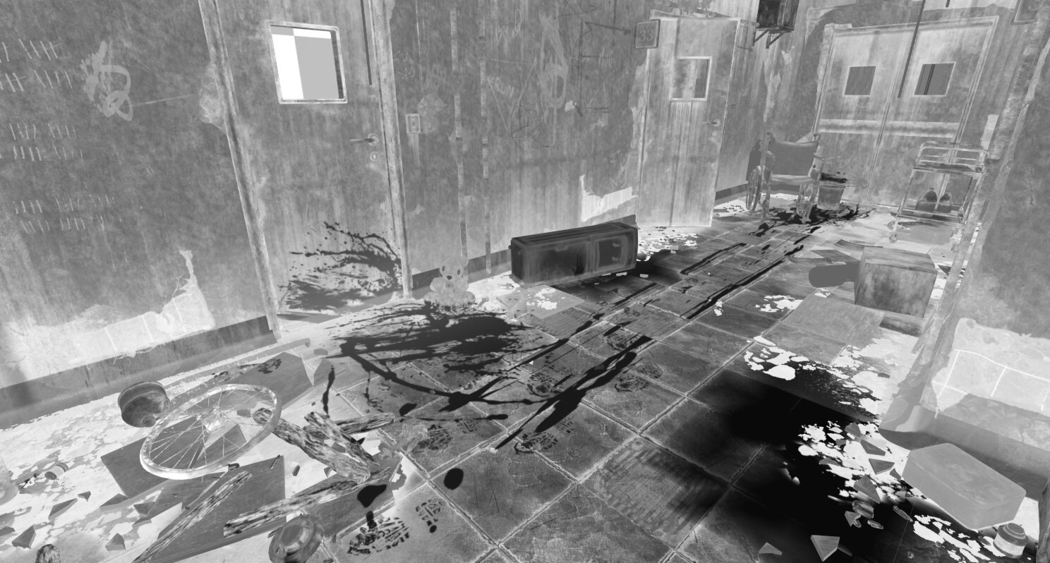
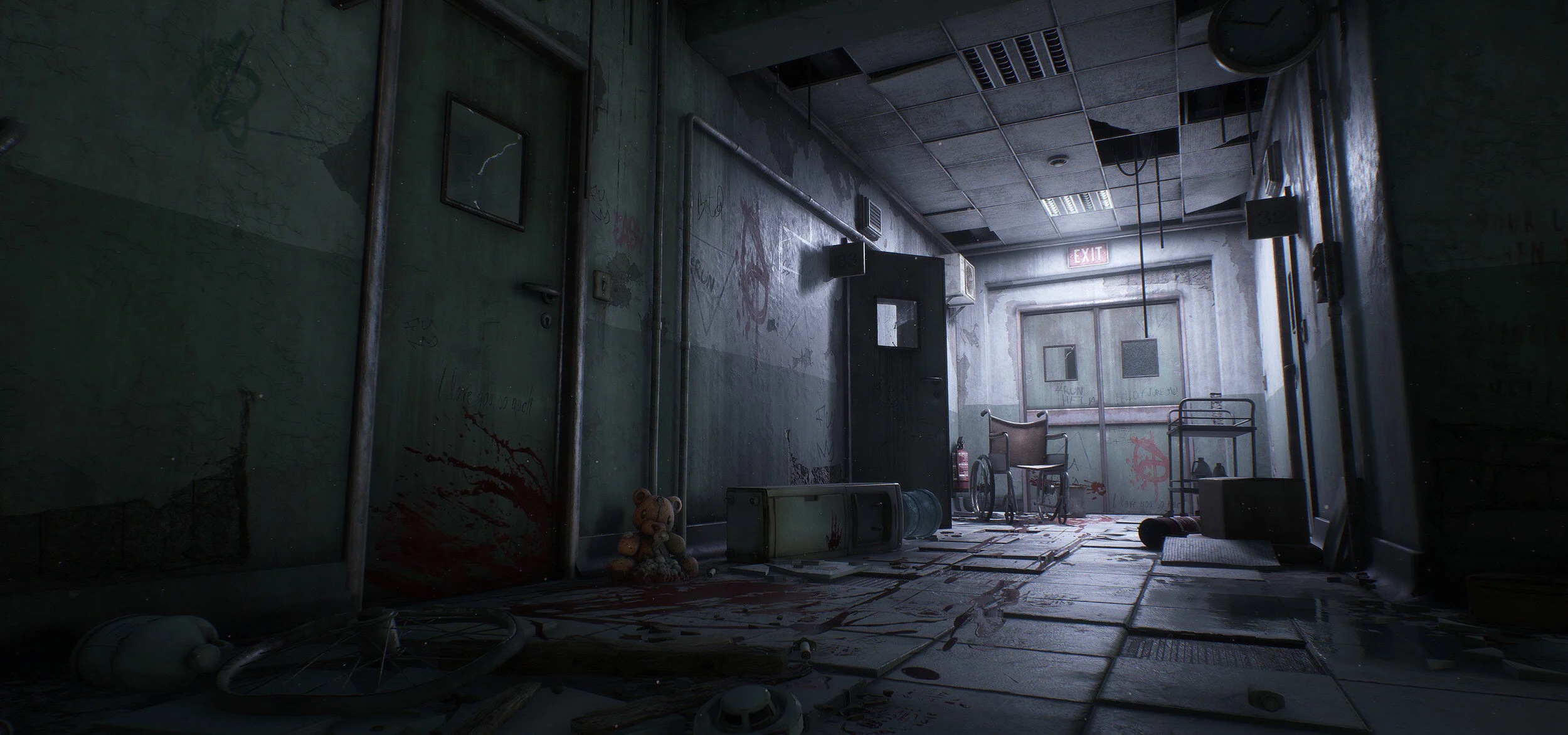
The following composition was a bit harder to sell. This was actually my first shot, based on the concept from The Division.

Second Composition
For the most part I use the same principles here too. Since it’s a corridor, the attention is automatically led to the background of the image. The hard part of this shot was to get the balance right. I wanted the viewer to not notice the whole torture scene instantly but gradually get here. The problem was, the two focal points would always fight for attention.
I ended up trying to have high contrast in the background to really focus the viewers first sight on the wheelchair.

Contrast Example Using Threshold Filter
Using the threshold filter in Photoshop helps me to see if my composition works.
As mentioned before, I did not want the viewer to immediately notice the torture scene. My first attempt was to have the wheelchair in the foreground and the bear in the background but that lead to both points of interest fighting for each other. Having the smaller element (the bear) in the foreground helped balance the composition better since it takes less attention.
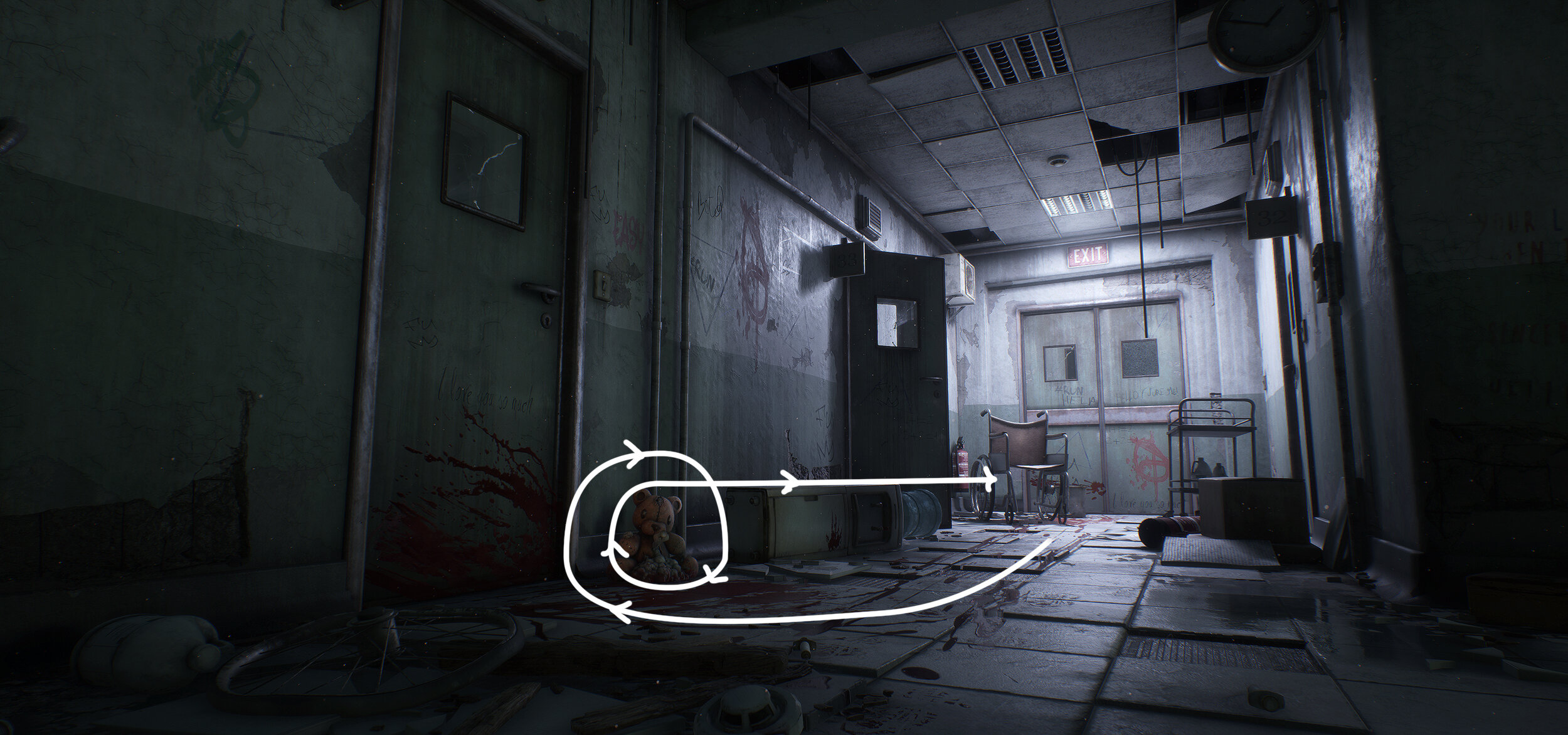
Leading Lines Analysis
The blood path helps to lead the viewer‘s eyes smoothly to the bear. The foreground elements make it so the attention doesn’t leave the image.
Colour | Light | Mood
Lighting a scene properly is really challenging. It’s what sells or kills your project. Before lighting my scene, I try to think about what I want the viewer to feel. What’s the story I’m trying to tell? For instance, I knew I wanted the viewer to feel some unease and to know something happened or is about to happen. The greenish tint of the skylight pushes this quite a bit.
I also wanted to have some colour contrast in my scene, and since I really like warm/cold contrasts I went for red lights. I wanted a nice red that represents danger, like the one you see on “STOP” signs, instead of that warm and cosy feeling you get from more orange reds.

Example of Light Rays
Another thing I tried to push in this shot were the light rays on the panel. My intention was to have something that represents some kind of hope or freedom. Having some really bright light coming from the outside helped me bring that feeling to the composition.
The tricky part about lighting is that you have to sell your story while maintaining good looking assets and address performance issues. I think that one of the hardest parts is to get those neat reflections on your materials. To enhance them, especially in shots where the main source of light comes from outside, I like placing some secondary light sources with really low intensity in front of the window to get the most out of my roughness maps.
Here’s an example:

Example of Secondary Lights
I try to play around with different lighting scenarios as soon as possible and try to be as clean as possible when starting to light my scene. I find that going step by step is crucial, starting with a single light source and moving on to another once that first one is “perfect” makes the whole process a lot easier.
Cinematic
For the cinematic, I started by recording a bunch of usable rushes that cover everything in the scene in UE4’s sequencer and then put everything into Vegas Pro.
I then thought about how to make the viewer not feel lost. I wanted to have some logic in the sequence. I started with the main interest point of the scene which is the torture scene and went gradually from one end of the scene to the another with slow moving shots. This helps the viewer not get lost by jumping across different locations in the scene.
Iteration | Lighting

Environment Progress
The first thing I do after blocking out the structure of my scene, is explore different lighting scenarios.
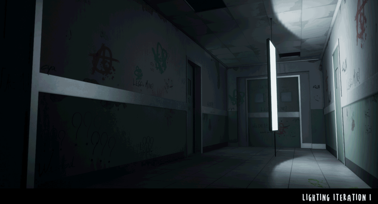
Lighting Iterations
I try to get a rough idea of the direction I will be going with and the mood I want to have in the scene. When you iterate on the lighting like that, it’s important that the process is fast. You can’t afford to wait 20 minutes between every bake at this stage. I always try to have clean lightmaps as early as possible so I know the iteration process will be smooth.
Here are some lightmass settings for my test bakes (in medium) and settings for my final bakes (in high or production). The test bakes settings depend on the scale of the scene. If I work on a bigger environment, I’d probably change some of those settings to iterate a bit faster.
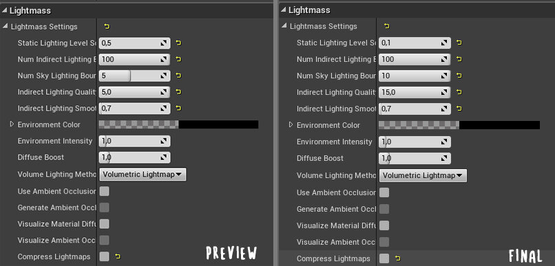
Lightmass Settings Comparison (Test Bakes on the Left, Final Bakes on the Right)
Making Big Changes

Old Lighting Scenario
I was quite happy with what I had at this point, I liked the mood and I had clear intentions with my lighting but something bothered me. The scene structure felt a bit too simple and the roughness on my materials weren’t quite readable.
I decided to change the scene and the lighting completely so the materials read better. Having the light source at the end of the corridor make the reflections pop way more.

New Lighting Scenario
It was a difficult decision to take because I really liked the intentions and the mood.
Another huge change was reworking the structure completely. I wanted to have some “playable space” in this project. I decided to enlarge the scene and to add some more structure with perpendicular corridors.

Added Corridor
Along the way I also changed the composition a bit. The wheelchair took too much attention to the foreground, so I decided to switch its place with the bear. This helped a lot in balancing the scene.
I ended up reworking things so many times. It took me an absurd amount of time to rework everything but it was well worth it in the long run.
I think this is actually really important, especially for students. You should take your time with every piece you do, the more time you invest, the more you learn and the more you can reapply on future projects. Focus on quality and try to push your projects as far as possible instead of being satisfied too fast.
I think that when people give you valuable feedback, coming back and applying it to the project instead of planning to do it on the next one is a huge factor of improvement as an artist.
Storytelling
The Story
An old resident was left for dead in this abandoned psychiatric hospital, completely disoriented, he was able to survive there for some time. His way of calling for help was writing all kind of stuff on the walls, even leaving some heartfelt messages for his only daughter. One day, a man who used to work here came to his block to look through some old files and when he saw there was still someone here, he cold-bloodedly murdered him and pulled him across the whole corridor.
Storytelling with Decals
The story of my scene changed quite a lot over the whole process. The only thing that didn’t change was the torture/murder in a psychiatric hospital idea. I think that iterating, constantly adding stuff and removing stuff will improve the overall story telling of the scene. In my case, a lot of stuff regarding the story kept changing, especially the decals. In this scene, the decals add a lot to the storytelling.
As I said, my decals changed all along the project. At some point, I had an idea (well, someone suggested it over on the DiNusty discord) where tally marks would represent the days the resident was trapped in the psychiatric hospital and that the marks would get more and more sloppy. I ended up removing that idea because the idea was quite hard to sell.

Decal Example
Instead I went with easier to understand decals, like a heartfelt message to his only daughter. A simple “I love you so much” next to a horrible murder scene means so much. Writing stuff is another easy way to make the viewers understand your intentions.
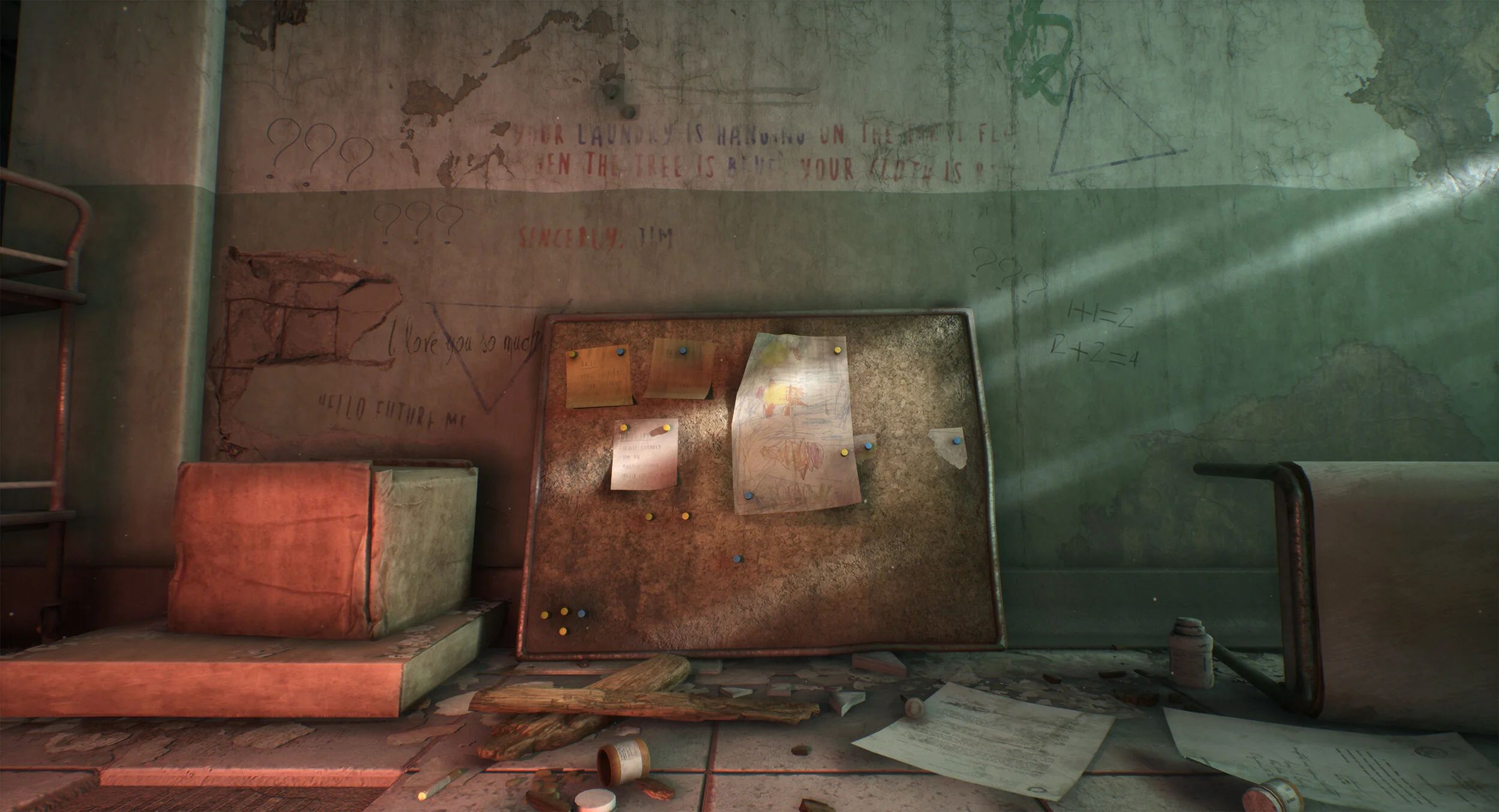
More Decals
Using Lighting to Push Storytelling
I always try to think about what different lighting could add to the story I’m trying to tell. Setting the correct mood is really important. I think this overpaint illustrates my point a bit more than what I actually finished with. Looking back, I probably should have tried to dive a bit more in this direction, and to stick to my initial intentions a bit more.

The orange light coming out of the room, was there to push the fact that what happened was quite recent and that the resident still was enjoying some things in his room, reading books or playing games. It represented some kind of hope, which I liked.
Showing Movement
I think that what helps the audience to immerse themselves in your story the most are things representing movement. In my scene, I added footsteps, bloody smears and trails from the wheelchair on the floor. I also played with the dust. I added a lot of dust in places where the resident would walk to and made the surfaces where he doesn’t walk way dustier. All those things really are easy to understand to the viewers, and will help selling your story so much more. Having them really visible in your roughness maps also helps a bit.
Roughness View
Modular Building | Texturing
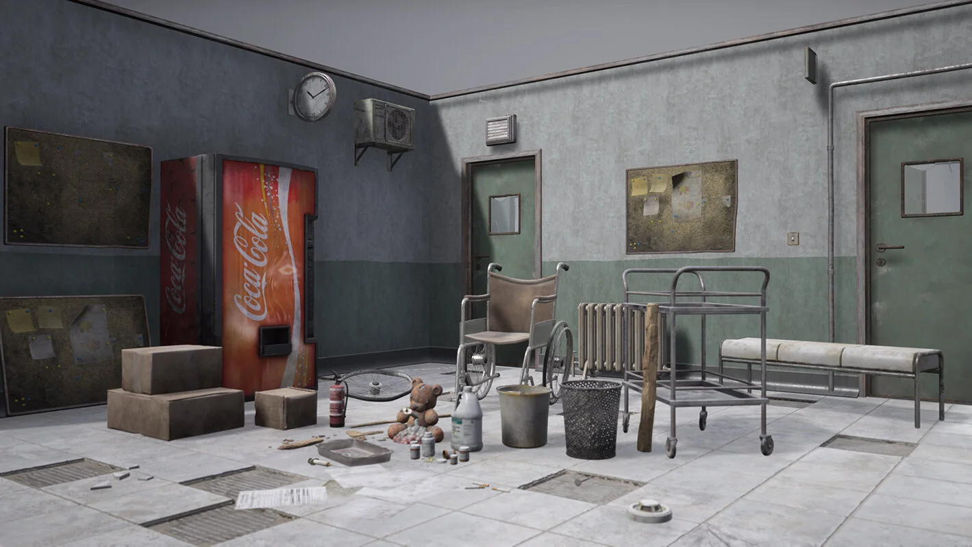
The kit for the scene is fairly simple.

Modular Kit
I suggest keeping modular kits as simple as possible in the beginning, just enough to get the scale and the metrics down. Once everything is placed with the correct pivot points, you can just build out your modular pieces on the go without changing anything in your actual scene.
Tiling Materials
I used Substance Designer to create all my tileable textures. In this scene I mainly used it for the floor, the ceiling and the walls and all of the other more “structural” elements.

Tiling Materials
Tiling Materials
Unique Textures in Substance Painter and Photoshop
Most of the props that are not part of the modular kit use 1:1 texturing in Substance Painter.
One thing I feel like I should do more is using trim-sheets but I didn’t really feel the necessity of them in this project. I still have some really generic trims where I spent almost no time on, for some metallic parts in the scene.
Wall Material Layering
Regarding textures, one of the most difficult things to get to look right was the wall materials. I couldn’t get that paint thickness I wanted to have on my vertex paint. After some trial and error, I came up with a simple thing in the shader. I isolated the outcoming vertex paint edges and multiplied it in the colour to get some fake AO.
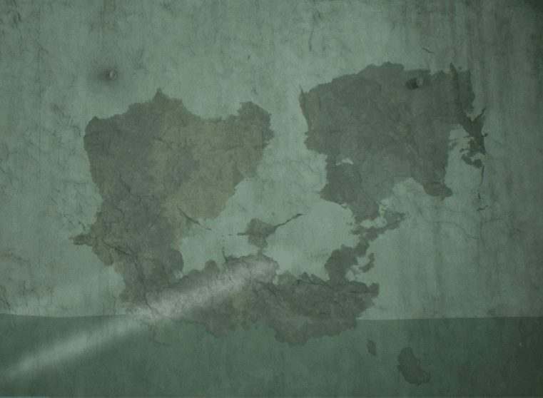
Edge Darken Example

Material Graph
Albedo Textures in PBR
Albedos are basically the colour of the materials without any light information. Having some guidelines for your albedo values is a really important thing in PBR workflows. If your albedo values are not right, the assets throughout your scene won’t feel consistent. I really like using DONTNOD’s PBR Material chart as a base for my scene’s albedo values. There’s also Quixel’s huge scanned library which have physically correct albedo values to pick from too.

There’s also this blogpost that goes more in detail about albedo values.
To check if your albedo values are right, you basically convert them to linear grayscale and colour pick in Photoshop and compare the value you get to the reference charts or textures.
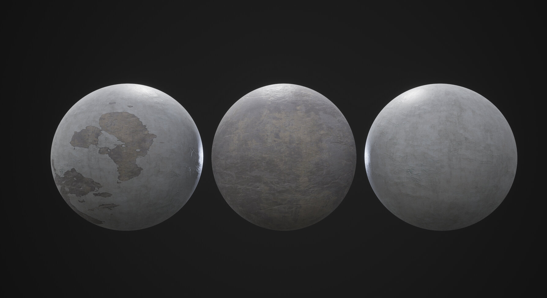
Roughness Maps in PBR
Roughness maps are my favourite. It’s the one map where you can make the most artistic choices since most of the roughness values change heavily with time. Your objects can get more polished, wet, broken, etc. You can still get some base values for your roughness maps from the Megascans library.

Roughness Chart
If you want a more in-depth explanation about PBR workflow, this is where you can go.
Something you can do to help your assets look consistent and to make sure they look good throughout all lighting scenarios is look at them in a complete neutral unreal scene.
Neutral Lighting Scene
Here’s a cool tutorial on how to setup that type of scene in UE4.
Decals
The number of decals I had to create and to place in the scene was a bit frightening at first. My workflow for them actually is really simple and they were really fast to do. I don’t think that this is the best method to make great decals but it worked for me.
R = Clean decal opacity mask
G = Roughness
B = Colour mask used to assign a second colour to the decal in the shader

Decal Setup
Since I wanted a huge variation of decals regarding aging, dirt, colour etc. and I didn’t want to invest time doing all of them uniquely, I created a quick and simple shader in Unreal to do this for me.
This shader gives me the opportunity to:
⦁ Assign two different colours depending on the mask of the blue channel
⦁ Have more or less tear depending on a grunge texture
⦁ Deform the decal depending on a grunge texture

Decal Shader
Just tweaking a few of the constants give a huge variation of the same decal.

Decal Variation
Regarding the leak and concrete decals, they are mostly from Megascans.

Decal Examples
Straying from the Concept

Basically, I think of the concept as an idea, as a starting point. I like starting with a concept and building around it until I have something unique, with more things to show than just what is in the concept.
In this case, I took the psychiatric hospital and pushed the traumatising experience that had happened in the scene way further, with blood, torture, heartfelt messages and murder.
Different Lighting
I think the lighting is a huge factor of difference between my scene and the concept. In a personal project, I always try to gather lighting references that are different from the concept.
Since I started experimenting with different set ups from the beginning, I knew that my piece would begin to part its way with the concept.
Pushing and/or Changing the Story
When I’m working on a personal project, I always try to build my own story. Thinking about a story to tell really helps to stray from concepts and to make your scene believable.
Texturing Process
My texturing process is really simple. The unique props use basic high to low poly modelling and baking. When I start texturing my stuff I try to keep everything simple, I block out all materials on my mesh in separate folders inside Substance Painter. I also try to stick to the PBR Albedo charts I pointed out earlier to have consistent looking assets throughout my scene.

Substance Painter Layers
Once my blocking out is done, I start adding subtle colour and roughness variations on top.

Colour Variations
And then I do my dirt passes

Dirt Passes
The problem with Substance Painter is that it automates a lot of stuff and you can easily get into the habit of just throwing smart materials around. I always try to paint my dirt manually and to have some logic behind it instead of just throwing a dirt generator on it and thinking that it is good enough.
To add subtle variation, I find that multiplying masks is a fast and easy way to work. I usually just multiply white noise by clouds or some other basic noise to get my colour variation.

Layers
Feedback
I seek feedback as much as I possibly can but dealing with a huge amount of feedback can get a bit overwhelming. I like using Trello boards to stay organised, so when I get feedback, I always put it down on my board.
I also try to at least consider all the feedback I get, but implementing every single thing is almost impossible.
Most of the feedback I got for this project came from The DiNusty Empire Discord, but I also like to post my stuff on Polycount. Another huge source of feedback are my teachers at Haute École Albert Jacquard, they’re incredible.
Tips and Advice
I’d say keep your things stupid simple in the beginning. Work on composition and scene layout and focus on the big picture before going all in on smaller props.
Also take your time with your personal projects and stick with them. There will be times where things won’t look good and you want to just drop everything, but working on it until your satisfied will push it to the next level.
The Future
I just started working on a Venice inspired place for my portfolio. I’m still planning stuff out and in the early blockout phase. You will be able to follow the project on Polycount once I have something showable.
Outro
The amount of stuff I learnt during this project is huge and I hope I was able to share at least a bit of what I learned.
Thank you for reading this and I hope you found this article interesting!