
Medieval Pub Diorama in UE4
In this article we take a look at Kassondra Krahn’s amazing Medieval Pub Diorama. Explore how this piece was brought to life with a dive into the lighting, colour and composition. Look at how tiling materials were approached, as well as how to find inspiration and iterate throughout a projects development.
Introduction
My name is Kassondra Krahn and I’m an Environment Artist at Next Level Games in Vancouver, Canada. I was born in Winnipeg, grew up near Toronto, and now live in beautiful British Columbia. After high-school I did a four year Honours Degree specializing in Fine Art & Art History. I learned a lot about painting and drawing, but was also responsible for writing papers on past artists and art periods. This led me into Museum and Gallery work for a few years, and during that time I made a few friends who introduced me to 3D art and animation. I never knew you could be an artist in this industry; I always assumed it was for people who could code or were far more technically inclined than me. I attended the Vancouver Institute of Media Arts soon after and found my first gig in the industry after graduation. Now I’ve been there for nearly four years!

Reference and Composition
The concept for this medieval house was created by the very talented Sean Andrew Murray. The drawing shows a stylized medieval cottage with a flat white background. For my personal portfolio I enjoy making diorama scenes with an exaggerated camera angle, so the drawing felt perfect for this. I love anything isometric and stylized, and although this isn't strictly isometric, the idea of a floating miniature environment has grown into my personal aesthetic. There’s something about containing the environment within the shot that I find compositionally pleasing, and these barriers can help bring the piece together quickly.
Murray’s work translated well for my style and had various angles for me to work with. The initial stage was mainly collecting references on models that matched the concept, as well as breaking down what tiling textures I’d need to make. Since I had a precise and clear concept, the planning stage was pretty straightforward. I love using PureRef for this part so I can quickly scan through all my images as I go through the project.

Reference Board

Texture List
Colour and Lighting
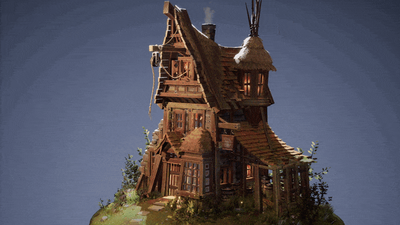
I really liked the artist’s balance in the concept, and wanted to stay true to the mood and colour palette as best I could. However I did change a few small things based on my own personal taste. The house is predominantly made of wood, so to add some material separation I created one wood texture and used material instances with tint adjustments to gain some variety within the scene. I also made these textures more saturated than the concept since it felt a little washed out with my darker lighting. I changed the miniature roof on the right hand side from wood to shingles, just to add more colour to the scene. I was quite happy with this texture so I also wanted to show it off more, and I liked the combination of the orange-ish roofing with some green moss and overgrowth.
When I first saw the concept I was instantly drawn to the glowing blue-ish windows near the base, and I wanted to incorporate some interior lights throughout the house. I decided to cut extra windows into the architecture to provide additional light sources and, again, add more saturation and colour. You can see this major difference in the tower on the upper right hand side. I created this glow effect in the windows by placing point lights in the mesh, plus some spotlights facing outwards to cast shadows of the window frames onto the ground or rooftops. Once I was happy with this interior lighting, the final touch was to isolate the house from the background. I wanted it to stand out and be the focal point, so I used a very strong rim light to create that highlight near the top. That’s all it really took to light, along with two spotlights from either direction with a very low intensity. This was just to brighten up some shadows and darker areas to soften the mesh a little bit.

Lighting Setup

Lighting Setup


Style and Development
I am generally drawn to a more stylized look when it comes to 3D. Ironically in school I made more realistic models, but over the years I’ve fallen into creating stylistic and vibrant dioramas. I like to push the silhouettes and colour palettes of art in general, so I think a more stylistic approach makes sense for my aesthetic. I originally studied abstract painting in school, so I believe that has translated into how I create my work!

Straying from the Concept
As I worked I realized my lighting had become darker and more atmospheric than the original concept, and combined with the glowing window panes mentioned above it felt more like a pub than a house or cottage. I decided to go with this idea and adjust some of the props to match. This meant adding wine casks and kegs under the roof, stray wood beams on the left by the stone walls, and a beer sign on the front. The concept didn’t include a ground or pedestal to sit on, so that was an area I had to make up on my own. Originally I was going to make something much more stylized and chunky, but the lighting and textures didn't really match. Then I tried a sort of globe/earth thing to sit on. Again as I went it felt removed stylistically and too “cute” if that makes sense. In the end I used a disk with tessellation and vertex blending to transition between the house and the rocks. I also spent time creating foliage to sit around the base. I generally love foliage so I wanted to incorporate that with the ground, plus It helped add some colour using the wildflowers. The scene consists mainly of brown and green tones, so the small hit of pink and purple helped brighten it up a little. Foliage is great in environments, especially with Unreal’s foliage tools, and is something I try to sneak into most scenes I make!

Windows, Flowers, and Custom Props

Foliage Zoom
Tiling Materials
Substance is amazing for environment art, and although it can be intimidating at first, it's great what you can achieve once you learn the fundamentals. I wanted to push myself with this concept and create all the materials with Substance Designer, which was a real learning experience and perfect for iterating.
Generally with Substance (or any form of art really), it's a good idea to start from general to specific. Get your big shapes and patterns in, and start working with them to create new masks and noises. Usually I try to get a texture about 70% of the way there, and place it into the engine and onto the model with its proper UVs. Then I can see where things need to be adjusted quickly. I went back and forth constantly re-exporting and importing between the two softwares to hit a look I was happy with, since it's easy to tweak tiny details back and forth.

Substance Designer Tiling Materials
I’m still new to using Substance Designer, and it can be a pretty daunting software to learn! I think every time I use it, even if the texture doesn't work out, I get more comfortable with the node structure. I’m lucky to have friends and co-workers who have been able to show me the ropes and teach me some new things. I also watch a lot of tutorials online, which is a great way to see how other people have organized their graphs. It's interesting how many ways you can do something in Substance, and how different people think things through. The way I might start a specific texture can be completely different than somebody else, even though the results may be similar in style. I’m excited to learn more about Substance, and hope I can create new patterns with new techniques.

Substance Designer

Creating Tiling Materials
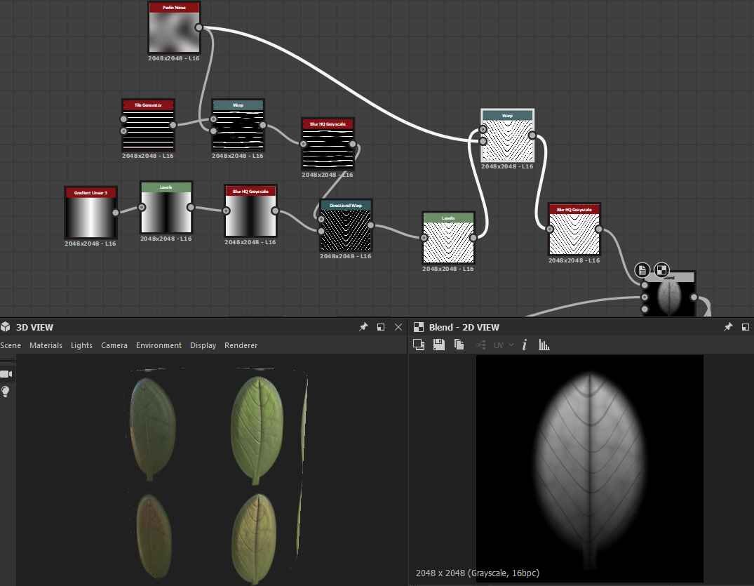
Substance was an essential tool for creating the foliage in this project. I needed a leaf graph to use as individual cards, but also to bake into my ground textures for vertex blending. To make my basic leaf shape I started with a ridged bell shape node, then scaled it a little in either direction with a tile generator. From there I levelled it out, blurred it a bit, and blended it with a rectangular shape node to create a stem at the base. I also multiplied a levelled out Gradient Linear 3 to create the dip in the middle of the leaf. Then another gradient was blended on top to add some height variation from tip to base. After this stage I used some warps to alter the leaf a bit and break its symmetry, and then blended a cells 1 node to add some pattern variation onto the leaf itself. Finally, I blended a rectangular tile generator that had been directionally warped to mimic the thin ridges along the leaf. Once I was done with the height map, I created four variations using different warps to make an alpha sheet I could use as cards in my scene. I also used them with splatter circular in another graph to form weeds and flowers baked into the texture. This process worked well and allowed me to iterate later on as needed. If I wanted my leaves thicker, thinner, more warped, etc. it was just a matter of adjusting a few nodes or sliders and re-exporting. For my flower petals I actually used the same leaf graph but fattened them up a bit at the base and changed the albedo to a pinkish purple hue.

Leaf Shape
Leaf Ridges

Substance Leaves
Another important Substance for this scene was the cobblestone on the walls of the pub. Stone can be pretty tricky, and I think there is more to learn here, but I was pretty happy with the result I achieved. This is one of my more stylized textures, and at first it thought it was too chunky, but I like the way it feels in the scene.
The breakdown for this cobblestone started with a tile sampler. I blended two separate tile samplers, one with masked out bricks at half the width to add some variety in the tile. Then these were plugged into an edge detect and a flood fill node. After this I used a layered process of plugging flood fills into a random gradient node with various angles. These are then levelled or histogram scanned and blended on top with Multiply or Min(Darken) to add chips around the edges. This is a great way to get those super stylized cracks around the corners of your stones, a bit like Trim Dynamic does in ZBrush. After this I blended a moisture noise node on top at very low strength just to get some small variations on the front surface of the rock. Then I blended a clouds 3 that had been blurred a little to get a bit more damage and wear. This was enough for my height and normal maps, which I also used to plug into my gradient map for the albedo. I used a curvature smooth node at the end to get that nice highlight along the top edges, which helps to stylize the bricks. The roughness map was simply a matter of blending low opacity noises together for variation, along with some masks from the height map process. The roughness is pretty light for the most part as I wanted the rocks to look dry. Rocks and organics can be tricky, and this is an area I want to continue to work and play with. It really is fun the different patterns you can get with substance, and how easy it is to reuse graphs you’ve made to create new textures.

Base Cobblestone Shapes

Cobblestone Shaping

Substance Cobblestone
Iterating Throughout the Project
My first step after gathering reference is to model and block in the majority of the piece in Maya (unless it is modular, in which case I'll wait to uv/texture before I duplicate). After this is done the model gets placed into the engine to see how it looks and if the balance feels right. This also gives me a chance to set up camera angles for rendering. Translating from 2D to 3D always involves some tweaks, and because the concept only shows one side I had to do some guess work on how the left hand side was built. Some of the biggest iterations involved the lighting, and the ground pedestal as I’ve mentioned above. I kept changing my mind if I wanted a nice bright scene, which would show off my textures nicely. However, once I fiddled with the glow within the windows I knew I wanted to keep it dark to showcase these lights. I also iterated on the skybox constantly through the process. Originally I just used the Unreal skybox, and then I created a skybox on my own. Both of these felt too distracting from the house, so in the end I landed on a flat background (simply an inverted sphere with a flat grey shader at full roughness). A final element that required some tweaks was the amount of foliage. I tend to go a little heavy on plants since I love the way they add colour to a scene, but again it was taking away from the architecture which was meant to be the focal point. I had to pull that back and create more clumps of grass and trees instead of just using it everywhere. These small changes helped the scene come together, and overall the process was pretty seamless. I think using a strong and clear concept saved me a lot of time and headache, plus some planning at the beginning to sort out my materials. I’d definitely recommend using lots of references that are easy to visualize in 3D before starting a scene!

Project Iterations

Building Geometry

Foliage Clumps
Finding Inspiration
I started learning about art in a 2D realm, so most of what I am inspired by is in that direction. I’m really drawn to bright pastel colour palettes and simple shapes, and I like to look at graphic design and illustration to get ideas. I love 3D, and how powerful it is, and I believe having a more traditional fine art background has shaped my style today. I’m interested in abstract painters, particularly ones from the 1960’s, and I think some of my colour choices are drawn from that era. My previous work is quite a bit different than some of the scenes I’ve made in 3D, but I do think there is a correlation between the two. I’m hoping to make more 3D artwork soon that is brighter in colour and could perhaps initially be taken as a 2D image.


Seeking Feedback
I’m lucky to have a lot of amazing co-workers and friends from school who I have kept in contact with. One thing I would recommend is trying to get as many eyes on your work as you can. People will point out little things that you can easily miss looking at it all day. I showed this work to my friends and colleagues constantly and they really helped me look at it with a more critical eye. Plus it's great to have a network of artists you can ask to help with Substance or any other software.
Tips and Advice
I think whether you work in 2D or 3D, modelling is a great skill that can be applied in diverse ways. Being able to create images that can instantly be viewed from multiple angles is a really interesting thing to me, and I wish I had known about it sooner! The software can initially be a bit scary, and I am always meeting people who know much more than me in any specific area. I think it's important to stay humble and try to learn from anyone you can (and if given the chance, share what you’ve learned with other people too!). This is an industry that is unique in how fast it moves and evolves, and it's exciting to think where CG art could be in the future (the recent Unreal demo shows us that!).
The Future
Hopefully I can learn more about Substance Designer and create some more unique artwork! I want to start using 3D as an influence on some of my 2D drawing/illustrations as well, whether as paint overs, flat renders or toon shading. I have no doubt you’ll be seeing some pastel colours and dioramas from me in the future!
Outro
Thank you so much to Experience Points for reaching out! It's great to share a bit about my process, and hopefully I can continue learning from this project! To anyone starting out in this industry it can be a scary place, but it’s also one of the most exciting jobs to have as an artist. I look forward to making more artwork and hopefully talking to more cool artists! If you want to reach out, you can find me on Artstation or here on LinkedIn. Thanks again! Cheers.
