
A SHOWCASE OF mastery
The team at Experience Points feel extremely humbled to be able to present what is possibly the biggest article we have published to date.
Turn the lights off, put on your headphones and grab your popcorn. We are about to explore the masterpiece that is… ‘255,255,255 RGB‘.

Introduction
Good day, the name is Banan Blanco. I am 32 years old and have lived most of these years, and still do, in Germany. So you could consider me German and sure you can imagine this article is most accurate to be read with a strong German accent. Not only did I study Graphic Design at University but I did actually learn something throughout this time. After that I mostly worked alone on different art projects at night. You could call it freelancing but it's more occupational therapy. I need to do things, need to learn, become better. Not in a specific field but rather on a broader scale. Maybe one day I can become the next Joe Garth, so handsome and wise.
Your use of colour is amazing. Can you describe your process for us?
On the technical level this work is mostly performed in Photoshop CS6. No additional Plug-Ins, though some external tools were used.
The calculator to calculate the right resolution. I prefer the Windows default with the scientific setting but any mechanical or digital data processor capable of basic arithmetic will do. Colour and shape are always in correlation to each other. You will need the right shape if you want to communicate the colour as it is intended to be perceived by your audience.
One other important tool was PureRef for collecting references. Even when creating something new, looking at existing work or at nature is important. By far the most important part of this work. Once you understand and know your tools you stop worrying about the “how?” and start asking questions like “what?” or even “why?”. In a sense the main method of this work is asking these questions and projecting the answers onto the canvas.
And finally Notepad to take notes on the things learned during the process. I find it crucial for any artist to improve through their work. Take notes so you do not forget the nuances that were most beneficial to archive the result. Maybe revisit the work at a later point. Learn from the things you’ve already learnt.
Of course sharing your notes with others will help them to. So feel free to improve through my notes: Download
What was the inspiration for this scene? Are there Renaissance motifs?
Unmistakable Robert Ryman’s work is the true inspiration. The master of minimalism and monochrome painting. His work does raise a lot of questions in some people. Is it art? Why do people pay 15 million dollars for a white image? Can I also get the that kind of money? All valid question that I try to explore in my work.
Minimalism is what interests me the most. I do not remember who said it but it was some car designer I believe: “Remove one line. If it still looks good, remove another”. How far are you willing to go with this rule? Can it still look good with no lines at all? Can I have negative amount of lines as well? Always questions wherever you look.
The main motivation is to get answers. It is an exploration one has to do himself to know, and no, you cannot have less than zero lines. I really tried, but computer says: “No”.
Would you be able to describe your lighting setup?
I think its better to describe the setup by a full step by step tutorial. Since this is a very colour focused task with requirements for precise colour judgement I suggest you re-calibrate your screen before you start working.
In Photoshop and Create a new image by going to File > Create New, a new dialog will show up. In the new dialog we are able to set some properties. This first step is already of most importance as it will define the shape of the final product. Always consider your target media when setting up your file.
For this creation I recommend width and height of 1920x1224 pixels. Choosing this aspect ratio was not easy, the process is best described by observing at a lot of rectangles in their natural habitat. Be patient, look at them, become one with them. You just feel what is right then.
On the next one you can express yourself. I used 239 Dots/Inch as the resolution just as a sign that I and everyone else do not care about this value. Really, just use any number in here, call it artistic freedom.
For the Colour Mode we choose “Lab Colour”, allowing us to treat colour and brightness separately and 16-bit for the precision we will need. You can go down to 8-bit if you are low on RAM but it will not give you the best result, especially on HDR screens.
Background Content needs to be “Transparent” We don't want any background. This image is all foreground. Everything is equally important on the canvas.
To fully get the cinematic look we choose the Pixel Aspect Ratio to be “Anamorthic 2:1 (2)”. To correct the pixel distortion we now have to calculate the width again. We now need to divide our target width (1920) by the pixel aspect ratio number (2) results in a width of 960.

New File
Once we have the file setup add some adjustment layers. Add Patterns with some noise, scale them up a bit. This will make a good base. Then a Curve Layer to make sure we use the full range of brightness levels. Followed by a Gradient Map that will turn brightness into a colour gradient. Since we want white we choose a gradient with all the colours in it. The human eye combines all colours to a white but we need to do some more steps first.

Adjustment Layers
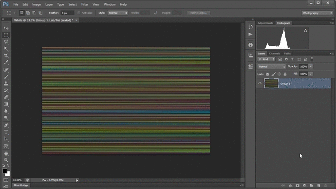
To recreate the VHS look we now can utilise the Lab Colour Mode. Collapse all layers. Go to Channels and apply Gaussian Blur on both colour channels (A & B). This will result in some nice old video tape looking colours.
After applying a heavy Motion Blur on all channels we can give the image some direction. It will just make it nicer to look at. Also apply Gaussian Blur on the colour channels for a second time after that. And I recommend to invert the colours at this point but this is just a flavor, you can choose for yourself.

VHS Colors
As the Final Filter we add Thresholds and as we animate the slider to the left we watch the Image render in front of our eye. What a great moment, when all the pieces fall into place. We now can see the end result for the first time. If it did or didn’t work out.
Threshold
But there is no time to rest. We still need to be able to share our work. Since not all platforms support Pixel Aspect ratio other than 1:1 we need to convert it back.
I choose File > Save To Web. Choose JPEG as file format with of cause Maximum quality. Why would you accept less than maximum? Make sure to enable Progressive, we want to make progress after all. Set Resolution back to 1920x1224 and Quality to Bicubic Sharper to retain all the fine details after the resize.
Press save and choose an appropriated file name like: very_bright_gray.jpg, maximum_illuminated_color.jpg or white.jpg. If any but the last filenames seem more fitting to your result I would recommend to check your screen calibration again.

Save File
What is the story of this piece? How did you create the mood?
A very emotional but also rational piece of work. It’s the artists mood projected upon it. Uphold what you want to express, your work needs change until it is approved by yourself. The story is important but you don’t have to tell it. It will reflect in your work.
When I first met and worked with Joe Garth many years ago, he was the guy who could touch the ceiling and climb the pillar. All impressive skills but the conversations about abstract concepts is where it got really interesting. What is time? Do we eat the burgers for lunch?… Does art exist?
These are some of the many arguments we had. Especially the last two questions hold the necessary importance to be followed up. My answers are: “Yes” and “No”, in this order.
I do not believe that art exists. Not only because it’s the contrary opinion and I want to trigger Joe, but for other surely non-fictional reasons too. But can I prove it? Can I build a philosophical concept that would prove that everything is art and therefore nothing is? That nothing “is” art and it only comes down to artistic appreciation of an individual? Arguments so well picked, everyone would agree on? I guess not, but I could post an all white image on Artstation and land on the trending page. Small win by small win.
Future Work
I was thinking of a movie adaptation of this work. But Yukari Onosaki already did his own version and I am not a fan of movie remakes. Most of the times they seem pale in comparison to the original. Please watch all his movies. They are all executed perfectly, he is a remarkable director.
Some people may have seen some new work popping up recently on my Artstation after some years of silence. I’m going 3D now to push some boundaries there. Once done with that maybe adding time as the 4th dimension and discovering animation is next. The future is bright.
Outro
Always Improve.