
call of cathulu - storytelling through props and lighting in ue4
What do you get when you combine Call of Cathulu and Garfield? A beautiful environment that oozes character. Radek gives us an incredible breakdown for his scene and details every step of production. Learn everything from conceptualisation to texturing assets, lighting techniques from photography and correct PBR values, as well as composition rules.
Introduction
Hi, my name is Radek Kościukiewicz. I'm from Poland, and my professional life connects with Warsaw. I am a sociologist by education and have no formal artistic preparation. Despite this, before I got interested in 3D graphics I was creating 2D animations for advertising in-house and as a freelancer. At some point in my life I decided to change my path and got interested in computer games which in my opinion, was a much more attractive journey.
The first stage to appear in the world of gamedev was to build a portfolio. It had to be good enough to be of interest to any of the game studios. The first group of people I had a chance to work with was the People Can Fly team. Working on their latest title “Outriders,” and being surrounded by gamedev professionals/veterans, I had the opportunity to gain knowledge directly from the source. After some time I was invited to work together with CDProjektRed on “Cyberpunk 2077”.
After an extraordinary, extremely engaging adventure in the world of Cyberpunk, I returned to the choppy waters of freelancing.
The Call of Cathulu project was created for two reasons. Firstly, I needed to take a deep breath from the restrictions related to performance, polycount and other optimization. I wanted to spend time on the complete process, not just part of it, and break away from the technology-oriented topics I've been surrounded by in recent years. Secondly, the fact that none of the titles I've worked on have been released yet, I can't brag about what I've done so far (I don't want to spoil the surprise for those who are waiting for these games of course) and my portfolio needed refreshment.


Idea
The idea came to me from my brother (who is also the author of the Cthulhu-Garfield model) pointing to a funny topic on the Reddit forum “I'm sorry John”. The dark vibe of Lovecraft history and the orange cat from the comic - absolutely perfect. After refreshing my knowledge with “The Call of Cthulhu” and Jim Davis's cat story, I was more than ready. The whole process can be finished in three easy steps: idea, concept, execution

Plan
When you start a new project, especially for yourself and non-commercial, you are full of positive emotions and energy. However, one must remember that it will be very time consuming and often the previous excitement turns into a distressing duty. The feeling burns out and the project that had been so exciting not so long-ago lands in the trash.
To reduce the risk of failure, it is worth making a plan. The plan allows you to not lose the rhythm, focus on the current task and visualise progress. It is surprising how important a simple routine is in the creative process.

It's just a graphically simplified representation of the next steps. A more detailed sample is included in the assets production plan. Sometimes it is the most extensive and time-consuming stage but not always. Making a plan is an extremely helpful step if you have all the time for yourself, and it is absolutely necessary when you need to divide your time between work and your own project.
Concept
When the idea is roughly formed, it should be put into picture. Gathering references (real-life footage) and inspirations (i.e. what other artists have done related to this topic) for the general scene is the next step.

References
Concept art is a graphic note made quickly, containing all of the information needed for further stages of work. The concept is most often used to inform about the expected result of the work of people working on a given element, regularly at different levels and various departments. I communicated with myself, so I could afford more freedom and inaccuracy.

Concept
My concept was more about visualising the scale - not only in terms of proportions but also in the level of detail in a single object, asset propagation, and the overall climate of the light. It did not contain information about the composition or background. This process was intended to create a reasonably accurate graphic representation of my vision without engaging in more time-consuming activities.
Execution
Blockout
Placing depleted representations of objects on a scene is a way to work on it

Blockout Process
It is obvious that when the elements of the scene start to take up space - they cast a shadow, cover themselves, create negative spaces, crowding in one place, and leaving empty space in others. This can be predicted but to a limited extent since the concept functioning in 2D space often does not provide full information about the perspective.
This is the moment to master the space before it comes to finish with colour and texture. I create the blockout so that the image I am working on does not dazzle me and at the same time gives me a chance to work on the composition and further iteration.
Composition
Composition
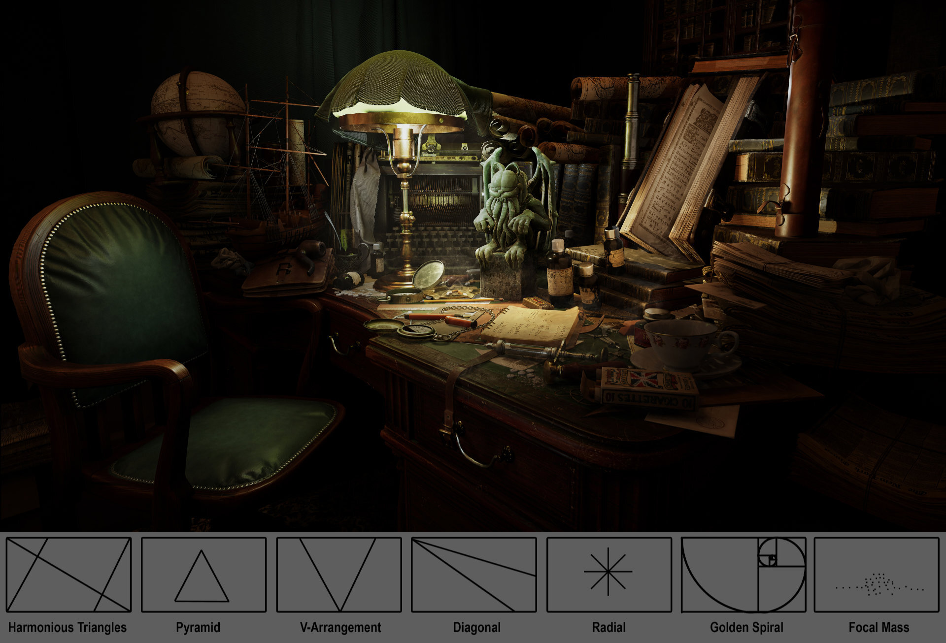
Composition helps read the image to the viewer. It is good to reach for one of the tried-and-tested compositions. There are so many that one can definitely choose something that will best match the work. There is no point in straining the viewer's patience.
The initial composition was Harmonious Triangles. With the Trapezoidal shape of the desktop on which all the “action” takes place, this arrangement seemed to be the best solution but traces of other compositions that I experimented with are still perceptible in the final work.
Assets
Asset production was carried out in the following pipeline.
Draft |Mid-Poly | High-Poly | Low-Poly
UV Mapping
Normal Baking
Texturing

Asset polycount were kept within reasonable limits but since the objects were to be shown in close-ups, they weren't overly stripped down. References were collected for each element in the scene. There were quite a few but taking the time to gather and analyse them is a necessary stage of the process.


The figurine in Lovecraft's story is made of soft green stone. I tried to convey the nature of the material based on references and colour samples taken from them.

Figurine model made by Sławek Kościukiewicz.
Textures
Textures were made in Substance Painter. One thing to keep in mind is the proper diffuse values. Excessively dark elements would not serve the scene well. This link explains it better.
In short, one needs to give the light a chance to work on the surface of the objects. The overly dark surface absorbs light, not allowing it to bounce from one object to another. The proper working range in sRGB is 40 - 240. After reducing the colour to these values, the textures are able to give the impression of being slightly washed out.

Correct sRGB Values - Photoshop

Correct sRGB Values - Substance Painter
To make sure that the black on the textures does not go down to dangerously low values, I added an appropriate layer in Substance Painter and modified the value with the levels modifier. The same effect can be achieved using Photoshop.

Although some elements still appear black, none of them have a lower value than 40 sRGB.
Decals
The last bit of detail was dirt on the desk.
Stains
Spills
White Powder.
They enliven the scene by adding visible traces of human presence.


Adding Decals
Lighting
For those who, like me, did not have much to do with stage lighting, I recommend checking out The Art of Lighting - Pixar in A Box. This guide explains the basics of working with light in a simple manner. I made a quick sketch for my needs. Knowing what effect I wanted to achieve, I outlined how I imagined the lighting setup.

Lighting, Reflection and Decal Actors

Lighting Sketch

Lighting GIF
To illuminate the scene with soft diffused light, I used softboxes.

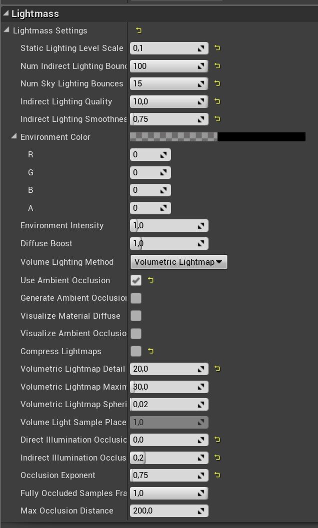
Since the scene was to be an illustration from the beginning, the quality of light on the objects was almost a key element. There was no point in compromising on scene performance, hence the map density on the lightmaps was strongly increased.

The lightmap settings are also scaled to get the best and most accurate light baking.
Post-Production
In post-production, I limited myself to only using a LUT (lookup table). There is no other active post-production modifier. Information on the use of LUT’s is best found in the following documentation. The difference is very subtle but in my opinion the final touch was needed. Escaping from an orange colour towards a greener colour.

LUT Setup
Although I did some retouching in Photoshop, the result turned out to be so satisfactory that I limited myself to adding only some smoke effects, not wanting to involve VFX in Unreal. As you can see, the final scene differs from the original idea in some places. The final work contains no traces of blood, the arrangement is a bit different and it doesn’t have all of the elements that appear in the early stages of the scene. The project has evolved over time. Not constrained by restrictive and detailed technical or aesthetic guidelines, I gave myself a place to experiment, follow my own instincts, telling the story in such, and no other way.

Outro
When one decides to create a scene rich in handmade elements, remember that it is very time-consuming. Therefore, in the process of pre-production count the components that are going to be made and think about the final shot. Think about which objects will be seen in close-up and which will be hidden in the shadows. Focus on what is most valuable to the scene.
When one accumulates a lot of assets in a scene and each of them is exposed to the same intensity, it creates visual noise. To avoid being accused of seeing all the information at once, define a focal point and put everything in a simple, definite composition.
With a scene suggesting poor lighting, watch the black values of the textures. If they are too low, it will not allow light to work on the surface of the object, and to light the scene with high brightness and unrealistic values will cause more trouble at later stages. Start working with lighting as early as possible.
Thank you Experience Points for the opportunity to share the path I went through while implementing the project entitled “Call of Cathulu”. Perhaps some of the information in the text will be helpful. Maybe it will inspire someone to see how much one can squeeze out of the engine when one doesn't bother with optimization or to read Lovecraft's short story and to experiment with mixing genres. Good luck.