
CAST AWAY - RECREATING A CLASSIC IN UE4
Join Alec Tucker in this beautiful breakdown on how he recreated the iconic island from Cast Away. He goes through his approach layering assets realistically, working with Megascans, compositional and colour analysis as well as how he created the iconic best friend ever, Wilson.
Introduction
Hi, my name is Alec Tucker and I'm from California, USA. Since childhood I have always been into creative activities which started with drawing, coloring, and building Lego. These interests evolved into computers and computer games. When I was about 7 or 8 years old, my parents bought a Dell computer where I played my first video game which was Lego Island 2. I played that game for many hours due to the open world nature of it and how free I felt while exploring. This led to trying more and more games over time.
In high school, I discovered film-making and became immersed in video editing, cinematography, and visual effects. I decided to major in that once I went to college. This went on for several years and I started to lose interest. I transferred to California State University Chico to begin the Computer Animation & Game Design major. This sparked my love for game dev and 3D modelling/environment art. For the two years I was there before graduating I spent most of my free time working on non school related modelling and environment art projects to hone my skills. In 2018, I tried out Unreal Engine for the first time and became addicted. Ever since then I have been making environments in UE4 and learning the program as much as I can to become better and make better environments.

Difficulties of Working with an Iconic Film
Since the film is considered a classic, that means that a lot of people have seen it and have memories of it interpreted in their own way. This poses a problem because it means I have to be thorough with all aspects of the mood, props, and overall feeling viewers get from looking at the scene.
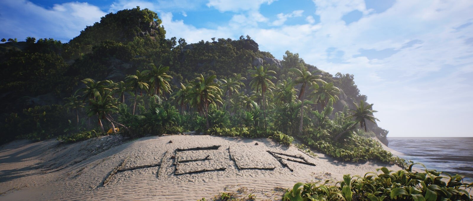
My primary emotion when thinking about Cast Away is nostalgia, and I assume that applies to others as well. I specifically designed the scene to play off of peoples nostalgia, especially with the star of the show - Wilson the volleyball. Going off of pre-existing material is difficult because you have to get the important aspects of the source material right in order for people to make the connection to the original source material. In my final renders, I included a few angles that were the same as the ones in the film, specifically set in emotional beats of the story. For instance, the nighttime scene with the bonfire takes place during the moment that Tom Hanks is celebrating his achievement of starting a fire.

Castaway Environment Beach

Castaway Film Beach
Another challenging aspect of this project was determining what I should take artistic liberties on and what should remain the same as the original film. I chose to make an updated island, almost like Cast Away if it were remastered to show it in higher detail and in more vibrant colour but leave certain landmarks the same as the movie to stay consistent with the movie. Here is my moodboard with reference I used for each point of interest (POI) and for the main area of the island.

Moodboard
Process for Set Dressing and Environment Building
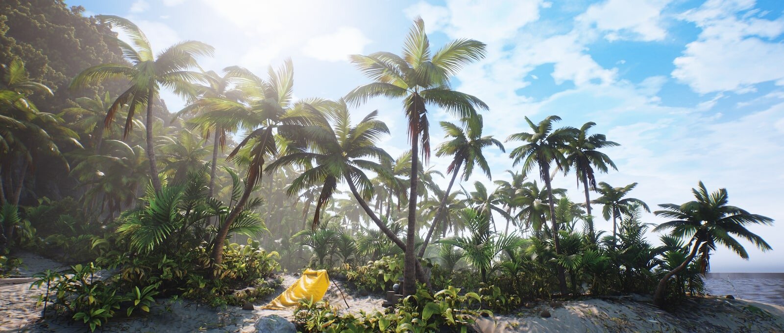
I wanted the island to feel small and insignificant, but also large and unexplored. The combination of feeling lost but also the wonder of discovering what is on the island were the two moods I went for with this piece. I made the island smaller in scale than the actual island because in a lot of reference photos it felt very large, almost like you could be on a peninsula of a large continent. By making it extremely small in size, I created the feeling of being stranded like how Tom Hanks felt when he first arrived at the island.
In the film, there was a lot of dead and dried foliage on the ground. I chose to make all of the plants live and green to give the island more visual interest and look more healthy.

I had a simple rule with foliage placement: Start with the big shapes and work your way down. Start with primary shapes, then go on to secondary shapes, then tertiary.
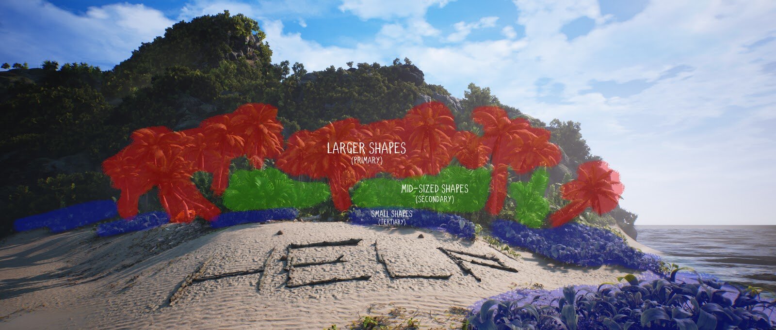
Breakdown of Shape Structure
I started with the palm trees to give the island its shape and scale, specifically placing them in certain camera angles to act as leading lines for the composition. Next, I placed mid-sized bushes and trees to act as padding between the denser and smaller plants that are at eye level. These secondary trees and bushes created very interesting shadows and mini-vignettes in certain areas, shown here.


After placing the mid-sized trees, I placed the smaller plants to form the paths through the island and fill in the undersides of the larger trees. This is where I spent the most time to get realistic and eye catching placement of plants as they would grow in real life.
This gave the viewers a path to follow to the important locations in the scene, and also doubled as a story element that Tom Hanks walked these paths to navigate the island. The principle of primary, secondary, and tertiary detail is how I made all of the details of the island.
Using Asset Packs
Asset packs are a tricky subject because the artist has to identify what they are willing to make themselves from scratch or what they are willing to pay money for. This can cause people to overuse asset packs in their projects. I chose to expedite the process of making this scene by using a few asset packs simply because I would rather put time into polishing and making my project up to my standards than spend a lot of time making every single asset and blueprint. For this project, I used Megascans mainly, but also used Ultra Dynamic Sky to create my cloud cover. I chose this sky plugin because it has very robust settings for all times of the day and can connect to your already existing Directional Lights and Skylights.

Ultra Dynamic Sky Plugin Demonstration
I also used the Community Ocean Water Shader project that is being developed by the UE4 community. It was complex to get working, but ultimately produced way better results than if I were to create water blueprints myself. You can find the plugin here.
The last asset pack I used was a free Unreal Marketplace pack called Open World Demo Collection. It comes with several high quality scans of rocks that worked well in this environment. It’s good for filing in the blanks for what Megascans doesn’t have in their library currently.
Using Quixel Megascans
Megascans has been the single most useful asset resource I have ever come across when making organic environments in UE4. Since I make more nature based scenes, the scans they make achieve an insane amount of photo-realism. I used Bridge’s integration into Unreal 4.22.3 to make selecting assets and importing them extremely simple and quick. You get a ton of control with what res textures or what LOD you want to import, so you can choose to prioritise optimisation or go for the highest res mesh. Quixel has done an amazing job with providing tons of different assets/ textures for any kind of environment. My general workflow is to find the assets I want in Bridge, export to Unreal, then match colours and roughness to the scene and add my modified master material to them that has extra features like Detail Normals and Dither Blending.
Instead of focusing on making or scanning every asset which involves buying software and/or a camera, you can just use Megascans which has most of what I would need for most situations. If you have an idea, Megascans are the Lego blocks you use to make your idea. It’s an integral part of my production process now simply because it helps me create my ideas much faster than making each asset individually. On top of that, they make their applications and plugins very simple to use and modify.
I modified every single texture and asset I brought in from Megascans. Most notably the sand textures were all from different parts of the world, meaning the coarseness, colour and toughness of the three sand materials varied greatly. I used buffer visualisations through albedo and roughness to hone in what made each one different, then used the colour adjustment settings built into each textures settings to adjust each one by eye until their colour and roughness matched perfectly. I also modified the mid sized trees by adding additional subsurface that was more saturated than what the Default Megascans Material had set up.
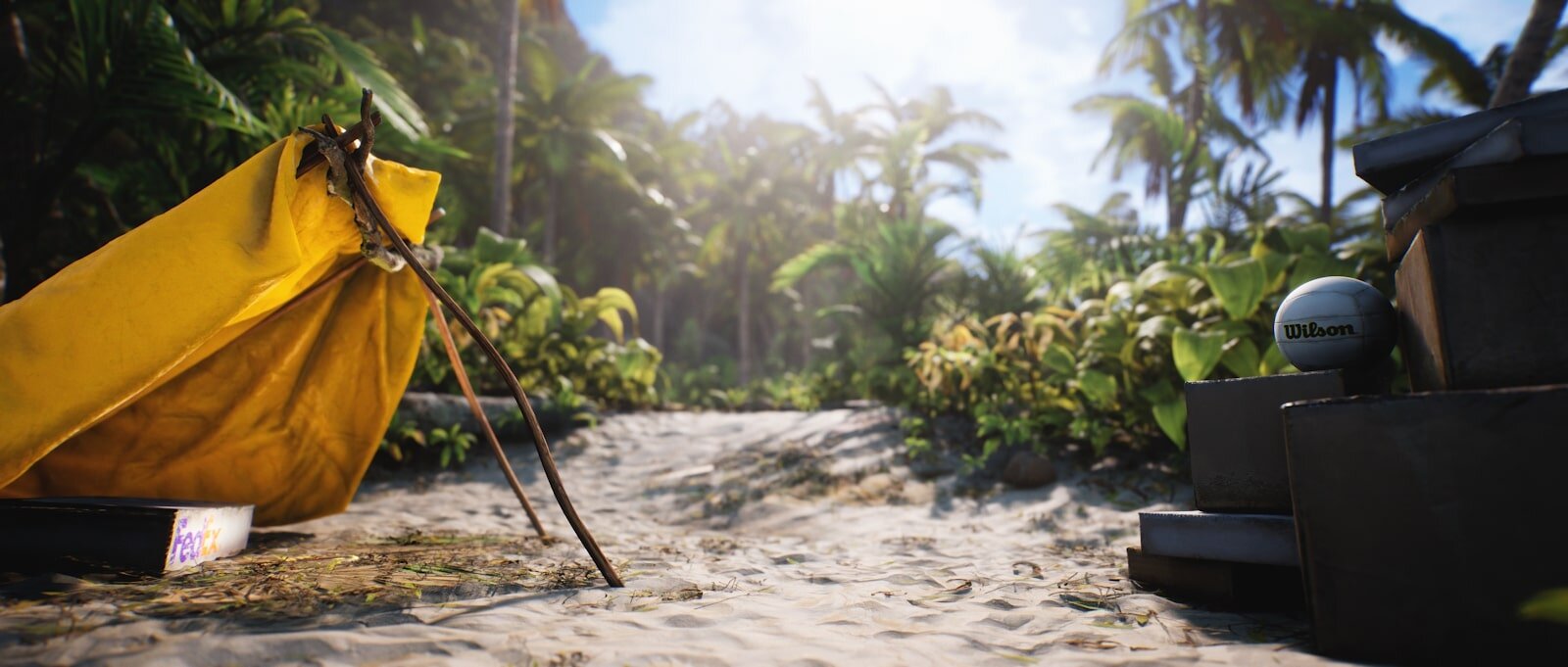
Using Marvelous Designer to Create the Tent
I started by researching the construction of rubber life rafts to see how the stitching and individual pieces went together. After that, I started making the individual pieces one by one and then sewing them together in Marvelous Designer.

Once sewn together, I brought in the sticks that the raft is being held up by into MD to use as a collider. I scaled the raft to match the size of the shelter. Before simulating the cloth, I adjusted the material to have the thickness and softness of leather, which was the closest I could find to thick rubber. I also added the lowest value I could to the ‘inflate’ parameter, showing that there is a tiny bit of air left in the raft. Then I pressed the space bar to simulate, letting the raft drop onto the shelter in a way I liked. I didn’t reduce the poly count because I wasn’t playing this scene in 60 fps which meant I could go heavier with my texture res and mesh poly counts. If this were a playable environment it would be reduced by at least 70%.


After landing on a shapeI was happy with, I pressed the ‘Remesh (BETA)’ button at the bottom of the Fabric properties, which turns your triangulated mesh into even quads. It looks like this.

After re-meshing, I exported as an FBX and brought the model as well as the structure into Maya. In Maya, I brought the UV’s that MD exported into the 1-1 space of the object’s UV space like any other model. After that, I exported the cloth from Maya and brought it into Substance Painter.
In Substance Painter, I baked the necessary curvature and thickness maps to get height detail etc. The texturing for this was very simple - Base layer of rubber with added normal and roughness breakup to make it less glossy and more worn. After that, I added a world position oriented dust and sand layer to the bottom of the raft as if Tom Hanks dragged it out of the water and over to this location after it was deflated. That’s it for the substance Work! From there, I exported the textures as RMA packed to be used in UE4. Once in UE4, I set up a very basic material for this which included Subsurface Scattering and Detail normals. Detail normals helped elevate this model to look much more realistic and detailed.

That’s about it for the raft! Overall, it was a fun process to go from Marvelous Designer to Maya then Substance.
Creating the Islands Terrain
I chose to sculpt the island by hand mainly because it is a different size than what the actual real-life island is. I didn’t do anything crazy with terrain sculpting, it was all very smooth and simple.

Islands Terrain in UE4
The real detail came from the terrain textures and rocks that I used to help the silhouette of the mountain. I chose to go the route of using the default out-of-the-box Megascans Master Landscape Material for this because it offers everything I would want in a landscape material - Displacement, Tiling Adjustment per texture, and Roughness control.
Lighting
For the daytime shots, I had a pretty straightforward lighting setup. I used a movable Directional Light to act as the sun set to the default brightness of 10. I also had a movable Skylight set in the scene which was creating the fill light for the foliage and darker areas.

Connected to the Skylight is Distance Field Ambient Occlusion, which gives foliage and other assets a very soft and diffused fill light.

In Project Settings, enable ‘Generate Mesh Distance Fields’ at minimum. For performance sake, I also enabled ‘Eight Bit Mesh Distance Fields’ and ‘Compress Mesh Distance Fields’ and noticed no difference in quality.

Comparison of Distance Field Ambient Occlusion
This sort of light compliments foliage a lot because it simplifies the shadows and bright spots to make them look less visually complex. This combined with Screen Space Ambient Occlusion (SSAO) with a much tighter radius made much darker shadows in spots that are closer to the ground.

Comparison of Screen Space Ambient Occlusion
Another method for creating more lighting detail is to adjust contact shadow length in your Directional Light settings. This creates micro details in your shadows which help ground the scene.
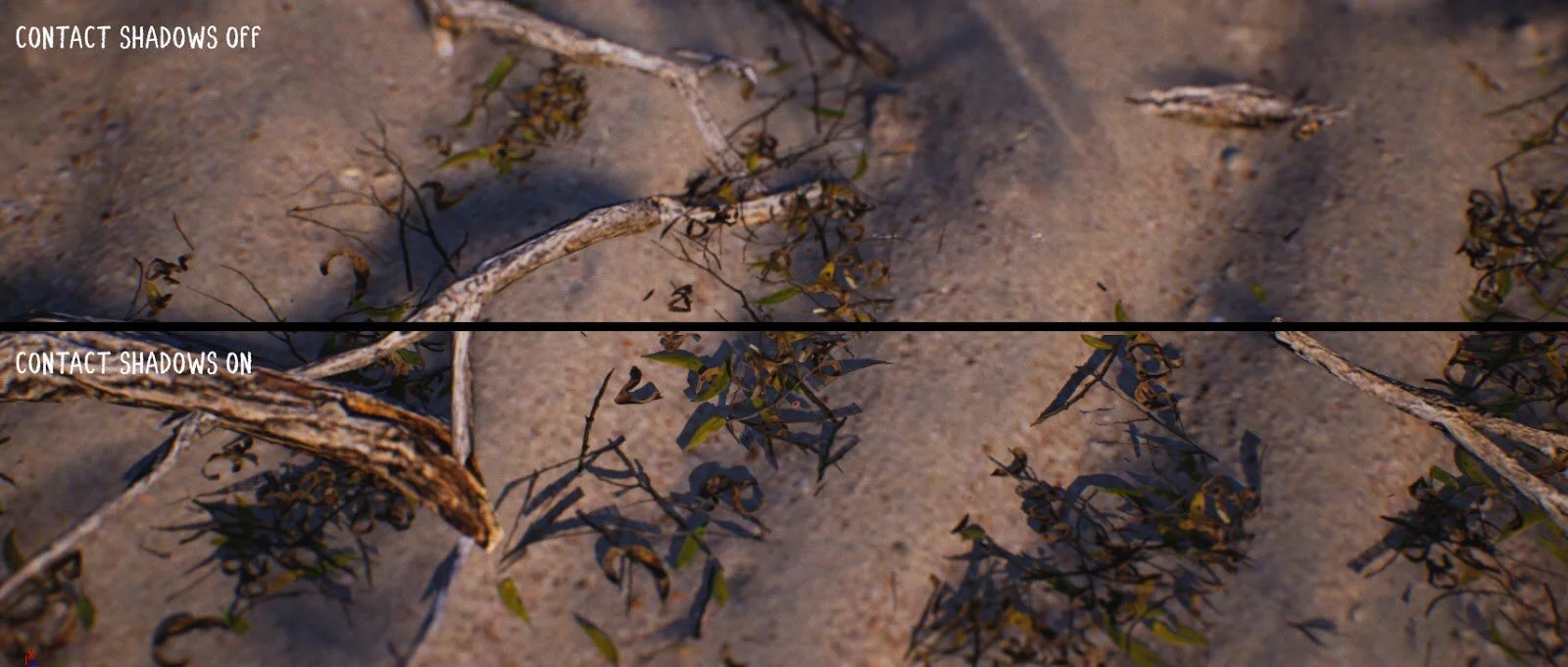
Comparison of Contact Shadows
I went with a very bright look for this scene to help give the viewers a sense of wonder and exploration. Keeping this bright of light gave me an opportunity to exaggerate the Subsurface contributions of the plants and props.
For the night-time shots, I used the same combo of Directional Light and Skylight with DFAO. I made a bonfire as the focal point using a Point Light. It is worth noting that the Point Light also has adjusted contact shadow length to exaggerate the shadows cast on the sand. To help with atmosphere, I added fog cards to the background to make the mountain look further away than it actually is and to help soften the bright light the moon was casting.
Moonlight Shine
It’s a combo of three elements. Sky Light, Directional Light, and the overall brightness of the sky.

I went for what is called “Movie Darkness” which is several stops brighter than actual darkness, meaning that you can see all the details in the scene still but it is still dark and has characteristics of nighttime like colour temperature and darkness.

The brighter overall fill light of the scene combined with the clouds covering the moon made the atmosphere feel like nighttime. A good way to judge if your scene is too dark or not is to take a screenshot, import into Photoshop, and look at the histogram of it. If there is a lot of black details being lost then your scene is probably too dark.
Composition Choices

For every shot, I wanted to have nature be the majority of what is in the frame and have the props appear to not fully belong. This rule helped make all of the renders feel grounded and adhere to the themes of the entire piece.

I also strongly believe in having obvious leading lines to the focal point of the image. This helps the viewer follow a path and ultimately end up resting on the spot I want their eyes to rest on.


Colour Analysis
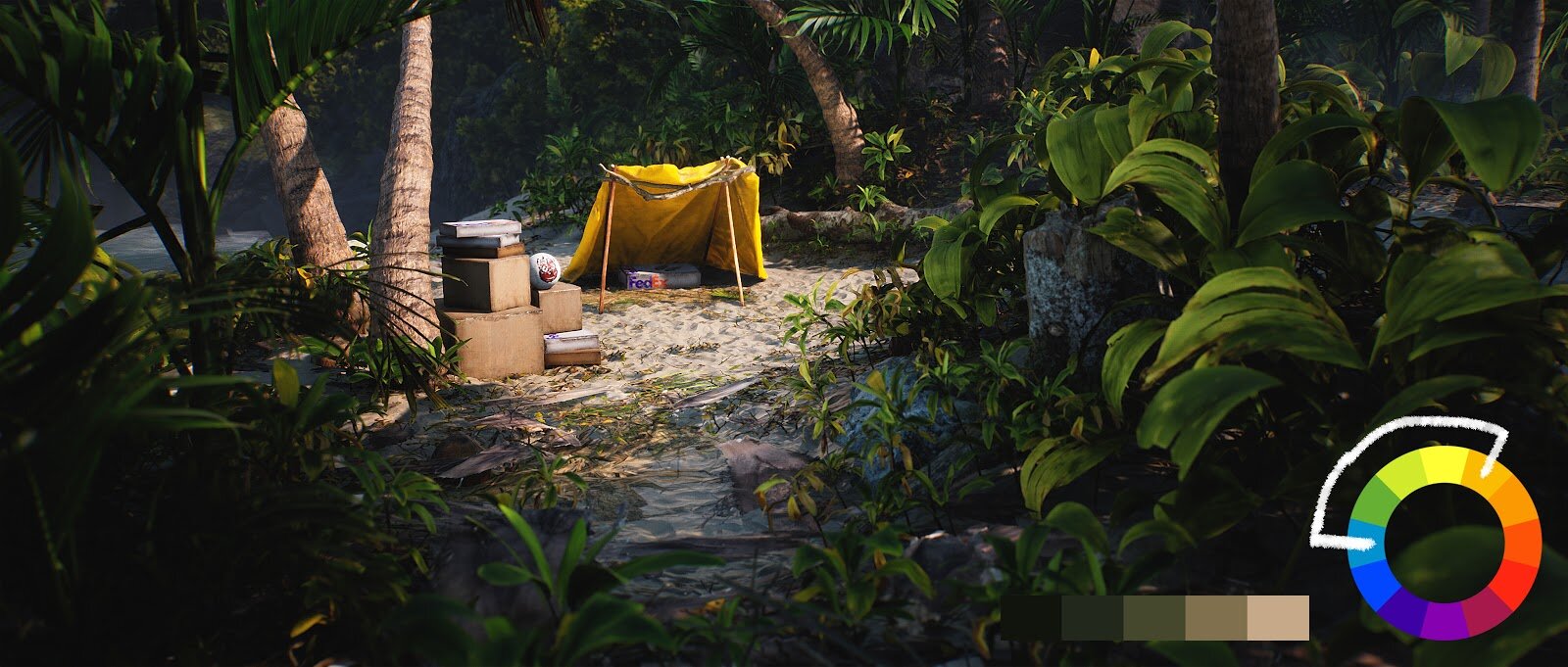
I went with a semi analogous colour scheme for this scene mainly to make everything blend well together. The many shades of green and yellow all give the feeling of it being a warm and welcoming tropical island. The raft being yellow was a choice I made to stay true to the original film. I chose a brighter and more saturated yellow to go with the other brighter and more saturated colours of the scene.
For the night-time shots, I went with a warm vs cool colour scheme just like the film. I wanted the scene to feel almost like an opposite of the daytime lighting scheme to see the environment in a different way. The warm fire light gives a feeling of comfort in the otherwise cooler looking lighting.

Post Processing
I am a strong believer in not relying on post processing on achieving the look you want. In a perfect world, your scene should convey the mood you’re going for before you even set up a Post Process Volume. That being said, I like to have a Post Process Volume from the beginning to help achieve the look I want as I am meshing and lighting the scene. Depending on the project, I sometimes use a Post Process Material to sharpen my scene but for Cast Away I chose to go for an unsharpened softer look to play into the nostalgia of the original film. On top of that, I always use very subtle chromatic aberration to soften the edges and slightly aid in getting the viewer's eye where you want it to go. This goes for my use of vignettes as well. I usually set vignettes per camera angle in the camera settings rather than setting it globally in the Post-Process Material. As mentioned earlier, I like to use SSAO in the Post Process Volume with foliage to help ground the different plants.
I am a big fan of the look of anamorphic lenses in movies, so I chose to make my renders in 2.35:1 Aspect ratio as well as make custom anamorphic bokeh to simulate the look of an oval lens. I did the same thing for my Forgotten Lands scene as I am very pleased with the final results.

To finalise the look of the final product, I like to use a combo of a LUT and individual tonemapper settings to hone in on the specific look I wanted for the scene. I made a custom LUT for this scene in Photoshop, following the very straightforward Unreal Documentation about making custom LUTs and importing into Photoshop. The LUT only adds a slight colour difference, reinforcing how I believe that the scenes colours and values should be in a good place before you tweak colour settings.

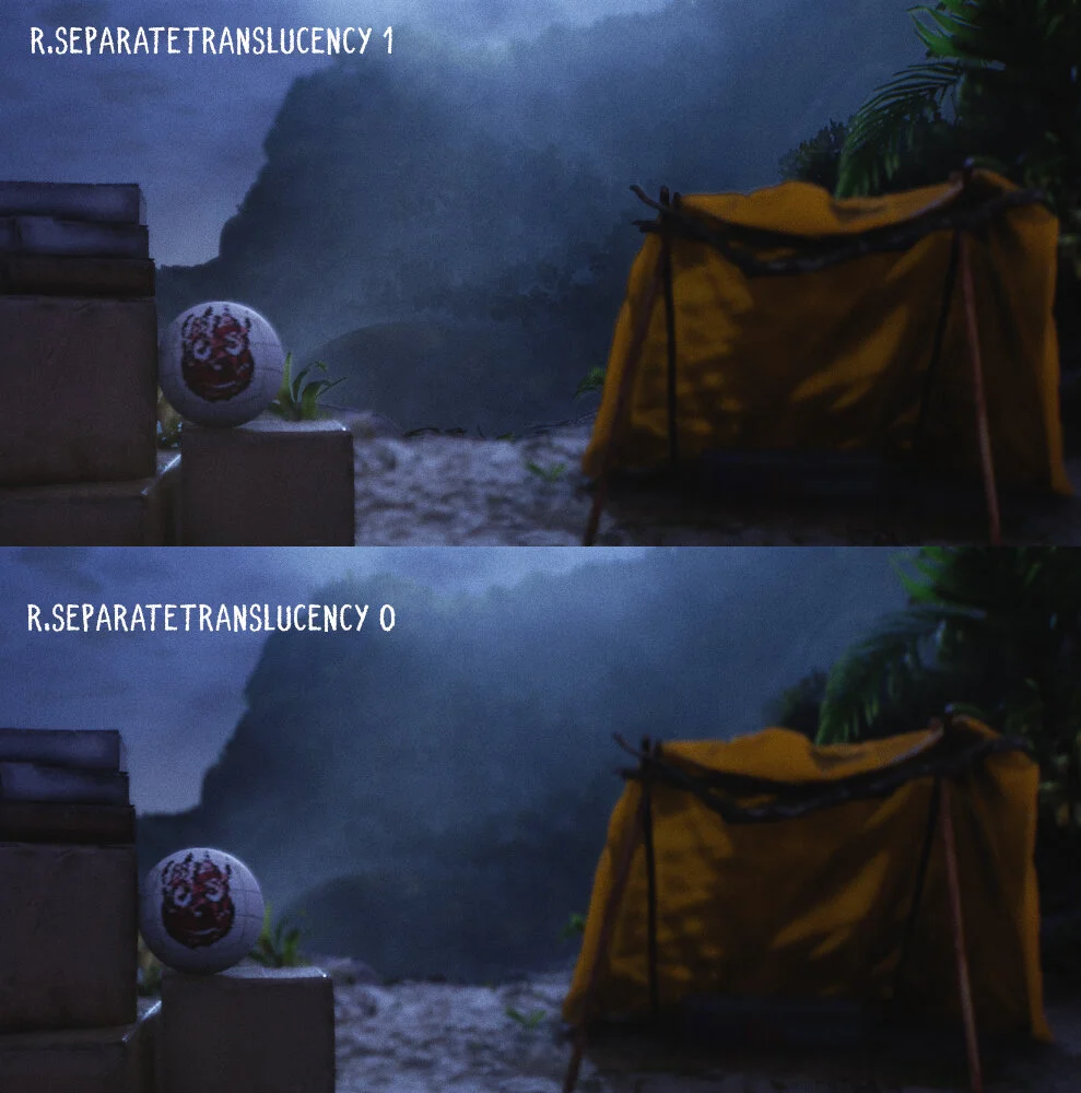
Once I move on to taking my screenshots, I like to use a console command in most scenarios:
r.SeparateTranslucency 0
Separate Translucency forces Unreal to include all translucent objects to work together and blur as they should if you are using depth of field. Fog cards and water shaders are notorious for shading strangely when using low f stops in Camera Actors.
Bonus Tip: Typing “r.ViewDistancescale 1000” into the console renders objects at a much farther distance, preventing any culling issues you could run into with wider landscape shots.
Cardboard Boxes
The boxes are scans from Megascans, and after downloading them someone pointed out that they appear too clean and untouched to be boxes that washed up on shore after a plane crash. To fix this, I manually imported each texture into Substance Painter, baked curvature maps of the meshes, and added wetness, sand, and dirt masks around the worn edges as well as the bottoms being soaked and then dried by the sunlight. Overall was a very simple process using only Smart Masks in Painter.

Common Lighting Mistakes
Being a junior artist myself, I am 100% guilty of doing all of the following things. I see a lot of scenes that either have way too many meshes which cause a lot of unneeded visual noise. I also see the opposite of that, too sparse of meshes which causes scenes to appear underdeveloped or last-gen looking. Another thing I still struggle with today that I notice others sometimes struggle with is Exponential Height Fog. I have seen so many environments that have fog turned up so high that you can hardly see further than 50 feet in the distance, making the scene feel very isolated and as if there is nothing beyond the fog. Fog needs to be used in service to the narrative rather than for the sake of visual style in my opinion.
Lookout in the Future
I have three UE4 projects that are in pre-production currently. I’m trying to plan which project to start working on and in what order to do so. I’d like to focus on each one individually and finish all of them at a level of quality that I am proud and content with.
Additional Tips & Advice
Overdo everything at first, then tone it back. Wiktor Ohman from Quixel said this in a recent video and I couldn't agree more. Adding subtlety first then trying to dial up only leads to frustration because you can potentially never reach the level that is right from your project. Starting with too much saturation or brightness in your lighting gives you an idea of the range you are working with now, which is between the most saturated/bright and complete darkness. This way of working has completely changed how I make environments.
Keep making art! Try adopting the mindset that there is potential to learn from anything and everything you do. Any art you see can help you gain insight into your own discipline.
Lastly… how did you make Wilson?!
I modelled Wilson in Maya by making a cube, then smoothing the cube once to give it a round shape. Once I had the round shape, I selected a grouping of faces that would act as one patch piece of the volleyball.

Once I had this, I added a bevel to the edges to make it bend inwards, creating seams. I then duplicated this six times until they all fit together. To make the low poly, I made a simple low poly sphere the same size as the high poly. I then went into Substance and textured it the same as any other asset really. The hand print was a high res image I found of the film that I extracted in Photoshop and masked. I created an albedo, height, and opacity map from that image to be stamped in Substance Painter.

Thanks for reading!