
MODULAR BUILDING DESTROYED INSIDE UE4
You probably think this scene took ages to create, but Bjorn completed it in only 3 weeks. In this extensive breakdown, Bjorn goes into detail on how he planned this modular building with all of it’s destruction. With rubble simulation in Blender, vertex blending shaders, baked lighting and blending meshes together, this article is full of information.
Introduction
My name is Björn and I’m 24 years old from Stockholm, Sweden. I’m a new intern at Fatshark and will be making Environment Art for their games.
Getting into the 3D world was not an obvious direction for me until relatively recently. I’ve always been into creativity and playing with shapes since childhood. My first job was making graphics for documentary films for a couple of years until I started shifting towards 3D and game development.
Designing maps for Half Life 2 and Counter Strike using Source SDK was something I loved to do in my free time. This experience was very helpful when I started 3D using Blender to model custom assets for games like Cities: Skylines. I discovered the Futuregames 3D Graphics program when my older brother studied Game Design there. Like most who graduate he now works at one of Stockholms finest studios and the same is expected of me when the internship ends.
One of the first games I remember fondly is this little 2D building/driving game from the 90s called Building Cars with Gary Gadget (Bygg bilar med Mulle Meck). You get to build your own car from junk parts you collect around this rural forest area. I would describe its dialogue and characters with a mundane charm that is typical of Swedish culture. I recreated a scene from this game as a VR concept in Unreal Engine that got me admitted to Futuregames.

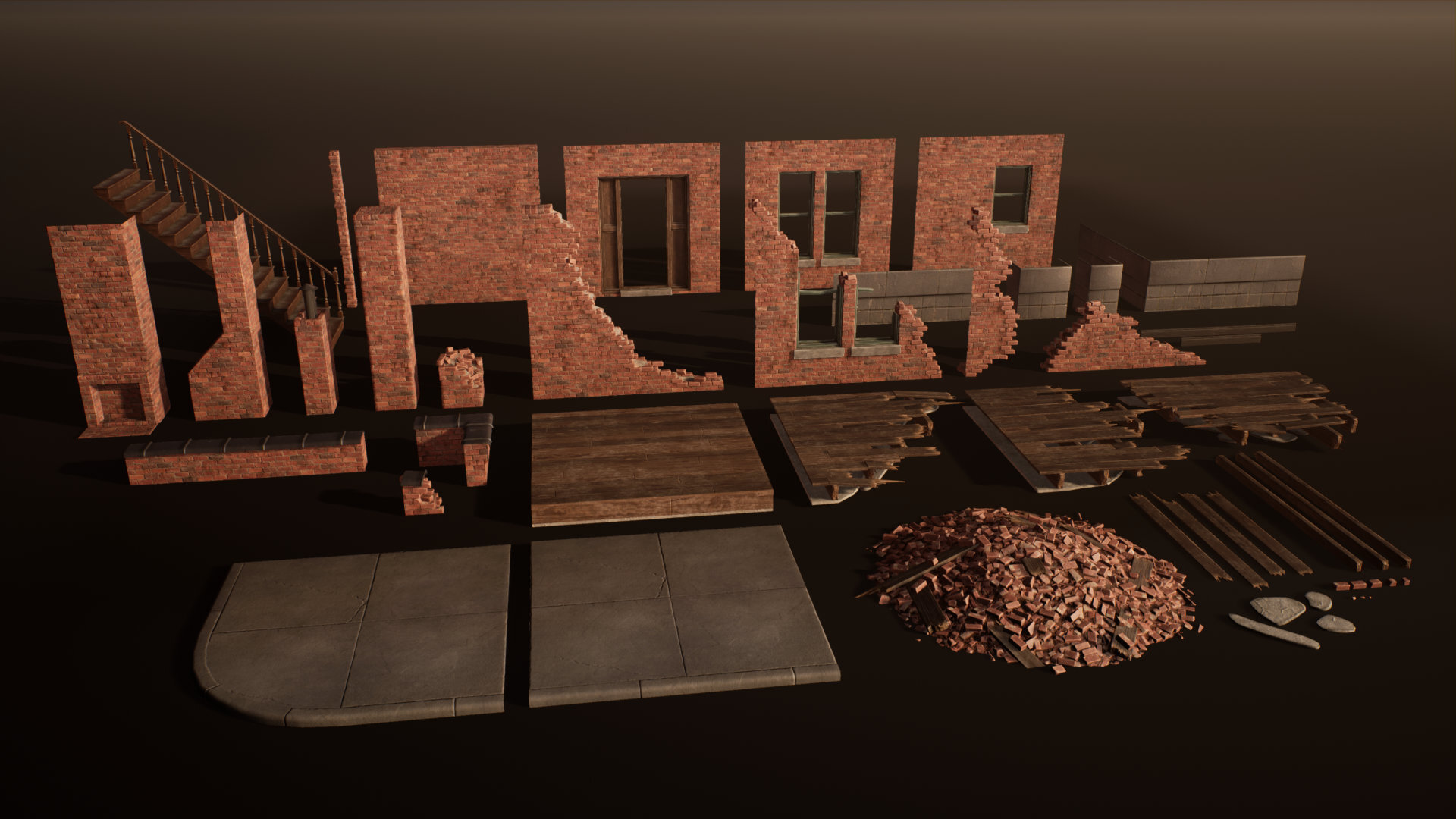
Modular Design and Planning
For the modular building project, I wanted to push my skills and learn a new workflow in making destroyed modular assets. Since I would be dealing with a bunch of modular pieces for just one building it was best keeping them as few as possible.
I chose an American architectural style as there are a lot of references to be found around decayed brick buildings. Using search terms such as urban ruins or Detroit were among the most helpful.
The first steps taken were setting up a basic scene in Unreal and blocking out simple modular pieces such as a plain wall, a wall with door/window and a couple broken variants. With these I started constructing a few houses to figure out what pieces I needed more or less of.

The first iteration of corners was a piece including two complete walls attached so that the texture tiling would be perfect around the corner. This brought the issue of needing more variants than preferred, compared to using the standard wall pieces and filling the corner part with a special column piece instead. I ended up switching to the latter method to save time on managing extra assets.
The wooden floor pieces were also tested with textures to figure out how they would tile when rotated and intersected in interesting ways. I ended up with one floor tile, and three broken variants to cover the flexibility I needed.

Hand Crafting Destruction
The real challenge in this project was to integrate destruction and shader systems into the modularity.
I started with figuring out how to make the broken walls by looking at how other games did it. I found some interesting solutions like blending a broken brick texture onto a jagged edge or simply baking each wall piece with unique textures.
The way I went can be found in Call of Duty: WWII for example, it’s a more commonly found method by placing loose brick assets along the broken edge of the wall. This gives that extra contour detail while allowing for flexibility when making changes, it's also very optimizable for games.


Using Zbrush I modeled a few different bricks and textured them using the same Substance graph created for the tiling brick wall texture so that the color and roughness values match.
With the help of instances in Blender it went pretty fast to place said loose bricks onto the destroyed walls. Copying chunks of pre-aligned bricks also did most of the work bearable

The unbroken floor has a tiling wooden planks texture that can’t be used on individual planks because of the gaps in the wood. Since a new texture was needed anyway, I decided to uniquely texture the broken planks.
They were modelled similarly to how the walls were made by making one end pointy as if it was snapped in half. Then adding some splinters for extra detail, which is just a small plane with a masked opacity material on it.
The few pieces turned out surprisingly versatile and doesn’t look too repetitive when used in the scene. The example below shows how I created larger assemblies within Unreal.

I found a very useful talk by Ben Wilson from Machinegames where he shows some of the techniques developed for Wolfenstein 2.
Placement of Debris
I only needed one asset for the rubble piles. It took a couple of times to get it right as the first version looked more like diced pork than bricks according to a classmate, partly due to the unfinished textures.
In Blender I simulated a ton of loose bricks into a pile that was baked as a texture and made tileable in Substance Painter. I applied it onto a mound shape and sprinkled some loose bricks and broken plank meshes onto it to add extra depth and silhouette.


The rubble piles were placed in strategic places around the collapsed walls of the building. I then used the foliage painting tool to add more loose bricks around the piles. This helped with blending the pile edges and making the scene look more chaotic. This image shows where the loose bricks are part of a mesh(blue) and where I have added extra with foliage paint(red).


Decisions for Storytelling and Camera Shots
Most of the destruction was concentrated in one area rather than being scattered too evenly. I aimed for controlled chaos where it looks like the corner pulled some of the building with it during the collapse.
Apart from how the destruction itself tells a story of abandonment and decay I needed some more detailed elements to emphasise an “everything but the kitchen sink” vibe.
I took a chair and table from an old project of mine, asked for a few painting frames from two friends, and a carpet was quickly made from a Textures.com image. Those are enough props to convey that someone once lived in the house. Some decals were used like a dust layer on top of the rubble and some ceiling cracks.

When placing the cameras in the scene the focus was on showcasing the destruction. In the main shot I included the whole building with the largest destruction right front and centre. This shot was also the most important getting the lighting right for, the intact walls on each side of the destruction are contrasted in that one side is directly lit by the sun. Otherwise it would be hard to read the shape of the building considering the gap in between.

The second shot is from the opposite side focusing even more on the destroyed rubble inside. What’s interesting about this angle is that the floors of the building are lined up between the foreground and background. The sagging floors and dusty staircase are leading your eyes down into the chaos of fallen bricks and shattered wood.

Challenges
One of the biggest challenges in this project was making sure it was consistent and polished to a satisfactory result. I didn’t want to get into the problem of missing crucial details or having mismatching assets.
Planning ahead was important especially since I was on a tight deadline. Therefore, I was focused on getting iterations going as fast as possible and overlooking the consistency of the scene every now and then.
Making sure the main brick shader had every function I needed was a challenge too. There were some issues with the texture sample limit exceeding on the brick shader. I solved it by removing excessive textures and channel packing various grayscale textures together.

Lighting
The scene uses five lights in total. A directional sunlight, skylight, a subtle rim light, the entrance and a streetlight outside.
The sunlight was key to getting the best shadow angle, I tweaked it many times during the project. In the main shot the sun acts almost like a rim light projecting slightly from behind the house.
The skylight helps to brighten up the scene and bring out details in shaded areas, I didn’t want large areas of complete darkness because it looks unnatural. Baking lighting is something I can’t recommend enough for portfolio environments, the difference in quality once you get the settings right is well worth the baking times. And if time is a problem there is a Graphics Card based light baker for Unreal worth checking out, it decreases baking times by insane amounts. These are the settings I used to get clean results.

Be careful with Static Lighting Level Scale and Indirect Lighting Quality as these settings will increase baking time the most. But cranking those means you don’t even need production quality, high was enough for my scene.
Here is a before and after of how the worst baking artifacts disappeared after getting the settings right.

Before

After

Feedback
During this project I had the opportunity to get feedback and tips from a lighting artist from Dice who visited our school for some lectures. Tilmann Milde showed which settings that improve the quality of baking and how to get rid of the baking artifacts you can see above. Without his input I wouldn’t have included the interior shot, which turned out to be one of the strongest aspects of the scene.
Another great source of feedback was from environment artist Saralie Wågström who works at Hazelight. She gave me a lot of useful feedback near the end of the project. She knows those final touches that gave that extra flair to my scene and presentation.
Since I was working on this project in at Futuregames I got constant feedback from my classmates who all have been incredibly inspiring during our one and a half years together. It’s a shame we have departed to different companies now but hopefully we will meet up once in a while and keep ourselves updated on how our internships are doing.

Learning New Techniques
A lot of new things were learned from this project.
Getting close to the final look as fast as possible was fundamental for when it was time to finalise lighting and polishing. I tried to keep iterating on every asset evenly and not let anything lag behind in quality. Something I’ve realised is that you get better feedback if you ask multiple people at different occasions, and make sure they understand your perspective of scope and problem solving.
One feedback I got early on was that I should use the modular pieces to create a ruined town in the background. While this is a great idea that would have made the scene more interesting, the later feedback I got was that I didn’t have enough time to pull that off in a good way. The idea was scrapped to make way for a more focused “photo studio” scene.
Getting different isolated perspectives can make your decision making easier. I also became more disciplined in sticking to the plan and not diverting into unnecessary additions like expensive hero props or general over-scoping. For my future projects I will have a more detailed plan for every asset I need to make and set clearer milestones.
Future Work
My latest project is this military mech with inspiration from Generation Zero made for the degree project at Futuregames. It’s been really exciting having a mentor along who works at Ubisoft Stockholm, Jacob Claussen is a great artist who has done an article for his environment art here too
None of us are really experts on hard-surface/vehicle modelling so we have both been figuring out the process as we go.
Currently I have this little environment piece inspired from the art by Hiroshi Nagai, it’s focused on a swimming pool with surrounding shops and palm trees in a warm Pacific Coast setting. I’ve been experimenting with water shaders and getting the right look of the scene. Once I have enough experience at Fatshark I want to show what I have learned there as well.
Advice & Tips
If you start a project that you really want to finish it’s a very good motivation to set a deadline early on. While it’s fun to just work on something however you feel, it’s easy to get stuck on redundant details instead of moving on and getting the whole piece done in a consistent manner. Some good ways to follow through on a deadline could be writing a schedule including milestones for each step in the process or joining a competition to put pressure on yourself to finish it in time.
Never forget your references, it’s easy to blindly keep working on something and end up with something that looks off. Keep a program like PureRef on a second screen showing the most relevant images to the part you are working on. Train yourself to rely more on replicating what you see in your references and keep looking to them whenever you have doubts. When pushing for realistic assets, the three most important aspects in my opinion are proportions, roughness and base colour. Our eyes are extremely good at spotting odd proportions, even if you can’t put your finger to it. Always try to find real world measurements whenever possible, and don’t be afraid to include the smallest details like wires and bolts because they still add up to the whole picture.
Roughness should have more contrast than you may think, the difference between dirt, surface and edge wear is usually in the whole range of white to black. Even if you can’t spot any roughness detail in your references, a very subtle grunge texture can be added to your roughness anyway, the small differences will be noticeable too. Most surfaces have a lot of interesting colour patterns and hue variations. A common problem is that the base colour values are too flat which can make it look stylized. Any way you can introduce contrast or hue shifts will make your texture look more realistic and interesting. Try to find variations on both a micro and macro level, as long as it can be referenced from real life.

Outro
If you’re looking for a job in the industry and want interest from a company, you must show it to them. No one knows what you think or want unless you tell them.
In my experience you can't predict what a recruiter will judge your application on, so keep your work focused on what you like to do or where you want to work. Don’t try to make a generic portfolio that makes you look uncertain. If you don’t succeed at first, you should have a better chance the second time with more persistence and experience. Keep on creating!