
SUBSTANCE SOURCE - WORKING ON THOSE SWEET DROPS
Celine Bader worked on some of the recent Substance Source drops and gives us an insight on what it’s like creating content for their Source library, the rules they have to follow, ensuring materials are kept consistent and how Substance builds the quick ‘presets’ available for artists.
Introduction
Hi! My name is Celine Bader. I am 23 years old and freshly graduated from the New3dge art school in Paris after 4 years of art and game art specifically. During those years I have worked for 9 months as a 3D Artist at Lumtec Project, an indie studio based in Strasbourg where I come from. I did environments but I also did character modelling, rigging, skinning and animation and integrations in Unreal Engine. Since then I have been employed by Substance, firstly part-time during my last year at school and now fully employed.
I discovered the world of 3D when I was in my first year in Paris in a Japanese art school I wanted to leave. I met the right people at the right time, they showed me how to make 3D and the magic began.
The first game I ever played was Lapin Malin... But I prefer saying that it was Rayman, the first and the best! It is thanks to this game that my love for video games begun and the reason why I am now willing to make one.


Substance Source - Uba Tuba Granite

Substance Source - Tan Brown Granite

Substance Source - Kashmir White Granite
Substance Source
Working on the Source team is amazing! I can really say even if it is only my second job, that it is one of the best places to work. You really feel at home but with the professional side along with it. They respect each person, each method of working, everything is more based on productivity instead of production and I find that amazing. You work better and faster in the end. Also, we are a team of less than 10 in the Source team so it’s cosy and we always have work to do. The last drop had more than 550 materials so I will let you imagine!
We work by drops, or themes if you prefer. We have a list of materials based on the drop theme and then each of us just make whatever we want on the list. If you want to begin a material but like to change often like me, you can. I often have two or three materials in "work in progress". Some people like to begin one material and to finish it entirely before beginning a new one. It depends! Each day we share some GIFs or images on Slack so we can all discuss what could be better.
Creating Source Materials
The graph MUST be clean because anybody can open it. Some materials are complicated no matter what but the user shouldn't feel totally lost in despair. In addition, we have some restrictions with the use of certain nodes because they cost too much, like the flood fill or grunge maps. Also, we don't use the gradient map for example because you can't change its colour with a parameter correctly. So we do colours and noise maps from scratch! As I said, anybody can open a graph but they should be able to understand it too!
Speaking of parameters, it is better to plan them but it's important to leave some space in your mind for accidents and surprises. During the process you can think of something and what’s amazing with procedural stuff is that it's always possible to go back and change some nodes etc.

Substance Source - Parameters
Variation and Presets
I am not the one who decides of the amount of presets. In fact we set the minimum to 3 presets. We propose them to our Content Directors and they accept them or not. If not, they can change whatever they want thanks to our parameters anyway.
We make presets depending on what is relevant. For granite, you can't think of anything else except a colour change, roughness change or changes directly in the granite if the type of granite has lots of variety. For a metallic material, you can think of a clean, dirty and rusty preset for example. It depends, but it is a funny part since it allows you to see if your parameters work!
Substance Source - Volga Blue Granite - Default Preset

Substance Source - Volga Blue Granite - Morganite Preset
In reality, a preset is simply a state of a material due to various parameter changes. To make the colours match those of a gemstone, I used the colour settings I exposed and played with them until they matched. For example, a "muddy ground" preset on a ground material will simply be the state where a parameter called "ground wetness level" will be equal to 1, considering that it goes from 0 (completely dry state of the soil) to 1.
To get to this state, I have to arrange the graph so that when the parameter reaches 1, the material turns into mud via modifications in the height, normal, roughness etc. It is possible in each node to build a function which is directed by a given parameter. This is how a parameter is created.
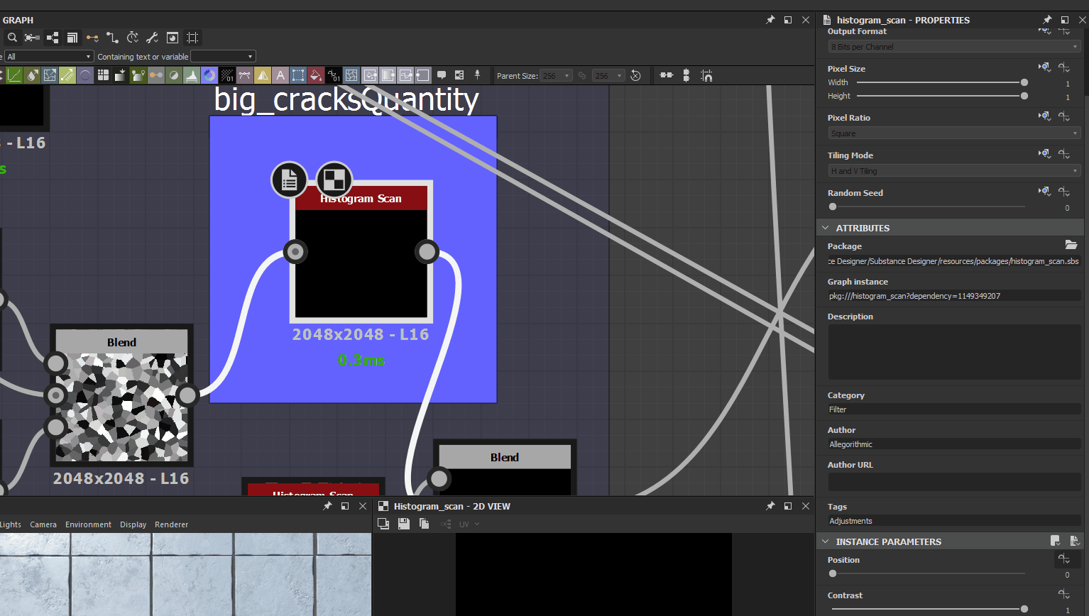
Imagine I got the roughness map I created and I connect it with an histogram scan node. I could put a function in the "position" parameter of the node and tell it by entering the function graph to go from 0.5 to 0.3 along with the "ground wetness level" parameter.
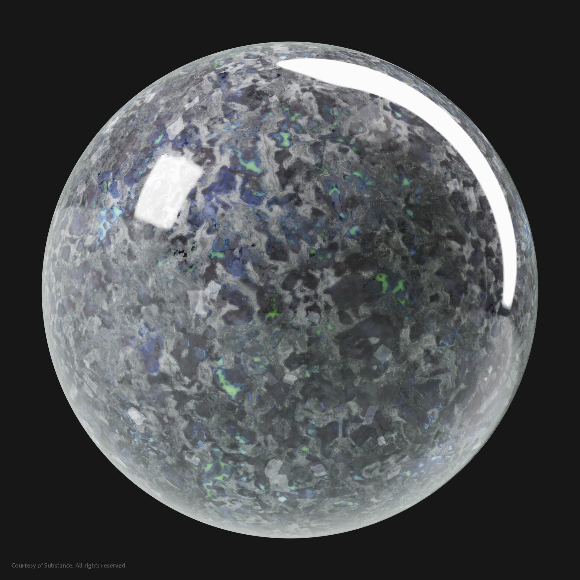
Green Granite Breakdown
It was the most challenging. All of the types of granite were challenging but this one was the best. I had to understand how a granite is constructed. It's an assembly of several pieces of minerals. I first tried to create the minerals but it didn't work at all. So I focused on the construction of the intersections instead. Between minerals it looks like some messy veins. I also participated in the drop of skin imperfections and I remembered how I made the skin grains. I found the technique quite similar! In the end it served as a basis for all the other granite materials. Mostly everything is on the base colour and created with masks, with the veins as a base (so if I change them, everything changes with it) with lots of slopes, warps, directional warps, and non-uniform blurs.


Substance Source - Green Granite Default Preset

Substance Source - Green Granite Emerald Preset
I create parameters depending on what I, or the users would like to do with that material. Maybe the tiling, maybe some colour change, maybe a more rough surface? I had fun with making a "roughness crystal" parameter which I really love on the black pearl granite for example. It is good to go out of reality just to make something nice to see.

Just by searching for references, you can discover new states of your material and you can have this state as a goal to create parameters too. The green granite didn't have much but the Bianco Antico Granite for example had veins and "exploding" veins, so making a parameter to achieve this was obvious.

How Presets Work?
Granite presets were fun to make because sometimes they really have different types. Like the Green Granite Royal which really exists but not all of them do. I searched for precious stone names (because granite made me think of them with all their colours) and tried to change the colour of the granite to achieve the same colour. I put the same name as the stone for the preset, like "Labradorite".

Substance Source - Green Granite Royal Preset

Substance Source - Venetian Gold Granite Labradorite Preset
Consistency Between Artists
The real power of our software is the procedural side. The future is the possibility to change your work whenever you want, to have non-destructible work. It gains time and it’s an unlimited creative way of working since you can change your material whenever you want.
If our materials are great looking, whatever changes you make to the parameters, then and only then, is the material good. I am working with really great technical artists that have really great eyes to see what is good or not. Since we share our work everyday and speak about it everyday, I think this is why we ensure a good visual quality. It is a team effort and not only one person, if your gaze is tired of your work, the others aren't.
For the quality of materials regardless of the change in parameter, let's take the same example of the ground material with its mud parameter.
This material, which must of course be of high quality in its basic state, must also be of high quality if the user decides to set the "ground wetness level" parameter to 0.2 for example. Our job is to ensure that the user has a wide field of action and that they can have a satisfactory result no matter what values they want to have the parameters set to. This part of the job is the one that takes the most time, at least for me!
Let's choose three possible presets for this one. We could have the default preset which is the one appearing when you open the material. It could be a mix of different parameters, let's say we have "ground wetness level" put at 0.3 and also a "cracks amount" at 0.4 to have a nice mix.
Then various presets such as:
Muddy Ground
Dry Ground
Damaged Ground
Challenges
If we only speak about the granite drop, the colours where the most challenging aspect I have ever encountered. I had headaches for some days because my brain was dancing with rainbows. I had to understand why this colour was there, how I could make it and create a whole bunch of masks... For those who downloaded them, they will understand what I am saying better.

Tan Brown Granite

Cecilia Granite Tiling Parameter
Better overview of colour work
Substance Designer Tips
I can't give you breakdowns of my work at Substance, unfortunately. Nonetheless, here is a link of an article I wrote for The Rookies about the wood material I made.
For some tips, I will just gather and repeat some things here:
If you are starting out, get ready to be surprised…. All the time. In fact, even if you are not a beginner. Each material has its share of surprises, little things that we had no idea existed. I remember wanting to make concrete, thinking at first sight that it was a simple grey thing... Marvellous mistake! Learn to see at the macro-level but also at the micro-level. Thus we learn to build our texture in stages. It is so easy to rush towards the three small grains of dust (essential) while the overall shape does not work perfectly.
References are essential. No need to have a ton of it, just what you need depending on the material you want to create. For my case, wood is complex because of its varieties and this is the case for many materials. We must ensure that we stay on the right track.
Take PureRef with you so that you can collect all your references and zoom as much as you want on an image without losing its quality. For micro-level, take the tool option of Google Image and choose only large images. For macro-level, don’t be too harsh on bad quality images, you can see nice height information on them sometimes. It all depends!
I also like to take references from works done by amazing artists such as Javier Perez, Enrico Tammekänd or Josh Lynch. It is nice to set a quality goal, analyse how they have made the same material and how they have enhanced it with nice lighting.
Analyse the different stages of construction carefully. Note how the height works, the different categories of details (cracks, shocks, grains...) how the roughness reacts on each part of your material, why is this material interesting? In general, it is a question of harmony between the details and the rest areas of contrast, a little like absolutely everything in art.
Talking about the height map, know that if the range value is under 0.5, it will dig down your mesh if you are making some displacement or parallax occlusion. The value 0.5 is the “neutral” value, your mesh will keep its original size and will have the desired areas (above 0,5) pushed over.
The normal map should not be too noisy. I had this problem a lot in Unreal Engine for example. It is not necessary to put the intensity at 10. 1 or maximum 3 is enough. But as I said before, it all depends on where you want to use your material.
Make sure, exceptions aside (mirrors, water, …) that your roughness value is never 0 or 1. This is not PBR, not realistic.
Then finally comes the albedo. It is important to make the difference between albedo and diffuse. Albedo is used with new physical-based material workflows. The difference is that albedo maps are the pure colour of an object without the shadow and light information that is on the diffuse map. So don’t put any light information! Maybe a little of ambient occlusion to add some depth, but that is it. The only case where you need to do that is when you are making a stylised texture.
And last but not least, feedback and gaze rest! Ask for advice and take some rest for your eyes. You should be able to give feedback to yourself too but to do so you need to refresh your vision of your work. Take some tea, go outside for five minutes and come back. It is better than staying in front of your screen wondering what is wrong. Take care of yourself!
Outro
Be curious, find a goal and appreciate the journey with its challenges!
I am open to any questions you have, any feedback you need or simply just to discuss about the industry and life struggle as an artist. You can find me on Artstation or on Twitter if you want to talk.