
STYLIzED MaterialS in Substance Designer WITH DYLAN SALVAlaIO
Dylan Salvalaio walks us through the Stylized Bonfire and Flowing Lava materials he made with Substance Designer. Read through to learn his process all the way from planning to presenting the final render and his tips and tricks on maintaining the stylized look in a procedural package.
Introduction
My name is Dylan Salvalaio, I'm 25 years old and I actually live in Belgium in the town of Grâce-Hollogne. I’ve been doing graphic design for three years now but I only started learning Substance Designer a year ago in my free time. I also work in Blender and Zbrush.
I’m passionate about video game art and I’m currently looking for a position as a Texture Artist in a studio as well as freelance work.
I don't remember the first game I played but the first one that left an impact was Warcraft 3 : Reign of Chaos.
Stylized Bonfire Breakdown

I always start by planning my texture with its composition, then I find my references.

I prepare all of the outputs such as the ambient occlusion and set them to coherent default values. Then I make rough shapes and set up a quick global render to see if I went in the right direction or if other shapes are necessary to give the desired result.

Once the basic shapes are ready, I start to detail them with 3 different resolution of details (low, mid and high frequencies) while trying to maintain a global look and stay on the right track.

Once everything is ready, I blend all the elements that compose my texture thanks to height blend nodes which output the masks I'll need for the colouring.
When all the details for each element are ready and the layout of the objects is good, I prepare a more precise ambient occlusion.
For the colouring, I start with an uniform colour for each of the objects that compose my texture, I add a second colour with a slight gradient to contrast a bit, then I blend my patterns height maps through my colours.
I add some more detail thanks to the curvature and the ambient occlusion which give me the peaks and crevices.

Once the colouring is done, I prepare my roughness thanks to the masks I used for the colouring and the height map.
So when the texture is finished, I set different renders and see if I have issues so I can then fix them.
Maintaining the Stylized Look
For the procedural aspect, I create each asset individually by breaking them down into simpler shapes according to the three frequencies of details that compose them.
To keep the stylized look I try to not give too fine details to my noises which give me a non-photorealistic organic result.
Material Planning
My technique and workflow remain the same in general even if I try to improve it with each new texture.
I start by planning the texture with its composition, then I search my references. I prepare all the outputs and give them coherent values according to the texture. Then I create rough shapes and try to make a quick global render to see if I did it the right way or if other shapes are needed to give the desired result.
Once the basic shapes are ready, I start to detail them with 3 different resolution of details (low, mid and high frequencies) while trying to maintain a global look and stay on the right track.
Once everything is ready, I blend all the elements that compose my texture thanks to height blend nodes which output the masks I'll need for the colouring.
For the colouring, I start with a uniform colour for each object that compose my texture, I add a second colour with a slight gradient to contrast a bit.
Once it’s done, I create my pattern height maps that I will use for colouring. Then I add details thanks to the height map. I add some more detail with the curvature and the ambient occlusion which give me the peaks and crevices.
So when the texture is finished, I stage different renders in Marmoset Toolbag to check for any issues that need fixing.
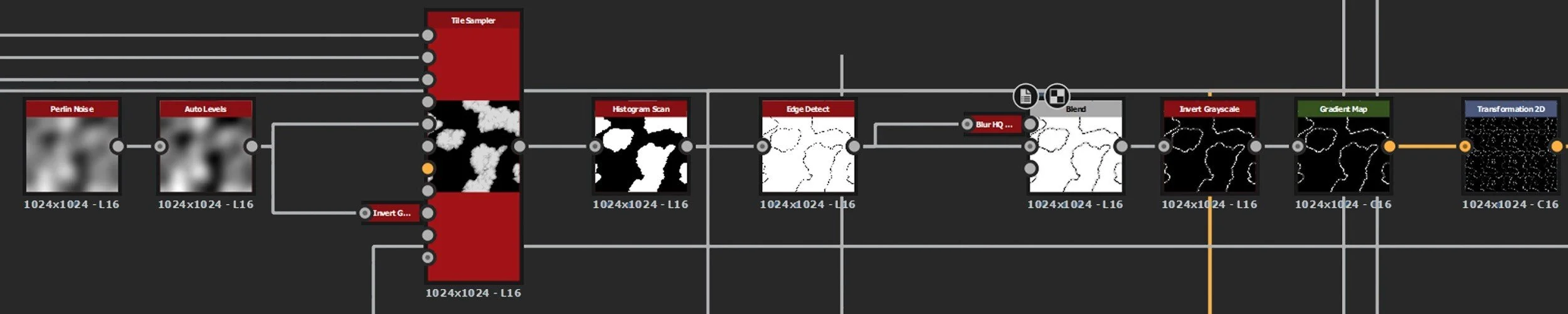
Graph Closeup
My favourite part is the map. The result is really good while I taken a lot of time to find the right way to make the scrolls rolled up.
I use nodes like shape extrude node or even use the circular splatter node in different ways.

The circular splatter gave me the rolling on part of the scroll and the shape extrude gave the length of the parchment keeping the rolling on part.
Lighting and Presentation in Marmoset
First, I look for a background that corresponds to the atmosphere I want to give to my scene, that inspires me.

The first light is a directional light to give me the sky colour and a first tint.

The second light is a yellow directional light close to the ground that match to the sunset to highlight the silhouette of the objects present in the scene.

The last one is an omni directional light that I use to illuminate the darker places and reveal more details.

Finally, some post-effects gives the final result and enhance the details.

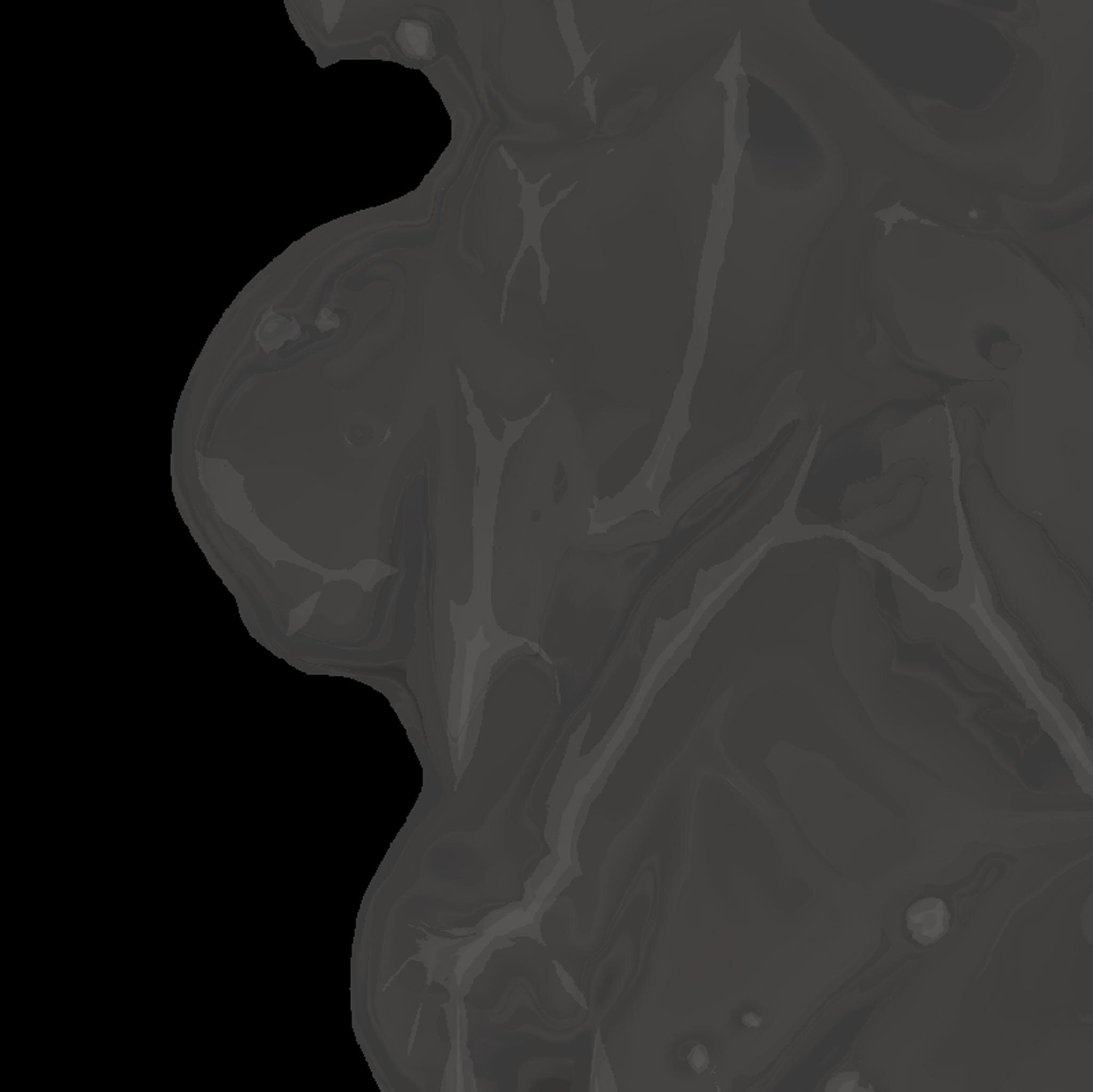
Flowing Lava Breakdown

For the height map, I first create my basic shape to use as input in two different tile sampler nodes that will give me 2 wave size variations for the lava.
Then I create a pattern based on the fractal sum base and clouds 2 nodes that I mix together with slope blur and directional warp nodes.

Once the pattern is ready, I blend my tile sampler with the largest shapes to make a beginning of lava behaviour.
I repeat the step several times with different inputs for the warp to give different levels of detail to give the lava the right layout and right organic result.

At this point, I have a global form of lava rocks that suits me but I still have to do the lava flow effect.
To make the lava flow, I start by blending my heightmap with a perlin noise node to give a global organic aspect.
Then, to blend the lava with the ground, I use a height blend to get back the height mask that will serve as a mask base.
I blur with a non-uniform blur node and a grayscale blur node my heightmap and use it as the vector in a warp grayscale vector node with lava as input, which allows me to create my lava flow. Then I reuse another height blend to get a mask that I blur slightly.
The blurred mask allows me to give a swelled effect on the extremity of the lava to give it a more viscous effect.
To finish I blend everything using a height blend node that will give me a mask for the colouring.

Emissive Masking
I begin with finding several lava references. With 2 histogram scan and ambient occlusion nodes as inputs it allows me to search 2 different levels of crevice. Then I blend each one with their own opacity to have 2 shades of gray.
Then I take the height mask in the height blend to have the border of lava, next I use a non-uniform blur node.

I use the blue channel of RGB split node to get fine variation of details. At the end, a simple gradient gives me the colour that I want.

Keeping the Albedo Clean
For colouring, I always start by setting a first colour with a uniform colour node.


Then I create a pattern that will give a first layer of detail.


I use a fractal sum base node that I slope blur on itself in blur mode. Then I use a non-directional warp node on itself to increase the organic aspect. After that, the directional warp allows me to break the continuity of my pattern thanks to a flood fill grayscale node that gives me the position of my rock.
Then I prepare an ambient occlusion that I slightly blur that will make the pattern follow the crevices of my texture thanks to a warp vector and make disappear the sharp fracture edges thanks to a directional warp node.
Then, thanks to a curvature smooth node and histogram scan node I add a colour on the peaks of my rocks.

I reuse the same curvature with a more accurate histogram scan node that gives me the finest peaks.
I reuse the same curvature with a histogram scan node by taking the crevices areas to darken.
Then regarding the lower resolution, I use the details found on the height map and other noises (for instance, a BNW 2 node with a histogram scan node) which gives a slight detail that I blend in low opacity.

Parameter Exposure
Yes I expose my parameters but I don't use them because I prefer to recreate them to learn and use more techniques. I’m teaching myself to create a smart material and use it in a procedural way as much as I can to create more organised and ambitious projects.
What I Wish I Knew
I think that pattern creation for colouring is the thing I wish I had at the beginning because there was not enough details in my work.
I wish I knew everything about coordinate manipulation based on vector mathematics, for example the non-directional warp node of Daniel Thiger because it helps me a lot in shape creation like rocks or be able to give something an organic aspect.
Layering Unique Details

For the colouring, I start with an uniform colour for each object that compose my texture, I add a second colour with a slight gradient to contrast a bit.
Then, I blend a pattern over it. I generally create my patterns by using shapes I've made before and transforming them according to the detail that I need.
For the following example, I put my ink stain shapes in a slope blur grayscale node in blur mode with as a second input a fractal sum base node to obtain the desired effect, them I finish this pattern thanks to a histogram scan node to gain wider flat areas with a slight gradient on the shape boundaries.
Once these shapes are done, I use them as input in a tile sampler node with random scale, position, rotation and colour to vary the levels of detail. Then I blend it with a uniform colour to have some tint variation.

Here are different patterns that I used to add some detail to my colouring.
The first pattern is the one used on my scrolls, the second one is used for the rocks and the third one is used for the ground.
At this point, I just have to improve the first detail map according to the detail I want and choose the colour that I need.

Once it’s done, I start to make the map ornaments.
I create the boundaries between the sea and the land by creating a tile sampler node with my rocks as input and I dispose them according to a perlin noise node.
After this step, I make a histogram scan then an edge detect to outline the land on my map.
Once those details are set, I create the mountain and wave shapes that will complete my map.
A simple waveform node controlled by a paraboloid shape in a directional warp node gave me the two silhouettes that I need.
To differentiate the mountains from the waves, I create a stroked shade effect with a tile sampler node that receive the same treatment as the mountains, then I just have to blend the whole thing together.


Lastly, I add more details with slight noise.
Custom Nodes
I use the warp non-directional node that allows me to create my patterns and give organic aspect easily.
Feedback
Most of the reviews I had come from my work friends Nathan Lebon and Romain Brooks: to focus on low, medium and high frequency details and tips on lighting, and to increase visibility of all the elements who compose my scene.
I treat all objects individually with the same process. Unify all the elements with common texturing technique and uniform colouring of ambient occlusion and curvature.
Additional Tips and Tricks
To begin with, I advise people who want to make stylized textures, and also love my work, to create patterns in order to improve their colouring skills quickly and in an effective way like in the example below.

To break the continuity of a noise that will add some detail over a texture, I usually vector warp it by using a Tile Random that goes through a Flood Fill to Random Grayscale, which will then alter my noise in a nice fashion, as you can see in the example below.

Finally, I would like to advise people to use professional nodes like the directional warp or the multi-directional warp which are very useful in texture creation whether it is in creating height maps in order to give an organic aspect or simply create patterns.
Outro
I really liked working on the bonfire texture because it helped me a lot to improve my workflow and learn new skills, even if it took me a lot of time and was harder than I expected.
I also really liked writing this article, I learned a lot about myself and how I work.
At last, I'd like to thank Nathan Lebon and Romain Brooks for their deep knowledge in Substance Designer and the procedural workflow in general, Daniel Thiger for the great tutorials he made available and Experience Points for giving me this opportunity to have article on their website.
If you like my work, do not hesitate to take a look at my work on my Artstation.